dkaffes
@dkaffesAll solutions
- Submitted 28 days ago
Article preview component with a share popup
- HTML
- CSS
- JS
- The popup content (
share-content-wrapper) is not perfectly centered above the share icon.
I used:
	left: 50%;
	transform: translateX(-50%);
	top: -70px;
How do i correct this misalignment?
- How can I change the color of the arrow icon when the icon is pressed? I used the
icon-share.svgimage file from the given design files.
- Submitted 3 months ago
Results summary component | mobile first and simple Grid usage
- HTML
- CSS
- Is the way I implemented the circular container containing the text: "76 out of 100" correct?
- Is there a better solution to make it more robust and responsive?
- Any help will be truly appreciated!
- Submitted 11 months ago
Testimonials grid section | grid-auto-flow: dense;
- HTML
- CSS
Is the use of the
qelement correct? Or is it more appropriate to useblockquote? I believe that the text inside the quotation marks is considered a short quotation that doesn't require paragraph breaks.Any advice is welcome!
- Submitted 11 months ago
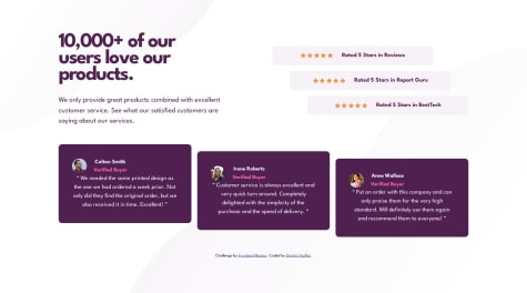
Social proof section | 3 Grids and some flexbox
- HTML
- CSS
I did not get the correct spacing as it is given in the design for the desktop version. When I try to emulate the cards width, the position of the title on the
background-imagebreaks and vice versa. I need some advice that has to do with the spacing between the elements.I understand the difference between margin and padding but I would like some general advice:
- How much padding is too much padding?
- How much grid gap is too much?
When the spacing between elements is big, how should I approach the layout design?
- Submitted 12 months ago
Four card feature section with grid-template-areas
- HTML
- CSS
In my solution the
border-top-coloron each of the four cards looks a bit curvier compared to the design files. Do I miss something here?Thank you!
- Submitted 12 months ago
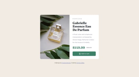
Product preview card | Responsive with Grid
#accessibility- HTML
- CSS
- Accessibility: Is the way I deal with the `` tag correct? I use it for the deleted price part:
$169.99 The old price of the perfume in strikethrough-
The CSS Reset (by Andy Bell) that I am using, removes only the
margin-block-endpart of the margins for elements like:body,h1,h2etc. This results in elements that keep their user agent stylesheet. For examplebodykeeps a small margin on three sides (top, right, left) of 8px. I had to repeatedly set themargin-bottomormargin-topusing some utility class. Is there a better way to deal with this issue? -
I had to set to the
element the `display:inline` in order for the `object-fit: cover;` on theelement to work. Is this approach correct?
Any help is valuable!
- Submitted about 1 year ago
Blog preview card with active states (CSS nesting)
- HTML
- CSS
Are there any comments related to the way I dealt with the active states of the interactive title element?
- Submitted about 1 year ago
Huddle landing page - introductory section | CSS nesting
- HTML
- CSS
How can I fix the
:focusstate of the social icons?It doesn' t get the same styles (even though they are in the same declaration set) with
:activeand:hover. In Firefox, focusing on the social icons looks ugly and focuses on the bottom half of the icons.