Single price grid component - CSS Grid and custom properties


Design comparison

Solution retrospective
🙏 Please enlighten me!
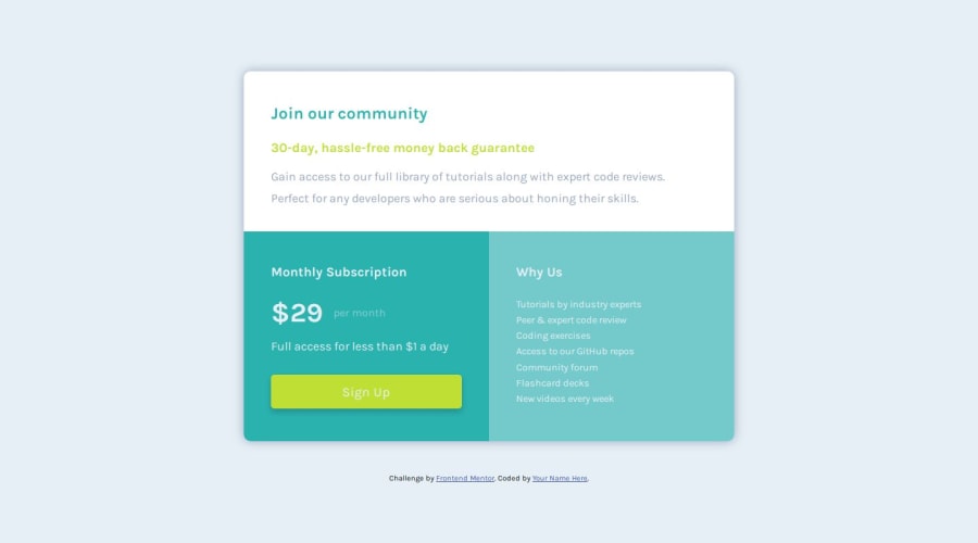
The Sign-up <a> element breaks to a two-line text at 360px. And as the width becomes smaller the whole button breaks because of its padding settings.
- What is the smallest width that we need to ensure the design is ok and does not break? Is it 320px?
- Does it make sense to create more media queries for widths smaller than 320px?
My query is general and not only for these FrontEnd Mentor challenges.
Thank you!
Community feedback
- P@danielmrz-devPosted about 1 year ago
Hello @dkaffes!
Your solution looks great!
About your question:
- Please enlighten me! The Sign-up <a> element breaks to a two-line text at 360px. And as the width becomes smaller the whole button breaks because of its padding settings.
📌 First: You can decrease the padding on the X axis a little bit.
5.5remis a lot of padding 😅📌 Second: Add
white-space: nowrap:to it. It'll prevent from breaking the row.I hope it helps!
🛸
Marked as helpful1@dkaffesPosted about 1 year agoHi @danielmrz-dev!
I know that
5.5remis a lot of padding 😂! I was just trying to emulate the design given!Thanks for the tips! Pretty useful!
1P@danielmrz-devPosted about 1 year ago@dkaffes
An alternative solution for not using that much padding is to set the button's width. By doing this, you won't need horizontal padding 😊
0 - P@EdwinSchPosted about 1 year ago
Hi dkaffes Nice work on your challenge. So first of; writing good queries is a hard part of front-end development in general as we have to deal with so many devices and screen sizes these days. And there aren't any "set rules" on minimums or maximums, it's mostly up to the UI design(er). But we could say most phones will deal with 300px width and upwards. Some very recent exceptions are the Samsung Fold models for example.
For your button in this case you could switch the width to auto or percentages and let it scale by the witdh of the parent and maybe loose some padding below a certain point.
Some tips in general for really small screen sizes:
- scale down font sizes
- break off texts if needed
- make paddings or margins as small as possible
- scale down gaps or line-heights
- scaling by percentages of parent
Alternatively there is always the option to not show anything at all below a certain point. I see a lot of apps doing this recently where below the range of 300px the body just shows a message like: 'please view on a bigger device' for example.
Hope this helps :)
Marked as helpful0@dkaffesPosted about 1 year agoHello @EdwinSch!
Thanks for the tips!
I will definitely keep them in mind for my next challenge!
0


Please log in to post a comment
Log in with GitHub
Join our Discord community
Join thousands of Frontend Mentor community members taking the challenges, sharing resources, helping each other, and chatting about all things front-end!
Join our Discord