


@LucasLeitePereiraSubmitted 20 days ago
Latest solutions
- Submitted 27 days ago
Article preview component with a share popup
- HTML
- CSS
- JS
- The popup content (
share-content-wrapper) is not perfectly centered above the share icon.
I used:
	left: 50%;
	transform: translateX(-50%);
	top: -70px;
How do i correct this misalignment?
- How can I change the color of the arrow icon when the icon is pressed? I used the
icon-share.svgimage file from the given design files.
- Submitted 3 months ago
Results summary component | mobile first and simple Grid usage
- HTML
- CSS
- Is the way I implemented the circular container containing the text: "76 out of 100" correct?
- Is there a better solution to make it more robust and responsive?
- Any help will be truly appreciated!
- Submitted 11 months ago
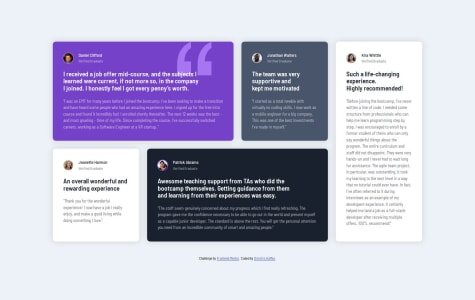
Testimonials grid section | grid-auto-flow: dense;
- HTML
- CSS
Is the use of the
qelement correct? Or is it more appropriate to useblockquote? I believe that the text inside the quotation marks is considered a short quotation that doesn't require paragraph breaks.Any advice is welcome!
- Submitted 11 months ago
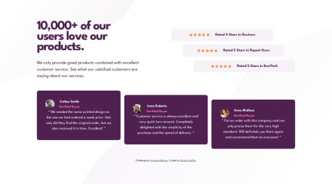
Social proof section | 3 Grids and some flexbox
- HTML
- CSS
I did not get the correct spacing as it is given in the design for the desktop version. When I try to emulate the cards width, the position of the title on the
background-imagebreaks and vice versa. I need some advice that has to do with the spacing between the elements.I understand the difference between margin and padding but I would like some general advice:
- How much padding is too much padding?
- How much grid gap is too much?
When the spacing between elements is big, how should I approach the layout design?
- Submitted 12 months ago
Four card feature section with grid-template-areas
- HTML
- CSS
In my solution the
border-top-coloron each of the four cards looks a bit curvier compared to the design files. Do I miss something here?Thank you!
- Submitted 12 months ago
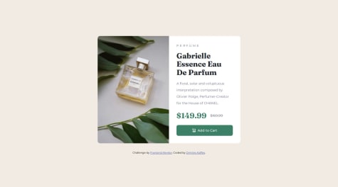
Product preview card | Responsive with Grid
#accessibility- HTML
- CSS
- Accessibility: Is the way I deal with the `` tag correct? I use it for the deleted price part:
$169.99 The old price of the perfume in strikethrough-
The CSS Reset (by Andy Bell) that I am using, removes only the
margin-block-endpart of the margins for elements like:body,h1,h2etc. This results in elements that keep their user agent stylesheet. For examplebodykeeps a small margin on three sides (top, right, left) of 8px. I had to repeatedly set themargin-bottomormargin-topusing some utility class. Is there a better way to deal with this issue? -
I had to set to the
element the `display:inline` in order for the `object-fit: cover;` on theelement to work. Is this approach correct?
Any help is valuable!
Latest comments
- @dkaffesPosted 18 days ago
Nice try @LucasLeitePereira!
I believe there is room for improvement in your solution:
- In general avoid using px for font-size: Why you shouldn't use pixels for font-size
- Your component is getting huge when the screen width is growing bigger (eg 900px) and before your 1024px break point. You should limit its width using
max-widthin rem. - Your paddings are big and there is lots of white space in your component.
The popup with the share content results in an up and down movement of the share icon. Consider reforming your HTML so that the share content is in the same container as the button wrapper:
- Your
.perfiland.shareshould both live inside a component-footer div. - Your
.sharediv should have as children the share button wrapper and the revealable content. - You could use absolute positioning on the revealable content. On mobile the position relative goes on the component-footer div, then in a media query for larger screens the position relative goes on share button wrapper.
Keep it up!
0 - @Muhammed-HamdanSubmitted 19 days agoWhat are you most proud of, and what would you do differently next time?
Used only flex box, can try recreating with grid
What challenges did you encounter, and how did you overcome them?- Child elements of flex box are not pinned to parent, used
overflow: hiddento solve it - Used negative margin to align cart icon with text in button
Please give suggestions to better organize the CSS and make it more readable
@dkaffesPosted 19 days agoFor the alignment of the cart icon with the text in button:
you can create two elements: an
<img>for the cart icon and a<span>for the text. If you enclose both elements in a<button>, then you can apply something like:display: flex; justify-content: center; align-items: center; gap: 0.5rem;on the
<button>. In this way, both the cart icon and the text are perfectly aligned and centered (vertically and horizontally).For the use of a different image for the desktop and mobile version:
you should better use the
<picture>element. You can further investigate the<picture>element on the MDN Docs0 - Child elements of flex box are not pinned to parent, used
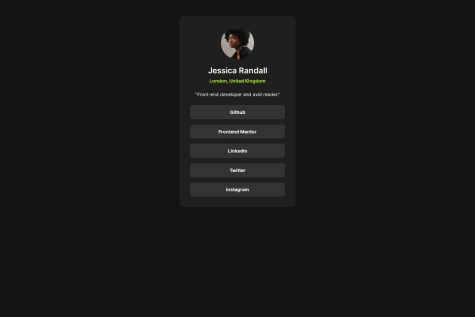
- @jeffgicharuSubmitted 12 months agoWhat are you most proud of, and what would you do differently next time?
I'm proud that I was able to structure my HTML well and use a media query in my CSS. Next time I would include more CSS in the media queries.
What challenges did you encounter, and how did you overcome them?I can't really say I encountered any challenges.
What specific areas of your project would you like help with?I would like some help with the media queries
@dkaffesPosted 12 months agoNice work @jeffgicharu!
I believe there is room for improvement in your code:
HTML
- You should use the semantic elements
<main>for the main content and<footer>for the attribution part inside your<body>. - You could give a more descriptive
altattribute for the image. - Giving an
h2to the title is correct, since the whole card is possibly part of a webpage with its ownh1title. However, there is no meaning in setting anh4for the "London, United Kingdom" text. This should be a<p>. - There is no point in using a
<div>inside the<a>tag. You could use a class inside the<a>element in order to style the anchor links. Furthemore,hrefattribute should be set with the appropriate link or left empty (href="").
CSS
- If you add a
footeryou need to includeflex-direction: column;to thebody. Along with somegapto make some space beetweenmainandfooter. In this way the vertical centering of the card will be achieved. - You do not have to set
height:100%to the.profile-card. The browser will decide the necessary height. However, we can set:min-height:100vhto make sure we have a minimum height. - Since you are using
display:flexfor the.personal-infoyou could usegapto create margin. - There is no need for a media query in this challenge, since there is no significant layout change. So, you could also add the
paddingdirectly in the body declaration so that the card does not touch the edges of small screens.
I hope this is helpful!
0 - You should use the semantic elements
- @dkaffesSubmitted about 1 year ago