

Design comparison

Solution retrospective
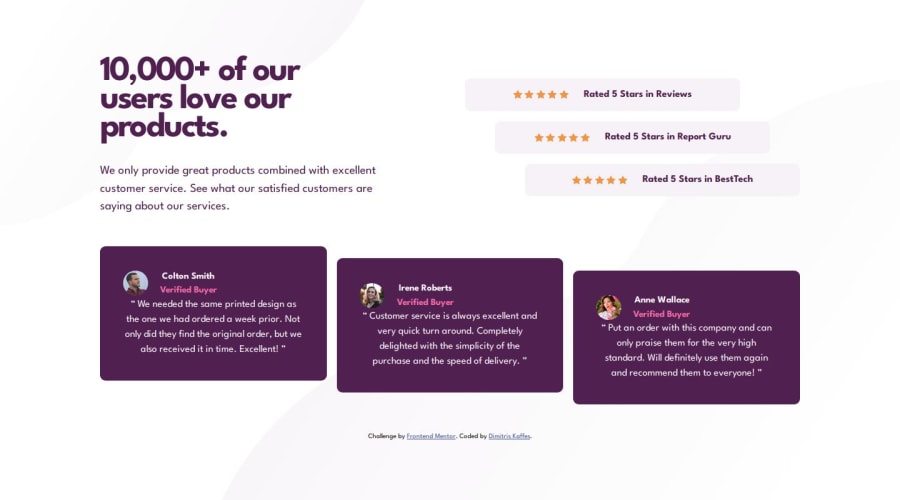
Even though I started working the CSS layout using Flexbox for the .ratings-container and the .cards-container, I quickly realized that this approach is not that simple and robust. So I changed course and used Grid instead.
Next time I need to think of the design more and try to choose right from the start the most appropriate tool.
What challenges did you encounter, and how did you overcome them?I had to do some research so as to produce the repeating icon-star.svg image. Reading through the related MDN documentation helped me overcome this challenge.
I did not get the correct spacing as it is given in the design for the desktop version. When I try to emulate the cards width, the position of the title on the background-image breaks and vice versa.
I need some advice that has to do with the spacing between the elements.
I understand the difference between margin and padding but I would like some general advice:
- How much padding is too much padding?
- How much grid gap is too much?
When the spacing between elements is big, how should I approach the layout design?
Community feedback
Please log in to post a comment
Log in with GitHubJoin our Discord community
Join thousands of Frontend Mentor community members taking the challenges, sharing resources, helping each other, and chatting about all things front-end!
Join our Discord