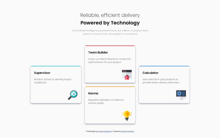
Design comparison
SolutionDesign
Solution retrospective
What are you most proud of, and what would you do differently next time?
I kept my code clean and managed to implement this more complex grid layout.
What challenges did you encounter, and how did you overcome them?I had to do some research in order to correctly use the grid-template-areas property for the grid, along with the grid-area property for the grid elements.
In my solution the border-top-color on each of the four cards looks a bit curvier compared to the design files.
Do I miss something here?
Thank you!
Community feedback
Please log in to post a comment
Log in with GitHubJoin our Discord community
Join thousands of Frontend Mentor community members taking the challenges, sharing resources, helping each other, and chatting about all things front-end!
Join our Discord
