

Design comparison

Solution retrospective
I tried to keep my code clean with a good HTML and CSS structure.
What challenges did you encounter, and how did you overcome them?I did not use Flexbox for the text box of the card (with its gap property) and I had to use utility classes in order to apply the margins needed. In this way, I managed to avoid repeating the same CSS declarations.
- Accessibility: Is the way I deal with the `` tag correct? I use it for the deleted price part:
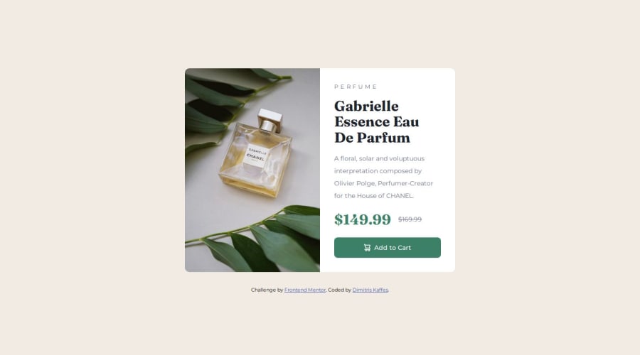
$169.99
The old price of the perfume in strikethrough
-
The CSS Reset (by Andy Bell) that I am using, removes only the
margin-block-endpart of the margins for elements like:body,h1,h2etc. This results in elements that keep their user agent stylesheet. For examplebodykeeps a small margin on three sides (top, right, left) of 8px. I had to repeatedly set themargin-bottomormargin-topusing some utility class. Is there a better way to deal with this issue? -
I had to set to the
element the `display:inline` in order for the `object-fit: cover;` on theelement to work. Is this approach correct?
Any help is valuable!

Join our Discord community
Join thousands of Frontend Mentor community members taking the challenges, sharing resources, helping each other, and chatting about all things front-end!
Join our Discord