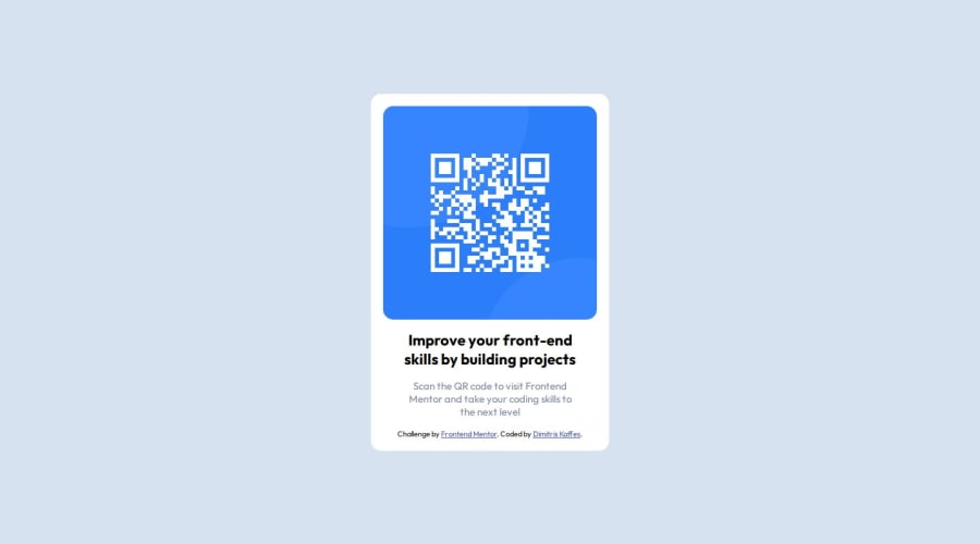
qr-code-component-main - Flexbox and Absolute Positioning
Design comparison
Solution retrospective
This is my first challenge submission.
I would appreciate some feedback for the following issues:
-
Is the use of semantic elements correct? Should i keep
footeroutside ofmain? -
I used
width: 25%for the.card-componentand gradually increased its value for smaller screens with media queries. Is the percentage value right? Is this overall approach correct?
Community feedback
- P@danielmrz-devPosted about 1 year ago
Hello @dkaffes!
Your solution looks excellent!
I have just one suggestion:
- Use
<main>to wrap the main content instead of<main>and<article>.
📌 The tag
<article>would make more sense if the card was part of a bigger website (in certainly would in real world), but here it is all we have on the screen.This tag change does not impact your project visually and makes your HTML code more semantic, improving SEO optimization as well as the accessibility of your project.
I hope it helps!
Other than that, great job!
Marked as helpful1 - Use
Please log in to post a comment
Log in with GitHubJoin our Discord community
Join thousands of Frontend Mentor community members taking the challenges, sharing resources, helping each other, and chatting about all things front-end!
Join our Discord
