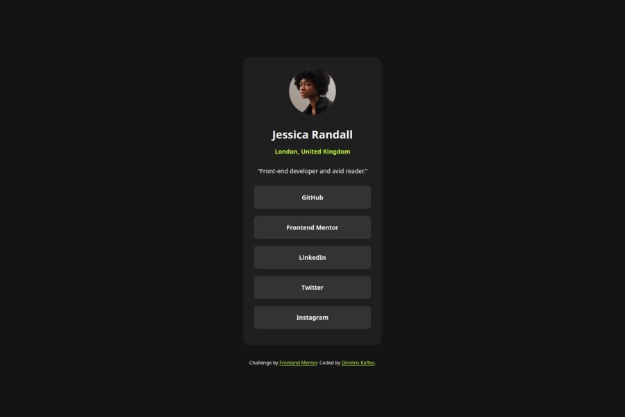
Design comparison
SolutionDesign
Solution retrospective
What are you most proud of, and what would you do differently next time?
I believe the styling of all the active states looks pretty neat! 🎉
What challenges did you encounter, and how did you overcome them?I had some minor issues styling the call to action button links and especially the active states but all the problems were solved.
For the :focus state an inset box-shadow trick was used to have a "non-moving" border.
Community feedback
Please log in to post a comment
Log in with GitHubJoin our Discord community
Join thousands of Frontend Mentor community members taking the challenges, sharing resources, helping each other, and chatting about all things front-end!
Join our Discord
