dimar hanung
@dimar-hanungAll comments
- @ClaudiuSonicaSubmitted almost 2 years ago@dimar-hanungPosted almost 2 years ago
Hello! 🖐️ Well done on completing the challenge
I have some interest and feedback with your code
That i like:
- I appreciate the similarity of your results with the design, a bit different in font color and shadow but still good
- html is pretty good, not too nested 👍
- Responsive until galaxy fold screen size 👌
- CSS Naming is also good, represent what is it for, like
<div class="details">for details section
My Feedback:
- I suggest you use html semantic convention, for example
<div class="container__ext">to<main class="container__ext">, it will make it clearer, and will improve seo if you want to submit your website to google, but you placeh1andpcorrectly 👌, i recomended this article: here - You can set font color #8BACD9 for class :
.text.second__p.third__p - Shadow is too bold, you can use this to make it more smooth
box-shadow: 0 25px 50px #00000018
anyways overall is good, nice solution, hope it's helpful 🙌
Marked as helpful0 - @Alihassan845Submitted almost 2 years ago@dimar-hanungPosted almost 2 years ago
Hello 👋, welcome to front-end mentor community, the way you submitted is not correct.
- you must deploy your result first into live, you can read here
- don't compress your result to zip
if you have problems, you can contact me via linkedin or other members of this community, we are welcome 🙌.
we are also studying here, so don't hesitate to ask, hope it's helpful 👌.
1 - @codermohit1265Submitted almost 2 years ago@dimar-hanungPosted almost 2 years ago
Hello! 🖐️ Well done on completing the challenge
I have some interest and feedback with your code
That i like:
- I appreciate the similarity of your results with the design, a bit different in scale and background but still good
- html is pretty good, not too nested 👍
My Feedback:
-
I suggest you use html semantic convention, for example
<div class="container">to<main class="container">, it will make it clearer, and will improve seo if you want to submit your website to google, i recomended this article: he -
I don't think css naming is right, because it still doesn't represent what it's for
i think this more suitable:
qr_code→containerimgqr→imgorimg-qrimage_content→contentordescription
-
it’s not too responsive on mobile, to fix it change style into this:
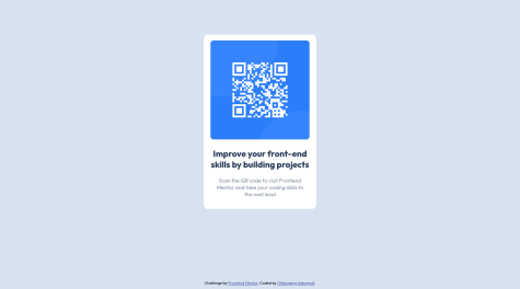
@import url('https://fonts.googleapis.com/css2?family=Outfit&display=swap'); @import url('https://fonts.googleapis.com/css2?family=Outfit:wght@300&display=swap'); *{ margin: 0; padding: 0; box-sizing: border-box; } body{ background-color: hsla(195, 43%, 91%, 0.72); font-family: 'Outfit', sans-serif; /* to make qr code card center */ min-height: 100vh; display: grid; place-items: center; } .qr_code { /* use padding in here instead in imgqr to make padding equal beteen image and content */ padding: 16px; /* height: 484px; */ /* set dynamic width */ width: 100%; /* add max width */ max-width: 335px; /* remove margin */ /* margin: 0 auto; */ background-color: white; /* use relative instead */ position: relative; /* top: 19%; */ /* left: 38%; */ border-radius: 12px; } .qr_code img { /* remove height */ /* height: 290px; */ /* use dynamic width */ width: 100%; border-radius: 8px; } /* you can remove this */ .imgqr { /* padding: 28px; */ /* remove margin */ /* margin-left: -12px; */ /* margin-top: -14px; */ } .image_content h1{ font-size: 22px; font-weight: bolder; /* change padding */ padding: 0 10px 10px 10px; /* remove this */ /* margin-top: -25px; */ text-align: center; } .image_content p{ font-size: 16px; text-align: center; color: hsl(210, 8%, 56%); } -
Maybe you can use tools like prettier to format your code to be more beautiful ( TIP: set prettier configuration to format on save, make it easier )
you can contact me in my linkedin or reply this if have question 👐.
anyways overall is good, nice solution, hope it's helpful 🙌
Marked as helpful0 - @engelbrechtzSubmitted almost 2 years ago@dimar-hanungPosted almost 2 years ago
Hi.. 👋, Congratulations on completing the challenge 🎉 .
I have some interest and feedback with your code
That i like:
- I appreciate the similarity of your results with the design, a bit different in position and scale but still good
- HTML is pretty good, not too nested and combination of semantic HTML👍
- Responsive until galaxy fold screen size (280 x 653)px 👌
- CSS Naming is also good, represent what is it for, like
<div class="price">for price section
My Feedback:
-
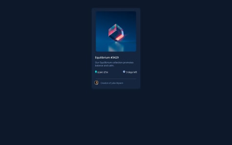
Javascript is not needed in this solution, you can use only css on view hover
-
1 - Remove
main.js -
2 - change and add this to
style.css.card_container .banner_image_container .hover_state { /* display: none; */ position: absolute; width: 250px; height: 250px; margin-left: 25px; margin-top: -16rem; border-radius: 10px; background-color: var(--cyan-color); /* set opacity to 0 instead display none */ opacity: 0; /* add transiton to make it more smooth */ transition: opacity 0.3s ease-in-out; } .card_container .banner_image_container .hover_state:hover { opacity: 0.3; cursor: pointer; }
-
-
Using grid you can make it center, change
bodyandcard-containerinstyle.cssto :body { background: var(--main-background); color: white; min-height: 100vh; display: grid; place-items: center; } /* card container */ .card_container { background: var(--card-dark-blue); width: 300px; height: 500px; border-radius: 10px; margin: auto; box-shadow: 0px 2px 10px 0px var(--card-dark-blue); /* remove margin */ /* margin-top: 50px; */ }
Overall, well done - your innovative approach using js is actually good! 👏, hope it's helpful 🙌
0 - @ClementBartholomeSubmitted almost 2 years ago@dimar-hanungPosted almost 2 years ago
Hi.. 👋, Congratulations on completing the challenge 🎉 .
I have some interest and feedback with your code
That i like:
- I appreciate the similarity of your results with the design, a bit different in width but still good
- html is pretty good, not too nested 👍
- SCSS Naming is also good, represent what is it for, like
<div class="prices">for prices section - SCSS folder well structured too, i like it, but my opinion you can build scss into assets to, example to
/assets/style.css
My Feedback:
- Maybe you can set
width:50%to > md screen in.left, to make sure width is still 50% in any browser, because sometime each browser have different characteristic - I suggest you use html semantic convention, for example
<div class="container">to<main class="container">, it will make it clearer, and will improve seo if you want to submit your website to google, i recomended this article: here - Maybe you can use tools like prettier to format your code to be more beautiful ( TIP: set prettier configuration to format on save, make it easier )
anyways overall is good, nice solution, hope it's helpful 🙌
Marked as helpful1 - @AbimimbomSubmitted almost 2 years ago@dimar-hanungPosted almost 2 years ago
Hello! 🖐️ Well done on completing the challenge – you did it! 🌟
I have some interest and feedback with your code
That i like:
- I appreciate the similarity of your results with the design, a bit different in scale but still good
- html is pretty good, not too nested with combination semantic HTML 👍
- CSS Naming is also good, represent what is it for, like
<div class="plan">for plan section
My Feedback:
-
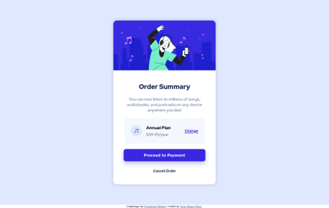
Is not too responsive on screen < 380px, to fix it you can add
flex-wrap: wrapin.plan -
you can seperate file by folder to be more structured, for example:
public/
├─ images/
│  ├─ pattern-background-desktop.svg // and etc
├─ styles/
│  ├─ main.css
├─ favicon.png
index.html
In summary, great work and an impressive solution - keep it up!, hope it's helpful 👍
1 - @rathmanjonathanSubmitted almost 2 years ago@dimar-hanungPosted almost 2 years ago
Hello 👋, Well done on completing the challenge! 🎉
I have some interest and feedback with your code
That i like:
- HTML is pretty good, not too nested 👍
- CSS Naming is also good, represent what is it for, like
<div class="container">for wrap another element / html tag - Responsive until galaxy fold screen size 👌
My Feedback and about your question:
-
I suggest you use html semantic convention, for example
<div class="container">to<main class="container">, it will make it clearer, and will improve seo if you want to submit your website to google, i recomended this article: here -
You’re forgot to push images maybe? or have problem to push the image to github? it causing image is not appear
-
You can make it center by adding
min-height:100vh, make body styles into thisbody { background-color: hsl(212, 45%, 89%); display: flex; justify-content: center; align-items: center; min-height: 100vh; } -
You can seperate file by folder to be more structured ( just developer preference, not a rule ), for example:
public/
├─ images/
│  ├─ qr-code-image.png
├─ styles/
│  ├─ main.css
├─ favicon.png
index.html
anyways overall is good, nice solution for first chellange, hope it useful 🙌
0 - @Sebascode20Submitted almost 2 years ago@dimar-hanungPosted almost 2 years ago
Hello 👋, Well done on completing the challenge! 🎉
I have some interest and feedback with your code
That i like:
- I appreciate the similarity of your results with the design, a bit different in position and font because footer, but still good 👐
- 📁 Folder is well structured, i like it
- html is pretty good, not too nested 👍
- CSS Naming is also good, represent what is it for, like
<div class="card">for card section - Responsive until galaxy fold screen size 👌
My Feedback:
-
You can make it center by adding
min-heightand remove setmargin:0to fixoverflow, make body styles into thisbody { font-size: 15px; font-family: "Outfit", sans-serif; background-color: hsl(212, 45%, 89%); display: flex; flex-direction: column; justify-content: center; align-items: center; margin: 0; min-height: 100vh; }
anyways overall is good, nice solution, hope it useful 🙌
Marked as helpful0 - @OlebxgengSubmitted almost 2 years ago@dimar-hanungPosted almost 2 years ago
Hello 👋, Great job on complete the challenge! 🎉
I have some interest and feedback with your code
That i like:
- I appreciate the similarity of your results with the design, a bit different in position and font because footer, but still good
- html is pretty good, not too nested with combination semantic html 👍
- CSS Naming is also good, represent what is it for, like
<div class="qr-code">for qr code section - Responsive until galaxy fold screen size 👌
My Feedback:
-
Maybe you can use tools like prettier to format your code to be more beautiful ( TIP: set prettier configuration to format on save, make it easier )
-
You can make it center using grid, make body styles into this
body { font-family: "Outfit", sans-serif; background-color: hsl(212, 45%, 89%); margin: auto auto; display: grid; place-items: center; min-height: 100vh; } -
you can seperate file by folder to be more structured ( just developer preference, not a rule), for example:
public/
├─ images/
│  ├─ qr-code-image.png
├─ styles/
│  ├─ main.css
├─ favicon.png
index.html
anyways overall is good, nice solution, hope it useful 🙌
0 - @AlanGLinaresSubmitted almost 2 years ago@dimar-hanungPosted almost 2 years ago
Hello 👋, Amazing job on conquering the challenge! 🌟
I have some interest and feedback with your code
That i like:
- I appreciate the similarity of your results with the design, a bit different in scale and font but not bad
- html is pretty good, not too nested with combination semantic html 👍, just little mistake you can remove useless white spaces between body and main
- Responsive until galaxy fold screen size 👌
My Feedback:
- Maybe you can use tools like prettier to format your code to be more beautiful ( TIP: set prettier configuration to format on save, make it easier )
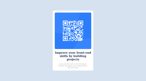
- You have import font, but not using it, you can add
font-family: "Vollkorn", serif;in body styles
anyways overall is good, nice solution, hope it useful 🙌
Marked as helpful0 - @krizzzzzzzzSubmitted almost 2 years ago@dimar-hanungPosted almost 2 years ago
Hello 👋, Well done on completing the challenge – you did it! 🌟
I have some interest and feedback with your code
That i like:
- I appreciate the similarity of your results with the design, a bit different in scale and color but still good
- html is pretty good, not too nested 👍
- CSS Naming is also good, represent what is it for, like
<div class="card">for card section
My Feedback:
- I suggest you use html semantic convention, for example add
<main class="container">, it will make it clearer, and will improve seo if you want to submit your website to google, i recomended this article: here - for card section i’m prefer to use class instead id, because card is component which may be used again and again.
- In galaxy fold (280px x 653px) is not to responsive, you can fix it by using dynamic width in image
- remove margin in
#cardadd padding 15px in#card - remove padding in
.image-qr-codeand addwidth: 100%;in.image-qr-code
- remove margin in
anyways overall is good, nice solution, hope it useful 🙌
Marked as helpful0 - @OmarElqady04Submitted almost 2 years ago@dimar-hanungPosted almost 2 years ago
Hello! 🖐️ Well done on completing the challenge 🎉
I have some interest and feedback with your code
That i like:
- I appreciate the similarity of your results with the design, a bit different in scale but still good
- html is pretty good, not too nested 👍
- Responsive until galaxy fold screen size 👌
- CSS Naming is also good, represent what is it for, like
<div class="card">for card section
My Feedback:
-
I suggest you use html semantic convention, for example
<div class="container">to<main class="container">, it will make it clearer, and will improve seo if you want to submit your website to google, i recomended this article: here -
you can seperate file by folder to be more structured, for example:
public/
├─ images/
│  ├─ qr-code-image.png
├─ styles/
│  ├─ main.css
├─ favicon.png
index.html
anyways overall is good, nice solution, hope it useful 🙌
0 - @samieyongSubmitted almost 2 years ago@dimar-hanungPosted almost 2 years ago
Hi.. 👋, Congratulations on completing the challenge 🎉 .
I have some interest and feedback with your code
That i like:
- I appreciate the similarity of your results with the design, a bit different because footer, but no problem
- html is pretty good, not too nested and combination with semantic html 👍
- Responsive until galaxy fold screen size 👌
My Feedback:
-
maybe you can use tools like prettier to format your code to be more beautiful ( TIP: set prettier configuration to format on save, make it easier )
-
you can seperate file by folder to be more structured ( but is just developer preference, not a rule ), for example:
public/
├─ images/
│  ├─ qr-code-image.png
├─ styles/
│  ├─ main.css
├─ favicon.png
index.html
anyways overall is good, nice solution, hope it useful 🙌
0 - @ZaiinabMSubmitted almost 2 years ago@dimar-hanungPosted almost 2 years ago
Hi.. 👋, Congratulations on completing the challenge 🎉 .
I have some interest and feedback with your code
That i like:
- I really appreciate the well-structured folder organization. 👌
- CSS Naming is also good, represent what is it for, like
<div class="plan">for plan section
My Feedback:
- I noticed that you're missing a closing
</div>tag for the div with the class "container". Please add the closing</div>tag right above the</body>tag to fix the issue. - I suggest you use html semantic convention, for example
<div class="container">to<main class="container">, it will make it clearer, and will improve seo if you want to submit your website to google, i recomended this article: here - maybe you can use tools like prettier to format your code to be more beautiful ( TIP: set prettier configuration to format on save, make it easier )
About your question:
-
To fix the background image issue, try using the
./path notation for the image URL in your CSS. This will look for the image in the current directory. Change yourbodybackground property to:body{ background: url(./images/pattern-background-mobile.svg), hsl(225, 100%, 94%); } -
you can use grid for simple centering div content ( Don't forget the issue earlier, put the closing tag above the closing body tag first )
.container{
 min-height: 100vh;
 display: grid;
 place-items: center;
}
anyways overall is good, nice solution, hope it useful 🙌
Marked as helpful0 - @felixicitySubmitted almost 2 years ago@dimar-hanungPosted almost 2 years ago
Hi.. 👋, Congrats completing this challenge 🎉 .
I have some interest and feedback with your code
That i like:
- I appreciate the similarity of your results with the design, a bit different in font scale and position, but still good
- HTML is pretty good, not too nested 👍
- Responsive until galaxy fold screen size 👌
- CSS Naming is also good, represent what is it for, very clear 👐
My Feedback:
-
I suggest you use html semantic convention, for example
<div class="container">to<main class="container">, it will make it clearer, and will improve seo if you want to submit your website to google, i recomended this article: here -
Maybe you can use tools like prettier to format your code to be more beautiful ( TIP: set prettier configuration to format on save, make it easier )
-
You can seperate file by folder to be more structured, for example:
public/ ├─ images/ │ ├─ qr-code-image.png ├─ styles/ │ ├─ main.css ├─ favicon.png index.html -
To make it center, you can add this is in body style
display: grid;
place-items: center;
and remove footer, or move footer to inside container
but overall is good, nice solution, hope useful 🙌
Marked as helpful0 - @zMitchCSubmitted almost 2 years ago@dimar-hanungPosted almost 2 years ago
Hi.. 👋, Congratulations on completing the challenge 🎉 .
I have some interest and feedback with your code
That i like:
- I appreciate the similarity of your results with the design, a bit different in scale but still good
- html is pretty good, not too nested 👍
- Responsive until galaxy fold screen size 👌
- CSS Naming is also good, represent what is it for, but in my opinion don't use abbreviations, because the important thing is easy to understand, instead
class="qrcode-ctnr"i’ts ok to beclass="qrcode-container", it looks a bit long, but the main thing is easy for others to understand
My Feedback:
- I suggest you use html semantic convention, add
<main class="container">, it will make it clearer, and will improve seo if you want to submit your website to google, i recomended this article: here - you can seperate file by folder to be more structured, for example:
public/
├─ images/
│  ├─ qr-code-image.png
├─ styles/
│  ├─ main.css
├─ favicon.png
index.html
About your question
-
You handle it well, like in here:
.qrcode-title, .qrcode-par{
    font-family: 'Outfit', 'sans-serif';
    text-align: center;
}
so it more less repetitive, nice 👍
-
The README.md was clear, just little mistake like whitespace in image too long and some typo like in section
Afer that, to get rounded corners I use border-radius: 10px., but I understand what you mean like progress, technology used, etc
and finally overall is good, nice solution, hope it useful 🙌
Marked as helpful1 - @MrKB03-creatorSubmitted almost 2 years ago@dimar-hanungPosted almost 2 years ago
Hi.. 👋, Congrats completing the challenge 🎉 .
I have some interest and feedback with your code
That i like:
- I appreciate the similarity of your results with the design, a bit different scale but still good 👐
- html is pretty good, not too nested and with combination semantic HTML👍
My Feedback:
- it’s good in normal laptop, but in 1920px it’s not center, because you set
max-width:1440px, remove max-width or addmargin: 0 auto(make it center harizontal) will fix it - You can seperate file by folder to be more structured, for example:
public/
├─ images/
│  ├─ qr-code-image.png
├─ styles/
│  ├─ main.css
├─ favicon.png
index.html
overall is good, nice solution, hope it useful 🙌
Marked as helpful0 - @shreya792Submitted almost 2 years ago@dimar-hanungPosted almost 2 years ago
Hi.. 👋, Congratulations on completing the challenge 🎉 .
I have some interest and feedback with your code
That i like:
- I appreciate the similarity of your results with the design, a bit different in font scale but still good
- html is pretty good, not too nested and with combination semantic HTML👍
- Responsive until galaxy fold screen size 👌
My Feedback:
- Maybe you can use tools like prettier to format your code to be more beautiful ( TIP: set prettier configuration to format on save, make it easier )
- Give html class naming is recomended, this can prevent style conflict in future, but in this case it is not necessary, so it's ok 🙌
- You can seperate file by folder to be more structured, for example:
public/
├─ images/
│  ├─ qr-code-image.png
├─ styles/
│  ├─ main.css
├─ favicon.png
index.html
overall is good, nice solution, hope it useful 🙌
0


