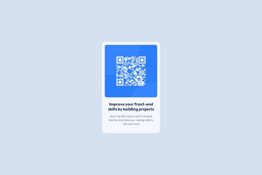
Design comparison
SolutionDesign
Community feedback
- @dimar-hanungPosted over 1 year ago
Hi.. 👋, Congrats completing the challenge 🎉 .
I have some interest and feedback with your code
That i like:
- I appreciate the similarity of your results with the design, a bit different scale but still good 👐
- html is pretty good, not too nested and with combination semantic HTML👍
My Feedback:
- it’s good in normal laptop, but in 1920px it’s not center, because you set
max-width:1440px, remove max-width or addmargin: 0 auto(make it center harizontal) will fix it - You can seperate file by folder to be more structured, for example:
public/
├─ images/
│  ├─ qr-code-image.png
├─ styles/
│  ├─ main.css
├─ favicon.png
index.html
overall is good, nice solution, hope it useful 🙌
Marked as helpful0@MrKB03-creatorPosted over 1 year agoHi.., Thank you so much for your help and feedback. It helped me to understand and organize my directory well and see the dimensions of the screens that I had not considered. Best regards @dimar-hanung
0
Please log in to post a comment
Log in with GitHubJoin our Discord community
Join thousands of Frontend Mentor community members taking the challenges, sharing resources, helping each other, and chatting about all things front-end!
Join our Discord
