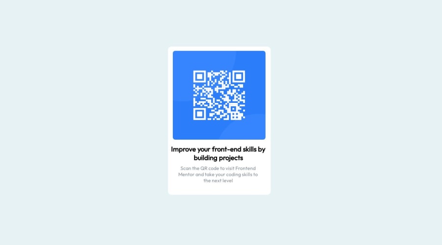
QR code component Fully responsive for phone as well as computer......
Design comparison
Solution retrospective
Thanks for feedback
Community feedback
- @ecemgoPosted almost 2 years ago
Some recommendations regarding your code that could be of interest to you.
If you want that this solution is responsive, I suggest some techniques without using media query for this solution. Also, I recommend avoiding repetition in your code and not using styles that don't work.
- If you want to make the card centered both horizontally and vertically, you'd better add flexbox and
min-height: 100vhto thebody - For the color of the screen, you can use the recommended color in the body
body { /* background-color: hsla(195, 43%, 91%, 0.72); */ background-color: hsl(212, 45%, 89%); display: flex; justify-content: center; align-items: center; min-height: 100vh; }- When you use flexbox in the
body, you don't need to useleft,topin the.qr_codeto center the card - If you use
max-width, the card will be responsive and you can reduce the width a bit
.qr_code { /* height: 484px; */ /* width: 335px; */ max-width: 300px; padding: 20px; background-color: white; /* position: absolute; */ /* top: 19%; */ /* left: 38%; */ border-radius: 12px; }- In addition to that above, in order to make the card responsive and the image positioned completely on the card, you'd better add
width: 100%to the img
.qr_code img { /* height: 290px; */ /* width: 302px; */ width: 100%; border-radius: 8px; }- You'd better add
marginto texts
.image_content h1{
    /* padding: 10px; */
    /* margin-top: -25px; */
    margin: 20px 0;
}
.image_content p{ margin-bottom: 20px; }- Finally, if you follow the steps above, the solution will be responsive
- You can remove media queries and these styles below to clean the code because you don't need to use them
/* .imgqr {
   padding: 28px;
   margin-left: -12px;
   margin-top: -14px;
} */

/* .image_content{
    margin-left: -8px;
} */
Hope I am helpful. :)
Marked as helpful0@codermohit1265Posted almost 2 years ago@ecemgo Thanks for your advices I'm working on my coding skills and started frontend mentor just few days before surely i will work on your advices .Thanks for your feedback edit- Can you tell me the place where i can learn css and JavaScript more deeply and improve my skills
0 - If you want to make the card centered both horizontally and vertically, you'd better add flexbox and
- @dimar-hanungPosted almost 2 years ago
Hello! 🖐️ Well done on completing the challenge
I have some interest and feedback with your code
That i like:
- I appreciate the similarity of your results with the design, a bit different in scale and background but still good
- html is pretty good, not too nested 👍
My Feedback:
-
I suggest you use html semantic convention, for example
<div class="container">to<main class="container">, it will make it clearer, and will improve seo if you want to submit your website to google, i recomended this article: he -
I don't think css naming is right, because it still doesn't represent what it's for
i think this more suitable:
qr_code→containerimgqr→imgorimg-qrimage_content→contentordescription
-
it’s not too responsive on mobile, to fix it change style into this:
@import url('https://fonts.googleapis.com/css2?family=Outfit&display=swap'); @import url('https://fonts.googleapis.com/css2?family=Outfit:wght@300&display=swap'); *{ margin: 0; padding: 0; box-sizing: border-box; } body{ background-color: hsla(195, 43%, 91%, 0.72); font-family: 'Outfit', sans-serif; /* to make qr code card center */ min-height: 100vh; display: grid; place-items: center; } .qr_code { /* use padding in here instead in imgqr to make padding equal beteen image and content */ padding: 16px; /* height: 484px; */ /* set dynamic width */ width: 100%; /* add max width */ max-width: 335px; /* remove margin */ /* margin: 0 auto; */ background-color: white; /* use relative instead */ position: relative; /* top: 19%; */ /* left: 38%; */ border-radius: 12px; } .qr_code img { /* remove height */ /* height: 290px; */ /* use dynamic width */ width: 100%; border-radius: 8px; } /* you can remove this */ .imgqr { /* padding: 28px; */ /* remove margin */ /* margin-left: -12px; */ /* margin-top: -14px; */ } .image_content h1{ font-size: 22px; font-weight: bolder; /* change padding */ padding: 0 10px 10px 10px; /* remove this */ /* margin-top: -25px; */ text-align: center; } .image_content p{ font-size: 16px; text-align: center; color: hsl(210, 8%, 56%); } -
Maybe you can use tools like prettier to format your code to be more beautiful ( TIP: set prettier configuration to format on save, make it easier )
you can contact me in my linkedin or reply this if have question 👐.
anyways overall is good, nice solution, hope it's helpful 🙌
Marked as helpful0@codermohit1265Posted almost 2 years ago@dimar-hanung Thanks for your advices I'm working on my coding skills and started frontend mentor just few days before surely i will work on your advices .Thanks for your feedback edit- Can you tell me the place where i can learn css and JavaScript more deeply and improve my skills
0
Please log in to post a comment
Log in with GitHubJoin our Discord community
Join thousands of Frontend Mentor community members taking the challenges, sharing resources, helping each other, and chatting about all things front-end!
Join our Discord
