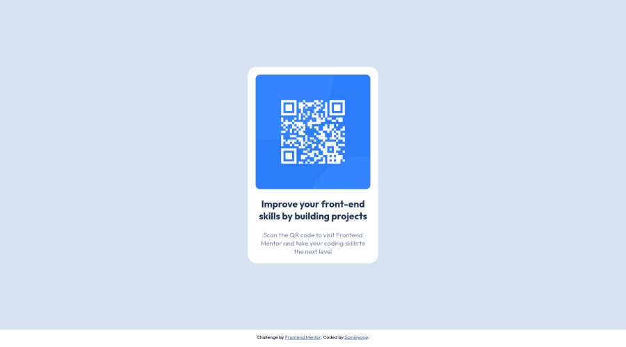
Design comparison
Solution retrospective
The project was a fairly easy one for me. I did it to get familiar with Frontend Mentor.
Community feedback
- @dimar-hanungPosted almost 2 years ago
Hi.. 👋, Congratulations on completing the challenge 🎉 .
I have some interest and feedback with your code
That i like:
- I appreciate the similarity of your results with the design, a bit different because footer, but no problem
- html is pretty good, not too nested and combination with semantic html 👍
- Responsive until galaxy fold screen size 👌
My Feedback:
-
maybe you can use tools like prettier to format your code to be more beautiful ( TIP: set prettier configuration to format on save, make it easier )
-
you can seperate file by folder to be more structured ( but is just developer preference, not a rule ), for example:
public/
├─ images/
│  ├─ qr-code-image.png
├─ styles/
│  ├─ main.css
├─ favicon.png
index.html
anyways overall is good, nice solution, hope it useful 🙌
0@samieyongPosted almost 2 years ago@dimar-hanung Thanks, I really appreciate your feedback. I will look into using prettier and also structuring my files better. 👍
0
Please log in to post a comment
Log in with GitHubJoin our Discord community
Join thousands of Frontend Mentor community members taking the challenges, sharing resources, helping each other, and chatting about all things front-end!
Join our Discord
