Not Found
Not Found
Not Found
Not Found
Not Found
Not Found
Not Found
Not Found
Not Found
Not Found
Not Found
Not Found
Not Found
Not Found
Not Found
Not Found
Not Found
Not Found
Not Found
Not Found

All comments

  • P
    Gilbert 290

    @juliengDev

    Submitted

    What are you most proud of, and what would you do differently next time?

    I am proud of several aspects of the project, particularly the implementation of TypeScript for enhanced type safety. This not only made the codebase more robust but also improved the overall developer experience with better autocompletion and error detection.

    Organizationally:

    •	I grouped DOM elements within an interface, which brought a structured approach to handling DOM manipulations.
    •	The code is segmented into smaller, more specific functions, emphasizing clarity and readability.
    •	By focusing on reusability, utility functions can be easily reused across different parts of the project, reducing redundancy and promoting efficient coding practices.
    •	The modular structure of the codebase ensures that future modifications are straightforward and less error-prone.
    

    Additionally, I implemented email field validation both at the HTML level and using a regex tailored to the expected data type. This dual-layered approach enhances the reliability of the form validation process, ensuring that incorrect email formats are caught early.

    What challenges did you encounter, and how did you overcome them?

    I have a strong recent experience with React and am accustomed to a declarative programming approach rather than an imperative one. The challenge here was to seriously reacquaint myself with vanilla JavaScript for this project, utilizing a functional programming paradigm.

    What specific areas of your project would you like help with?

    TypeScript Code Logic

    • I am interested in having a review of my TypeScript code to identify any areas where the logic can be improved.
    • I would appreciate suggestions on how to enhance the type safety and overall structure of the code.

    Code Organization and Structure

    Feedback on how the code is organized, particularly with respect to the separation of concerns and modularization, would be valuable.

    • Are there any best practices I can adopt to make the code more maintainable and scalable?

    Form Validation Approach

    • I implemented email validation both at the HTML level and using regex. I am open to constructive criticism on this approach and any recommendations for more effective methods or libraries.

    Performance Optimization

    • Any tips on optimizing the performance of my code, especially with respect to form handling and DOM manipulation, would be greatly appreciated.

    Usability and User Experience

    • Suggestions on how to improve the user experience, particularly in terms of providing clear and actionable feedback for form validation errors.
    P
    Moa Davou 310

    @moadavou

    Posted

    The solution looks great! I can't give any feedback since I'm not familiar with Typescript yet (writing this as a part of the Learning Paths)...

    0
  • leodev 250

    @hangtime319

    Submitted

    What are you most proud of, and what would you do differently next time?

    This project was very challenging, as I am a beginner in JS. I researched several solutions to implement in the project. In the next challenges where JS is used, I already have some ways to use.

    What challenges did you encounter, and how did you overcome them?

    I still haven't been able to find a solution on how to make the modal's polygon and I found it difficult to position it when it is activated.

    What specific areas of your project would you like help with?

    I would like help with creating the modal polygon and how to simplify JS further.

    P
    Moa Davou 310

    @moadavou

    Posted

    Great work on this project! Here are a few suggestions for improvements:

    • The share button is not fully functional on mobile. You can make the popup visible, but it's impossible to hide it again due to the share button being hidden.

    HTML

    • "Drawers" is not a sufficient alt text for the image. Try to describe it a bit more.

    • The share button must be inside a <button> element. This will make the JavaScript easier as well.

    • I don't understand why you have added a "Share-2" icon. This is not needed.

    CSS

    • The share button does not change color when it's clicked. Look at the design to see how it's supposed to look.

    • You have used rem units for the font, but why not the container and margin/padding. The text overflows the container when it's increased.

    • Use rem or em for the media queries.

    Marked as helpful

    0
  • Lena 230

    @lenanle333

    Submitted

    What are you most proud of, and what would you do differently next time?

    I'm proud of getting my website to look very close to the original design file

    What challenges did you encounter, and how did you overcome them?

    A small challenge I encountered was figuring out how I wanted to style the hero images in desktop view. I have a wider monitor so the page looked a little off when the page was in full screen. I decided to not be too nit picky with it and keep it as it is.

    What specific areas of your project would you like help with?

    Any feedback helps!

    P
    Moa Davou 310

    @moadavou

    Posted

    Great work on completing this challenge. Your project closely resembles the given design. I did however find some issues with your code.

    HTML

    • You have used ids instead of class names for your styling. This is generally bad practice since ids have a higher specificity than classes. Use classes instead.
    • You don't have to include "logo" in the alt text for the logo. It's also a good idea to wrap the logo in a link (<a>) and use an alt text that indicates where the link goes to. For example "Meet - Home".
    • "Built for modern use" is not an <h2>, it's an ribbon text. Make it an paragraf and set "Smarter meetings, all in one place" as <h2>

    CSS

    • The page is not responsive on smaller devices. Under 400px (give or take) all of the main content is off-center. Can you see if you can figure out a way to solve this?
    • Don't import your fonts in CSS, it's better to do it in HTML since it's better for performance.
    • Use a modern CSS reset. Yours is quite odd... Josh Comeau and Andy Bell have good ones.
    • Don't nest so much in your scss files. This causes high specificity and makes the code harder to work with.

    Marked as helpful

    1
  • @ErrorCode710

    Submitted

    What are you most proud of, and what would you do differently next time?

    Im very dissapointed on my project its like I almost forget the fundamentals this is my third project but I face lot of problem that even chatgpt cant comprehend my prompt

    What challenges did you encounter, and how did you overcome them?

    A lot you can see my code im just dirty positioning

    What specific areas of your project would you like help with?

    I want to know what is the fundamentals of css from the beginning. Please correct my project, It gives me dopamine to create more specially when im being corrected

    P
    Moa Davou 310

    @moadavou

    Posted

    Great work on completing this project! Here is some feedback, as per your request in the Discord group.

    • Make sure that you put h1-h6 in order. Right now you have put h3 before h6.
    1
  • P
    Moa Davou 310

    @moadavou

    Posted

    Great work on completing this project! Here is some feedback, as per your request in the Discord group.

    HTML

    • You have used the <picture> wrong. I can see that this is reoccurring in your projects. I recommend you to look up how to use it.
    • You need to add a <span> with the visually hidden class containing text indicating the old price. Otherwise, screen readers read the new and the old prices without any clarification as to what is what.

    CSS

    • Use em or rem in media queries. If you use px the breakpoint will not change with user settings regarding fonts.
    1
  • @ErrorCode710

    Submitted

    What are you most proud of, and what would you do differently next time?

    Ive create this faster than my previous projects

    What challenges did you encounter, and how did you overcome them?

    nothing for now

    What specific areas of your project would you like help with?

    If you have any suggestions on how I can improve this project, feel free to leave me a comment!

  • Earll 50

    @Earllgits23

    Submitted

    What are you most proud of, and what would you do differently next time?

    Judgment of using font-size, padding, and margin.

    What challenges did you encounter, and how did you overcome them?

    On how can i make the shadow-box moved when h2 is on active state.

    What specific areas of your project would you like help with?

    Need to learn more basic foundations

    P
    Moa Davou 310

    @moadavou

    Posted

    Great work on this challenge! Here are a few suggestions for improvement:

    • Use semantic HTML. Use <main> instead of <div> for the container and use <article> for the card.
    • If you have a <h2> on your page, you'll need a <h1> above it. If you don't want it showing, add a visually-hidden class.
    • Don't write your font-size in px. You want to use rem so that your site adapts to the user's settings.
    • To fix the active and hover effects you'll need to add:
    h2:hover, h2:focus {
    color: var(--yellow);
    }
    
    .container:hover, .container:focus {
    box-shadow: 20px 20px;
    }
    

    :hover is a pseudo-class that gets applied when the user hovers over the element. :focus is a pseudo-class that gets applied when the user focuses on the element, for example when the user navigates the site by using the keyboard.

    You have used the :active pseudo-class which represents an element (such as a button) that is being activated by the user.

    Marked as helpful

    3
  • P
    Moa Davou 310

    @moadavou

    Posted

    Great work on this challenge! Here are a few suggestions for improvement:

    • Use semantic HTML to put more meaning into your elements and make a more accessible website. Wrap all of the content inside a <main> and use <article> instead of <div> for the card.
    • Add an alt-text on the images to improve accessibility.
    • Don't use px for font-size. Use rem instead, since this unit scales with the user settings.

    Marked as helpful

    1
  • @iamporrrrrrrrr

    Submitted

    What are you most proud of, and what would you do differently next time?

    None

    What challenges did you encounter, and how did you overcome them?

    None

    What specific areas of your project would you like help with?

    None

    P
    Moa Davou 310

    @moadavou

    Posted

    Great work on this challenge! Here are a few suggestions for improvement:

    Make use of semantic HTML:

    • Wrap all of the content inside a <main>
    • Use <blockquote> for the quotes
    • Use <article> for the cards.
    0
  • ricky 140

    @thekid2005

    Submitted

    What are you most proud of, and what would you do differently next time?

    i make the mobile :)

    What challenges did you encounter, and how did you overcome them?

    doing the mobile

    What specific areas of your project would you like help with?

    if you have sugestions for the mobile and youd like to help me, dont esitate

    P
    Moa Davou 310

    @moadavou

    Posted

    Great work! Here are a few suggestions to improve your code:

    • <h1> has to come before <h2>. h1-h6 is used to create a table of contents (of sorts) for the page. It can be very confusing if they are not in order. You can wrap the first or second part of the title in a <span> to style it.
    • The cards are self-contained pieces of content. You should therefore use <article> instead of <div> to contain them.
    • You have a lot of repeated CSS for the cards. You can target multiple CSS classes at once, or take advantage of inheritance and put the styles on the .card class.
    • You are meant to use grid and not flexbox to position the cards.

    Marked as helpful

    2
  • P
    Moa Davou 310

    @moadavou

    Posted

    Great work on completing this project!

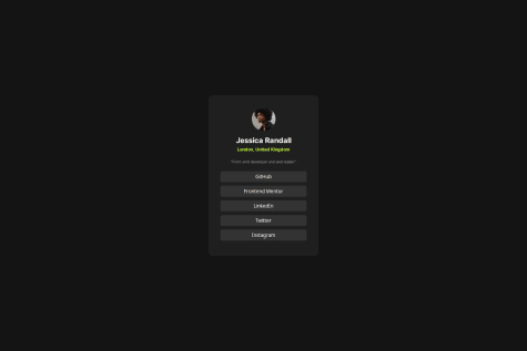
    • In your HTML you wrap the h1 and h2 tags in a div. This is unnecessary since you can just put the id on the h1 or h2 tag like this: <h2 id="location">London, United Kingdom</h2>
    • Class names have a higher specificity than id´s. I'm not an expert on this, but I believe that class names can be easier to use for that reason.
    • Don't use px for font-size. This unit is not responsive and won't change depending on the user's settings.
    • You can't set font-weight in pixels. Just use a number. For example: font-weight:700;
    0
  • Kerwin 80

    @KerwinAngeles

    Submitted

    What are you most proud of, and what would you do differently next time?

    I proud that I can finally undesrtand how custom properties work and why is soo important use when with start a project.

    What challenges did you encounter, and how did you overcome them?

    The challenges was that I did not know how to place the buttons one above the other. I overcome them putting the buttons inside a div and then using the display block with a width of 100% to occupy all the space available in the card-footer.

    What specific areas of your project would you like help with?

    All is clear for now.

    P
    Moa Davou 310

    @moadavou

    Posted

    Great work on this project!

    Here are a few suggestions for improvement:

    HTML

    • The article element should represent a self-contained piece of content that could be independently distributed or reused. However, in your case, it seems like you're using it more as a generic container (you have two instances of article). Consider using main instead for the article with the class name container-articles.
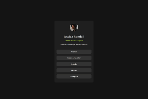
    • Alt text should provide a concise description of the image content. Consider describing the actual content or purpose of the image, like "Profile picture of Jessica Randall."
    • The button element is appropriate for interactive controls, for linking to websites, it's better to use a.

    CSS

    • Don't use px for font-size. This makes it so that the font won't change according to user settings.

    Edit: Quite a few mistakes were left in this response. I edited them out so that future readers don't get confused. Thank you @R3ygoski for taking notice!

    0