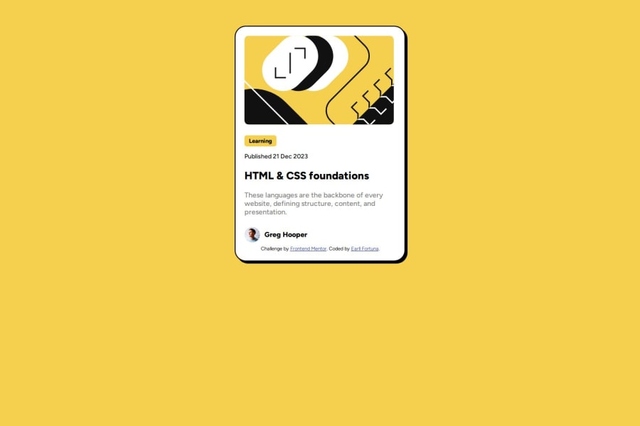
Design comparison
Solution retrospective
Judgment of using font-size, padding, and margin.
What challenges did you encounter, and how did you overcome them?On how can i make the shadow-box moved when h2 is on active state.
What specific areas of your project would you like help with?Need to learn more basic foundations
Community feedback
- @moadavouPosted 7 months ago
Great work on this challenge! Here are a few suggestions for improvement:
- Use semantic HTML. Use
<main>instead of<div> for the container and use<article>for the card.
- If you have a
<h2>on your page, you'll need a<h1>above it. If you don't want it showing, add a visually-hidden class.
- Don't write your font-size in px. You want to use rem so that your site adapts to the user's settings.
- To fix the active and hover effects you'll need to add:
h2:hover, h2:focus {
color: var(--yellow);
}
.container:hover, .container:focus { box-shadow: 20px 20px; }:hoveris a pseudo-class that gets applied when the user hovers over the element.:focusis a pseudo-class that gets applied when the user focuses on the element, for example when the user navigates the site by using the keyboard.You have used the
:activepseudo-class which represents an element (such as a button) that is being activated by the user.Marked as helpful3@Earllgits23Posted 7 months ago@moadavou thanks! Ill take a note on that. I used :active because i though "active-states" uses the :active pseudo-class 🤣
1 - Use semantic HTML. Use
Please log in to post a comment
Log in with GitHubJoin our Discord community
Join thousands of Frontend Mentor community members taking the challenges, sharing resources, helping each other, and chatting about all things front-end!
Join our Discord
