P
@marcello88cSubmitted about 1 month ago
🎓 Front-end specialist with expertise in TypeScript and React. 👨💻 As a freelancer, I'm seeking remote collaborations with people. My goal is to deliver high-quality solutions, contribute to dynamic teams, and continue learning. Let's connect and create amazing web experiences together!
I’m currently learning...Node.js - Next.js
I know that some effects are missing at the end of the game to bring out the winning combination, but I'll come back to this later. 99% of what was expected is there, and as usual I'm open to any suggestions for improvements. Thanks in advance.
All constructive criticism is welcome.
Every constructive comment on the approach used in the solution is welcome.
Feel free to give my any feedback :) much appreciate
constructive criticism is always welcome
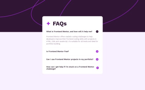
I would like help with effectively managing the positioning of a complex layout like the one I used in my project. Specifically, I struggled with aligning the FAQ section over the background image while keeping the overall layout responsive and balanced. I had to use a negative margin to achieve the desired effect, but I would appreciate guidance on whether this is the best approach or if there are more efficient ways to handle such positioning challenges without affecting the layout’s integrity.
I don't know why no matter how hard I try, I code slowly that almost spend a week to complete.
Am I too old to code? or any good practice or good book from UI masters or framework to construct a web UI.
I want to impove it, because my html and css look like 'Spaghetti code'.
First of all, congratulations on your solution! I won’t be able to go into too much detail because I’ve never used the Vue framework before, so I find it a bit difficult to navigate the project structure. If you’re looking for feedback, you might consider switching back to vanilla JavaScript so that others can better understand the code.
I don’t see any semantic tags in your code—everything is built using <div> elements. This is unfortunate as it doesn’t follow best practices in terms of HTML structure and accessibility. (You can replace this with more appropriate elements like <header>, <section>, <article>, etc., to improve readability and accessibility.)
I noticed some inconsistencies with the original design:
That’s what I was able to identify on my end—I hope this helps you spot the differences between the expected design/features and your project.
And don’t worry, you’re not too old or rusty! It’s not a race. Learning takes a lot of time for me as well, but as long as you’re making progress, that’s what matters most. Stay motivate and have fun, that's is all matter! 🚀
I hope this review will help you to improve your project and continue growing as a developer. Happy coding and keep up the great work!
I found a way to “import” breakpoints declared in SCSS into JavaScript in a way that makes maintainance easier, IMHO.
What challenges did you encounter, and how did you overcome them?In order to use the breakpoints I named in SCSS in JavaScript, I added custom properties targeting the breakpoints to the :root selector. First, I wanted to use getComputedStyle() to retrieve the custom properties, but Chrome does not include custom properties within the object returned by such a method (Chrome 131- at the time when I wrote these lines). Instead, I used document.styleSheets and nested for loops to get the custom properties.
Do not hesitate over giving feedback about how I implemented the way the menu appears on mobile view. I am wondering if there is a way to do that without JavaScript and in an accessible way.
Hello sir. I've analyzed your code with a focus on accessibility and semantic HTML. Here's a comprehensive review with suggestions for improvement.
Your navigation needs better semantic structure:
<nav id="menu" aria-label="Main navigation">
    <ul>
        <li><a href="/home">Home</a></li>
        <!-- other menu items -->
    </ul>
</nav>
Add descriptive ARIA labels to main content sections:
<main id="content" aria-label="Main content">
Link sections to their headings using aria-labelledby:
<section class="new-stories" aria-labelledby="new-stories-title">
    <h2 id="new-stories-title">New</h2>
</section>
Improve the header's semantic structure:
<header id="header" role="banner">
    <h1>
        <img src="./images/logo.svg" alt="" width="65" height="40">
        <span class="visually-hidden">News Homepage</span>
    </h1>
</header>
Restructure the articles hierarchy:
<ol class="top-stories" aria-label="Top Stories">
    <li>
        <article>
            <header>
                <h3><a href="/retro-pcs">Reviving Retro PCs</a></h3>
            </header>
            <figure>
                <img src="images/media/retro-pcs.webp"
                     alt="A retro PC surrounded by cassettes, a GameBoy console and a retro keyboard"
                     width="100" height="127">
            </figure>
            <p>What happens when old PCs are given modern upgrades?</p>
        </article>
    </li>
</ol>
Convert image containers from <p> to <figure>:
<figure>
    <picture>
        <source
            srcset="./images/media/web-3-desktop@4x.webp 4x"
            media="(min-width: 768px)">
        <img src="images/media/web-3-mobile.webp"
             alt="A set of wooden and coloured geometric forms">
    </picture>
</figure>
Replace generic "Read more" links with descriptive ones:
<a href="/web3-article" aria-label="Read more about The Bright Future of Web 3.0">
    Read more
</a>
Fix empty href attributes by adding proper destinations:
<!-- Instead of -->
<a href="">Home</a>

<!-- Use -->
<a href="/home">Home</a>
Je suis fr comme toi on peut se connecter sur linkedIn si tu veux. Bonne chance pour tes projets. Happy coding! 😊
No particular pride.
What challenges did you encounter, and how did you overcome them?No specific challenges.
What specific areas of your project would you like help with?Do not hesitate over giving feedback about accessibility if there are improvements in the way I implemented the validation errors and the toasted message.
Hello! I was happy to review your code and hope it can help you improve your coding skills. Keep up the great work, and continue striving for better accessibility in your projects!
Use of aria-label on <label> elements:
The aria-label attribute is not necessary on <label> elements in the form, as the <label> element already provides an accessible name for the associated form control when correctly linked via the for attribute.
Recommendation to Use autocomplete:
Consider adding the autocomplete attribute to your form fields to improve the user experience and accessibility. It helps with:
Missing aria-hidden on Error Messages:
It’s important to use aria-hidden="true" on error messages when they are hidden, to prevent screen readers from announcing unnecessary information. This ensures that only visible and relevant messages are announced to users.
Good Use of aria-live="assertive":
I noticed you used aria-live="assertive" for error messages. This is a great practice for ensuring that critical updates (such as form validation errors) are announced immediately by screen readers.
<fieldset> for Grouping:<fieldset> to group the radio buttons, which is a good accessibility practice. It helps users understand the relationship between options and provides context when read by screen readers.Hope it was helpfull see ya and happy coding 👾
I'm pleased that I was able to complete the challenge to the design specifications while only using HTML and CSS.
What challenges did you encounter, and how did you overcome them?I looked into animating the opening and closing of the `````` components, but was unable to achieve the results that I wanted.
What specific areas of your project would you like help with?I would appreciate any suggestions for animating the `````` components or any other tips/suggestions to improve the quality of my code.
Hi @nvalline, Hope you are doing fine
Im going to try to anwser to the animation question you have.
This how i approach the problem myself :
I used CSS transitions for smooth animations, particularly on the max-height property.
Instead of toggling a hidden attribute, I manipulated the max-height of the panel:
max-height: 0pxmax-height: panel.scrollHeight + "px"I added a CSS transition on the max-height property in our stylesheet:
.accordion-panel {
  transition: max-height 0.3s ease-out;
  overflow: hidden;
}
In the JavaScript, I updated the toggleAccordion method to set the appropriate max-height:
if (expand) {
  panel.style.maxHeight = panel.scrollHeight + "px";
} else {
  panel.style.maxHeight = "0px";
}
I also added a visible class to control opacity for a fade-in effect:
.accordion-panel {
  opacity: 0;
  transition: max-height 0.3s ease-out, opacity 0.3s ease-out;
}
.accordion-panel.visible {
  opacity: 1;
}
This solution provides a smooth animation when opening and closing accordion panels, addressing the challenge mentioned in the review. It combines CSS transitions with JavaScript manipulation of element properties to achieve the desired effect without relying on complex libraries or excessive code.
It might have another solution, but here is mine, hope it helps you to understand more the concept behind the effect.