News_Homepage_HTML_SCSS_GRID_TYPESCRIPT
Design comparison
Solution retrospective
Accessibility has been a priority throughout the site. Here are the key implementations:
- Semantic Elements: Proper use of HTML5 elements ensures logical content organization.
- ARIA Attributes:
aria-expandedandaria-hiddento indicate the state of the mobile navigation menu.aria-labelandaria-labelledbyfor descriptive labels on links, sections, and images.
- Screen Reader Support:
sr-onlyclass hides visual elements but keeps them accessible to screen readers.- Navigation links and buttons are descriptive and provide context for their actions.
- Keyboard Navigation: The site is fully navigable via keyboard, with logical focus order and interactive elements like buttons and links.
Handling Responsive Navigation with the Burger Menu
The responsive navigation is managed using a burger menu for mobile devices. Here’s how it works:
- Checkbox Input: A hidden
<input type="checkbox">element toggles the menu's visibility. - ARIA States:
aria-expandeddynamically updates to reflect whether the menu is open or closed.aria-controlslinks the toggle button to the corresponding navigation element for assistive technologies.
- CSS Styling:
- The sidebar (
<aside>) is styled to be off-screen by default and slides into view when the checkbox is checked. - Media queries ensure the desktop navigation (
<nav class="desktop-nav">) is displayed instead of the burger menu on larger screens.
- The sidebar (
- Progressive Enhancement: The approach ensures that the menu is usable even if JavaScript is disabled.
This implementation ensures that the navigation is both responsive and accessible across a variety of devices and user needs.
What challenges did you encounter, and how did you overcome them?This is the first time I build an Animated Hamburger Menu With Only CSS, hopefully I was able to follow some youtube tutorial to get some help. It was fun to do.
What specific areas of your project would you like help with?Feel free to give my any feedback :) much appreciate
Community feedback
- @khatri2002Posted 2 months ago
Hi! The developed solution looks good! Great work so far!
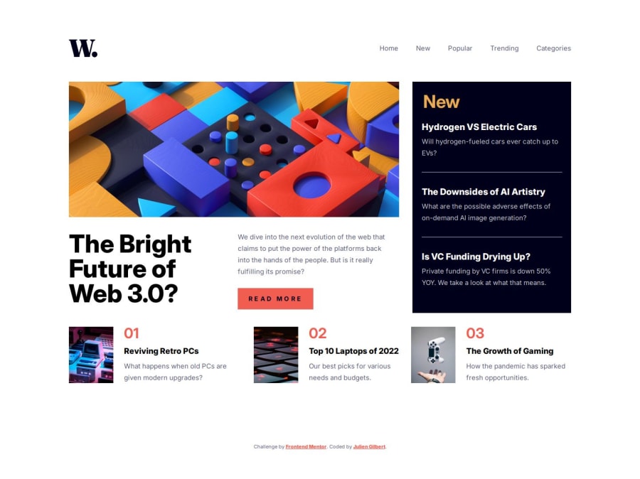
The primary focus of this challenge is achieving the perfect alignment of each news card, especially in desktop resolution. Let’s address the key alignment issues:
- The
Top 10 Laptops of 2022card should be aligned exactly below theRead Morebutton. - The
The Growth of Gamingcard should be aligned exactly below theNewcard.
Currently, both of these alignments are not maintained.
You’ve used a grid layout for the news section, which is a great choice! However, you’re managing the alignment by:
- Spanning columns for grid items.
- Using inner flex-boxes or grids for grid items.
While this approach can work, it introduces inconsistencies in gap management across grids and flex-boxes, which makes achieving perfect alignment tricky.
Simplified Approach:
- Minimize or avoid column spanning for grid items.
- Treat each card (or section of cards) as an individual grid item.
- By doing this, you can directly manage gaps between grid items without relying on inner flex-boxes or grids, reducing complexity.
This will allow you to maintain consistent gaps and achieve the perfect alignment effortlessly.
Improving Drawer UX for Mobile Resolution
On mobile resolution, when the menu icon is clicked:
- A drawer appears, and the menu icon changes to a close icon.
- The drawer also includes a separate close icon inside it.
- Due to the animation, both close icons are visible momentarily, which creates a confusing user experience.
By implementing these suggestions, you’ll achieve the required alignment for the news section. Great job so far! Keep it up! 🚀
0 - The
Please log in to post a comment
Log in with GitHubJoin our Discord community
Join thousands of Frontend Mentor community members taking the challenges, sharing resources, helping each other, and chatting about all things front-end!
Join our Discord
