Hi @larsenwald, 👋
Thanks for sharing your project! You've made a good start, but there are a few areas where improvements will help you build a more polished and semantically correct structure. Here's my feedback and suggestions, with practical explanations and code snippets to make things clearer:
1️⃣ Move CSS to an External File
Currently, your CSS code is inline in the HTML file. Instead, it’s best practice to use a dedicated style.css file.
Why?
Think of your CSS as the outfit for your HTML content. Just like you store clothes in a closet for better organization, separating CSS improves readability, maintainability, and scalability of your project. It also enables reusability across multiple pages if your project grows.
Refactored Code Example:
Move the CSS code from your HTML file and create a style.css file:
HTML File (index.html):
<head>
  <link rel="stylesheet" href="style.css" />
</head>
style.css:
/* Move all CSS rules here */
2️⃣ Use Semantic Tags for Accessibility
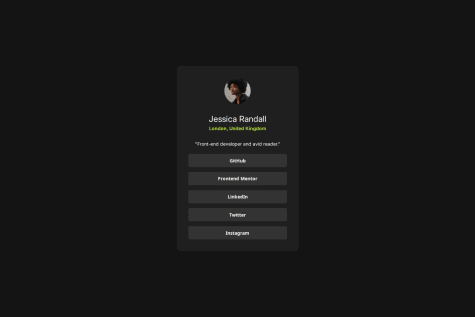
In your HTML, you’re using a <div> with buttons for your social media links. While this works visually, it’s not semantically correct. Use a <ul> and <li> to organize these links properly and wrap each link with an <a> tag.
Why?
Imagine a screen reader is like a human guide explaining a webpage to a visually impaired user. It relies on proper semantics to provide accurate information. By using <ul> for a list and <a> for links, you're telling the guide, “Hey, this is a list of links!” This makes navigation easier for users relying on assistive technologies.
Refactored Code Example:
<ul class="social-links">
  <li><a href="#">GitHub</a></li>
  <li><a href="#">Frontend Mentor</a></li>
  <li><a href="#">LinkedIn</a></li>
  <li><a href="#">Twitter</a></li>
  <li><a href="#">Instagram</a></li>
</ul>
CSS:
.social-links {
  list-style: none;
  padding: 0;
  display: flex;
  gap: 10px;
}

.social-links li a {
  display: inline-block;
  padding: 10px 15px;
  background: var(--grey-700);
  color: var(--white);
  text-decoration: none;
  border-radius: 5px;
  transition: background 0.3s;
}

.social-links li a:hover {
  background: var(--grey-500);
}
3️⃣ Avoid Setting Fixed Heights for Links
In your button styles, you’ve set a height: 40px. Instead, use padding to let the content dictate the height.
Why?
Think of a container holding water. If the container’s height is fixed, you risk overflow or unused space. By using padding, the container adjusts to the content, making it more flexible and easier to maintain.
Refactored Code Example:
.social-links li a {
  padding: 10px 20px; /* Adjust height using padding */
  border-radius: 5px;
  border: none;
  background: var(--grey-700);
  color: var(--white);
  font-weight: 600;
  font-size: 1.4rem;
  cursor: pointer;
  transition: background 0.1s, color 0.1s, transform 50ms;
}
4️⃣ Let Content Decide the Card Height
In your <main> styles, you’ve used a fixed height of 560px. Instead, let the content determine the height by using padding and flexible layout techniques.
Why?
A fixed height can lead to unnecessary blank space or cut-off content, especially if the text or layout changes. It’s like wearing a pair of shoes that don’t fit—uncomfortable and limiting!
Refactored Code Example:
main {
  background: var(--grey-800);
  display: flex;
  flex-direction: column;
  border-radius: 10px;
  padding: 35px; /* Adjust spacing */
  align-items: center;
}
Additional Tip: Use Prettier for Code Formatting
To improve readability and structure, use the Prettier extension for your code editor. It automatically formats your HTML, CSS, and JS, saving you time and effort. Think of it as a cleaning robot for your code—it keeps everything tidy without manual work.
Great job so far! With these changes, your project will be more semantic, maintainable, and accessible. Let me know if you have questions or need further assistance! 🚀
Best,
Aakash