@mkalkandevSubmitted about 2 months ago
What specific areas of your project would you like help with?
I couldn't make my project fully responsive, I need help on this issue. Apart from that, I am open to feedback on CSS Nesting and BEM methodology.

I couldn't make my project fully responsive, I need help on this issue. Apart from that, I am open to feedback on CSS Nesting and BEM methodology.
Hi @mkalkandev,
Here’s some feedback and suggestions for improving the project. I’ll also provide examples where needed to make it clearer:
Currently, you're using the <section> tag for individual cards in a grid layout. While <section> is great for grouping thematic content in a large layout, it's unnecessary here since the cards are part of a single grid structure. Instead, consider using <div> or <article> for each card.
Example: Imagine hosting a small dinner for six people. Would you assign a separate room for each person? Probably not—you’d group them all around the same dining table. Similarly, in this project, <section> over-complicates the structure.
Refactor:
<article class="container__card container__card-4">
  <div class="container__card-author">
    <div class="container__card-author-image">
      <img class="container__card-author-image-img" src="./images/image-patrick.jpg" alt="">
    </div>
    <div class="container__card-author-content">
      <p class="container__card-author-content-name">Patrick Abrams</p>
      <p class="container__card-author-content-job">Verified Graduate</p>
    </div>
  </div>
  <h1 class="container__card-heading">Awesome teaching support...</h1>
  <p class="container__card-description">“ The staff seem genuinely concerned...”</p>
</article>
Deeply nested CSS selectors make code harder to maintain. For instance, in your current structure, a small style update could require navigating through layers of selectors. Limit nesting to two levels for clarity and scalability.
Think of it like giving directions: "Take the first left, then the second right" is easier to follow than "Go left, pass the park, find the third right past the coffee shop."
Refactor:
.container__card {
  padding: 1.5rem;
  border-radius: 0.5rem;
  box-shadow: 0px 10px 10px rgba(0, 0, 0, 0.15);
}

.container__card-author {
  display: flex;
  gap: 1rem;
}

.container__card-author-image-img {
  border-radius: 50%;
  width: 2rem;
}

.container__card-author-content-name {
  font-weight: bold;
  font-size: 0.8rem;
}
Using ::before to add a background SVG can lead to unnecessary code complexity. Instead, directly use the SVG as a background image for the card. This approach reduces clutter and simplifies styling.
Example: Imagine pinning a note on a board. Instead of attaching strings and using extra pins, you could directly stick the note where you want it.
Refactor:
.container__card {
  background: url(../images/bg-pattern-quotation.svg) no-repeat;
  background-position: 85% 10%;
}
Designing for desktops first and then adapting to smaller screens can be cumbersome. Starting with mobile ensures the content flows naturally on smaller devices, where most users begin their experience.
Imagine designing a house starting with a single room and expanding outward. It's more manageable than starting with a mansion and then figuring out how to shrink it into a single room.
Refactor Example:
/* Base styles for mobile */
.container__card {
  width: 100%;
  padding: 1rem;
}

/* Adjust for larger screens */
@media (min-width: 768px) {
  .container__card {
    width: 45%;
  }
}

@media (min-width: 1024px) {
  .container__card {
    width: 30%;
  }
}
Using fixed widths restricts responsiveness. Instead, leverage grid properties to make the layout fluid. For instance, this style restricts adaptability:
.container__card-2 {
  width: 35ch;
}
Replace it with something like this:
.container {
  display: grid;
  grid-template-columns: repeat(auto-fit, minmax(300px, 1fr));
  gap: 2rem;
}
This way, the cards adapt naturally to different screen sizes, ensuring a seamless user experience.
Hope these suggestions are helpful! Let me know if you need further clarification or assistance 😊.
Best regards,
Aakash
I am most proud of figuring out how to connect Google Fonts and getting the margins and border-radius right despite being confused by Figma.
What challenges did you encounter, and how did you overcome them?I don't understand Figma well, and some of the values seem off. For example the border-radius for the card said 25%, but that was way too much and i landed on 2%.
What specific areas of your project would you like help with?I think I managed to get the font looking decent, but it doesn't feel perfect to me. I could use some guidance there.
Hi @tcmaraist, 👋
Great job on the project so far! Below are a few suggestions to enhance the semantics, responsiveness, and readability of your code. Let’s walk through them one by one with simple examples for clarity:
Currently, the card class is centered using margin-top, which doesn’t adapt well to different screen sizes. A better approach is to refactor the body CSS as follows:
.body {
    background-color: #d5e1ef;
    display: flex;
    flex-direction: column;
    justify-content: center;
    align-items: center;
    font-family: "Outfit", serif;
    min-height: 100vh; /* Ensures the content fills the entire screen height */
}

.card {
    height: auto; /* Let the content define the height */
    width: 100%; /* Make the card fluid */
    max-width: 320px; /* Maintain a maximum width for readability */
    border-radius: 2%;
    background-color: white;
    display: flex;
    flex-direction: column;
    align-items: center;
    text-align: center; /* Fixed typo: tex-align -> text-align */
}
This change ensures the card is vertically and horizontally centered, even on smaller screens. Imagine reading a business card: you want it perfectly centered for easy focus.
Setting a fixed height property limits flexibility. For instance, if you add more content or increase padding, the card might overflow. Instead, let the inner elements decide the height by using padding and margins.
.card {
    padding: 20px; /* Add padding to manage spacing */
    height: auto; /* Dynamic height adjustment */
    width: 100%;
    max-width: 320px; /* Ensures responsiveness */
    border-radius: 2%;
    background-color: white;
    display: flex;
    flex-direction: column;
    align-items: center;
    text-align: center;
}
Think of this like resizing a box based on what you’re putting inside it — the box adjusts dynamically, rather than spilling over or leaving empty space.
Using a fixed width (e.g., width: 320px) can break the layout on smaller or larger screens. Switching to max-width makes the card fluid and adaptive.
On mobile devices, the card will shrink proportionally instead of staying fixed at 320px.
.card {
    width: 100%; /* Fluid width */
    max-width: 320px; /* Restricts to a reasonable maximum */
}
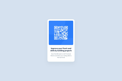
The p tag is currently being used for the card’s main heading. Since it conveys the primary purpose of the card, an h1, h2, or h3 tag would be more appropriate. Semantic tags improve accessibility for screen readers and provide better document structure.
<p class="card-title">
    Improve your front-end skills by building projects
</p>
<h2 class="card-title">
    Improve your front-end skills by building projects
</h2>
Imagine a search engine or screen reader trying to understand the card. Using an h2 signals, "This is important content!" — just like a bold heading in a newspaper article.
min-height: 100vh for the body and remove margin-top from the card.width with max-width.p tag with a heading tag (h2) for better accessibility and structure.Keep up the great work, and feel free to reach out if you have any questions! 🚀
I am proud of the following aspects of my project:
— Utilizing CSS variables for color management, ensuring consistency and scalability.
— Exclusively using REM units for responsive typography and layout.
— Effectively positioning elements to achieve a clean and organized structure. — Faithfully replicating the original design with close attention to detail.
— Using only class selectors in CSS, resulting in a clean, consistent, and maintainable codebase.
What challenges did you encounter, and how did you overcome them?I encountered a challenge with centering the box but resolved it by setting the height to 100vh.
Aside from that, all other elements were implemented smoothly.
What specific areas of your project would you like help with?I would appreciate feedback on the following areas of my project:
— Is my approach to centering elements using height: 100vh the most efficient, or are there better alternatives?
— Are there any improvements I could make to my use of CSS variables and class selectors to enhance maintainability or scalability?
— Does the code follow best practices for responsive design, especially with the exclusive use of REM units?
— Are there any areas where my positioning or layout could be optimized for better readability or accessibility?
Specific insights or suggestions on these aspects would be highly valuable.
Hi @ExtendoGH, 😊
I reviewed your project, and I must say you've done a commendable job! Here's a detailed breakdown of your code, along with some suggestions to improve it even further.
Your current approach to using margin-bottom repeatedly for spacing works but can become hard to maintain as the project scales. Instead, leveraging display: flex on the container with gap is a more scalable and efficient solution.
An Example:
Imagine you’re organizing books on a shelf. Instead of leaving varying gaps manually between each book, you could use dividers that maintain consistent spacing.
Refactor Suggestion:
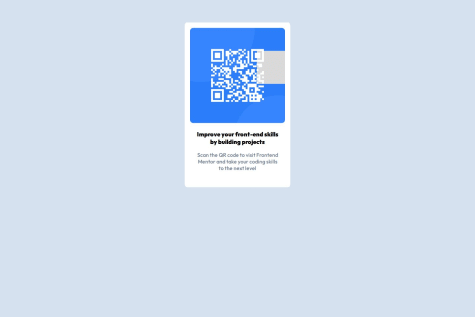
/* Current Code */
.qr-img {
    width: 100%;
    border-radius: 10px;
    margin-bottom: 2.4rem;
}

.qr-heading {
    color: var(--slate-900);
    font-size: 2.2rem;
    font-weight: bold;
    line-height: 120%;
    margin-bottom: 1.6rem;
}

/* Refactored Code */
.qr-container {
    display: flex;
    flex-direction: column;
    gap: 1.6rem; /* Controls spacing between child elements */
    background-color: var(--white);
    border-radius: 20px;
    max-width: 32rem;
    padding: 1.6rem;
    filter: drop-shadow(0px 25px 25px rgba(0, 0, 0, 0.0477));
}
Benefits:
While your current comments are organized, they could be more descriptive to help other developers understand the intent behind specific styles. Avoid shorthand like "OUTFIT BOLD: FZ: 22px" and opt for explanations.
Why this matters:
Think of a recipe. Instead of writing "use 1 tsp," specifying "use 1 tsp of salt to enhance flavor" makes it easier for someone following the instructions.
Refactor Suggestion:
/* Current Comment */
--02--TYPOGRAPHY
- OUTFIT BOLD: FZ: 22px, LH: 120%, LS: 0px

/* Refactored Comment */
-- Typography
- Use Outfit Bold font for headings, ensuring readability with a font size of 22px, line height of 120%, and letter spacing of 0px.
Your solution to center cards with height: 100vh is excellent! While position-based centering (position: absolute; transform) works too, your method is simpler and easier to maintain. Great job! 👏
Example of Position-Based Centering (not necessary here):
.qr-container {
    position: absolute;
    top: 50%;
    left: 50%;
    transform: translate(-50%, -50%);
}
But your approach is better for this use case—cleaner and beginner-friendly.
You're off to a great start! Keep experimenting with semantic HTML, flexible layouts, and concise commenting to make your code even more robust and future-proof. 🚀
Feel free to reach out for further discussions or feedback. Happy coding! 😊
Not really proud of anything. I didn't leverage layout tools like flexbox or grid as much as I would've liked. Everything was laid out using paddings and margins.
What challenges did you encounter, and how did you overcome them?I didn't come across a challenge.
What specific areas of your project would you like help with?Writing CSS with responsiveness best practice. I want to be so good at naturally making my layouts responsive with the built-in tools CSS offers without deferring to media queries, and only using media queries when absolutely necessary.
Hi @larsenwald, 👋
Thanks for sharing your project! You've made a good start, but there are a few areas where improvements will help you build a more polished and semantically correct structure. Here's my feedback and suggestions, with practical explanations and code snippets to make things clearer:
Currently, your CSS code is inline in the HTML file. Instead, it’s best practice to use a dedicated style.css file.
Why?
Think of your CSS as the outfit for your HTML content. Just like you store clothes in a closet for better organization, separating CSS improves readability, maintainability, and scalability of your project. It also enables reusability across multiple pages if your project grows.
Refactored Code Example:
Move the CSS code from your HTML file and create a style.css file:
HTML File (index.html):
<head>
  <link rel="stylesheet" href="style.css" />
</head>
style.css:
/* Move all CSS rules here */
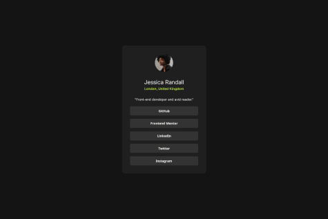
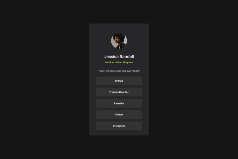
In your HTML, you’re using a <div> with buttons for your social media links. While this works visually, it’s not semantically correct. Use a <ul> and <li> to organize these links properly and wrap each link with an <a> tag.
Why?
Imagine a screen reader is like a human guide explaining a webpage to a visually impaired user. It relies on proper semantics to provide accurate information. By using <ul> for a list and <a> for links, you're telling the guide, “Hey, this is a list of links!” This makes navigation easier for users relying on assistive technologies.
Refactored Code Example:
<ul class="social-links">
  <li><a href="#">GitHub</a></li>
  <li><a href="#">Frontend Mentor</a></li>
  <li><a href="#">LinkedIn</a></li>
  <li><a href="#">Twitter</a></li>
  <li><a href="#">Instagram</a></li>
</ul>
CSS:
.social-links {
  list-style: none;
  padding: 0;
  display: flex;
  gap: 10px;
}

.social-links li a {
  display: inline-block;
  padding: 10px 15px;
  background: var(--grey-700);
  color: var(--white);
  text-decoration: none;
  border-radius: 5px;
  transition: background 0.3s;
}

.social-links li a:hover {
  background: var(--grey-500);
}
In your button styles, you’ve set a height: 40px. Instead, use padding to let the content dictate the height.
Why?
Think of a container holding water. If the container’s height is fixed, you risk overflow or unused space. By using padding, the container adjusts to the content, making it more flexible and easier to maintain.
Refactored Code Example:
.social-links li a {
  padding: 10px 20px; /* Adjust height using padding */
  border-radius: 5px;
  border: none;
  background: var(--grey-700);
  color: var(--white);
  font-weight: 600;
  font-size: 1.4rem;
  cursor: pointer;
  transition: background 0.1s, color 0.1s, transform 50ms;
}
In your <main> styles, you’ve used a fixed height of 560px. Instead, let the content determine the height by using padding and flexible layout techniques.
Why?
A fixed height can lead to unnecessary blank space or cut-off content, especially if the text or layout changes. It’s like wearing a pair of shoes that don’t fit—uncomfortable and limiting!
Refactored Code Example:
main {
  background: var(--grey-800);
  display: flex;
  flex-direction: column;
  border-radius: 10px;
  padding: 35px; /* Adjust spacing */
  align-items: center;
}
To improve readability and structure, use the Prettier extension for your code editor. It automatically formats your HTML, CSS, and JS, saving you time and effort. Think of it as a cleaning robot for your code—it keeps everything tidy without manual work.
Great job so far! With these changes, your project will be more semantic, maintainable, and accessible. Let me know if you have questions or need further assistance! 🚀
Best,
Aakash
I am proud of the way the project turned out, I would do the structuring of containers properly next time.
What challenges did you encounter, and how did you overcome them?I didn't know how to self host fonts, I googled and learned how to do that.
What specific areas of your project would you like help with?I would like to get comments on all aspects of the project since I am a beginner.
Hi @Nebil-Abdulfetah, 👋
Your implementation looks solid overall, but there are some key areas where you could improve accessibility, semantics, and maintainability. Let’s dive into each point with detailed explanations and examples. 😊
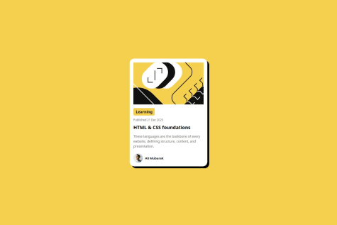
<img> Tag for Content ImagesIn the code, important content-related images (e.g., profile image and card image) are added as background images using CSS.
Using semantic HTML is like giving clear directions to someone unfamiliar with a place. For instance, imagine handing someone a well-labeled map versus a scribbled napkin drawing. Screen readers, search engines, and other assistive tools rely on proper semantic tags to understand the content's intent. By placing content images inside <img> tags:
Profile Section:
<div class="profile">
  <img
    src="../assets/images/image-avatar.webp"
    alt="Profile picture of Greg Hooper"
    class="profile-img"
  />
  <div class="profile-name">Greg Hooper</div>
</div>
CSS:
.profile-img {
  width: 32px;
  height: 32px;
  border-radius: 50%;
}
Card Section:
<div class="card">
  <img
    src="../assets/images/illustration-article.svg"
    alt="Illustration for the article"
    class="card-img"
  />
</div>
CSS:
.card-img {
  height: 200px;
  width: 100%;
  border-radius: 10px;
  object-fit: cover;
}
Images that convey meaning should always be inside <img> tags with proper alt attributes. Background images should be reserved for decorative elements that do not add value to the content itself.
While content-related images are placed as backgrounds, it’s good practice to limit this approach to purely decorative images (e.g., subtle patterns or visual enhancements).
Think of this as placing a motivational poster in a meeting room. It's there to add ambiance but doesn't affect the meeting's purpose or decision-making.
For purely decorative images, continue using CSS background properties but ensure:
Keep up the great work! 🚀 Let me know if you have any questions or need further clarification. 😊
I am proud that I finished another challenge.
What challenges did you encounter, and how did you overcome them?I started writing HTML using the ul, ol and table elements. During the styling process I found it easier to replace them with regular elements and use css grid to achieve an accurate design of the figma file.
What specific areas of your project would you like help with?You are welcome to leave any feedback.
Rather than changing your whole approach, add more generic tags and more and more styles you should use the previous approach of ul,ol and table.
I am proud that I finished another challenge.
What challenges did you encounter, and how did you overcome them?I started writing HTML using the ul, ol and table elements. During the styling process I found it easier to replace them with regular elements and use css grid to achieve an accurate design of the figma file.
What specific areas of your project would you like help with?You are welcome to leave any feedback.
Hi @VirginiaPat, 👋
Your layout is visually appealing and responsive across screen sizes—great work! 😊 I have a few suggestions to improve the semantic structure of your code, making it more maintainable and accessible. Let's dive in! 🛠️
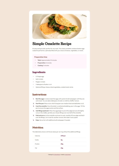
<ul> and <li>In your current implementation, you're using custom grid styles and icons for bullet points. While this works visually, it's unnecessarily complex. Using <ul> and <li> would achieve the same result with less code and better semantics.
Example (Before):
<div class="grid-4cols grid-5rows">
  <div class="dot-style col2-row1">
    <ion-icon name="ellipse"></ion-icon>
  </div>
  <p class="text16px-Stone600 col4-row1">
    <span>Total:</span> Approximately 10 minutes
  </p>
</div>
Refactor (After):
<ul>
  <li><span>Total:</span> Approximately 10 minutes</li>
  <li><span>Preparation:</span> 5 minutes</li>
  <li><span>Cooking:</span> 5 minutes</li>
</ul>
💡 Why? Imagine explaining to a friend: instead of manually drawing bullet points, you use a pre-made list notebook. It’s quicker and less prone to mistakes!
Similarly, your ingredients list can be simplified with a <ul> tag. It’s perfect for unordered lists like this.
Example (Before):
<div class="flex-container">
  <h2 class="ingredients-title">Ingredients</h2>
  <div class="grid-4cols grid-9rows">
    <div class="dot-style col2-row1">
      <ion-icon name="ellipse"></ion-icon>
    </div>
    <p class="text16px-Stone600 col4-row1">2-3 large eggs</p>
  </div>
</div>
Refactor (After):
<h2>Ingredients</h2>
<ul>
  <li>2-3 large eggs</li>
  <li>Salt, to taste</li>
  <li>Pepper, to taste</li>
  <li>1 tablespoon of butter or oil</li>
  <li>Optional fillings: cheese, diced vegetables, cooked meats, herbs</li>
</ul>
For sequential steps, an <ol> tag is ideal as it provides built-in numbering.
Example (Before):
<div class="grid-4cols grid-11rows">
  <p class="instrct-number col2-row1">1.</p>
  <p class="text16px-Stone600 col4-row1">
    <span>Beat the eggs:</span> In a bowl, beat the eggs...
  </p>
</div>
Refactor (After):
<ol>
  <li><strong>Beat the eggs:</strong> In a bowl, beat the eggs...</li>
  <li><strong>Heat the pan:</strong> Place a non-stick frying pan over medium heat...</li>
  <li><strong>Cook the omelette:</strong> Once the butter is melted...</li>
  <li><strong>Add fillings (optional):</strong> When the eggs begin to set...</li>
  <li><strong>Fold and serve:</strong> As the omelette continues to cook...</li>
  <li><strong>Enjoy:</strong> Serve hot...</li>
</ol>
💡 Why? Think of reading instructions in a recipe book—it’s easier to follow when steps are clearly numbered.
<table> for tabular dataFor the nutrition table, <table> tags make your data more semantic and easier for screen readers to interpret.
Example (Before):
<div class="nutrition-table">
  <p class="text16px-Stone600 col2-row1">Calories</p>
  <p class="nutri-col2 col4-row1">277kcal</p>
</div>
Refactor (After):
<table>
  <tr>
    <th>Nutrient</th>
    <th>Amount</th>
  </tr>
  <tr>
    <td>Calories</td>
    <td>277kcal</td>
  </tr>
  <tr>
    <td>Carbs</td>
    <td>0g</td>
  </tr>
  <tr>
    <td>Protein</td>
    <td>20g</td>
  </tr>
  <tr>
    <td>Fat</td>
    <td>22g</td>
  </tr>
</table>
By adopting semantic HTML, you’ll:
Keep up the great work, and feel free to reach out if you have any questions! 🚀
Best regards,
Aakash
Hi @omarrrefaatt1, 👋
Your project has some great foundational work! However, I noticed a few areas where you can improve, and I'd love to share some suggestions to help you polish your code further. 🚀 Let's dive in:
Refactored Example: HTML:
<link rel="stylesheet" href="styles.css">
CSS (in styles.css):
.card {
  max-width: 350px;
  padding: 20px;
  border-radius: 15px;
  background-color: white;
  display: grid;
  grid-template-rows: auto;
  gap: 10px;
  border: solid black 2px;
  box-shadow: 10px 10px 10px rgb(0, 0, 0);
}
margin and height in .card are not essential. Similarly, other properties in .cardimg, .cardtitle, .date, etc., can be removed without altering the design.Refactored Example:
.card {
  max-width: 350px;
  padding: 20px;
  border-radius: 15px;
  background-color: white;
  display: grid;
  grid-template-rows: auto;
  gap: 10px;
  border: solid black 2px;
  box-shadow: 10px 10px 10px rgb(0, 0, 0);
}
.cardimg {
  border-radius: 15px;
  width: 100%;
  object-fit: cover;
}
<button> is for actions like submitting a form.<a> is for navigation to another page or section.<a> for linking to another page and <button> for triggering JavaScript actions like toggling content.Refactored Example:
<!-- Use <a> for navigation -->
<a href="/more-info" class="card-button">Read More</a>

<!-- Use <button> for actions -->
<button onclick="toggleContent()">Show Details</button>
grid-row and grid-column properties in several classes like .cardimg, .cardtitle, etc.Refactored Example:
.cardtitle {
  width: max-content;
  padding: 5px 20px;
  border-radius: 5px;
  font-size: 16px;
  background-color: hsl(47, 88%, 63%);
  font-weight: 800;
}
Simplifying and cleaning up your code not only enhances readability but also saves development time in the long run. As you build more projects, keeping these best practices in mind will ensure you're writing efficient and maintainable code.
Let me know if you need further clarification or assistance! 😊
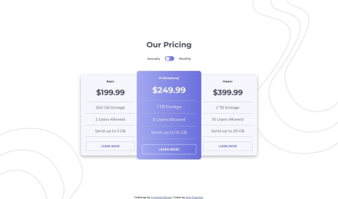
Any help with using plain CSS to style the middle column's height to extend beyond that of both columns beside it will be much appreciated.
Hi @romrauq,
Great work so far! Your project looks promising, but I’d love to share a few suggestions that can help refine and enhance it further. 😊
transform: scale(1.1) property can make it pop even more by subtly emphasizing it. 🌟Why? Think of it as someone walking into a room and standing a bit closer than others—it naturally draws your attention without overwhelming the entire room!
Here’s the updated CSS snippet:
.pricing-column-middle {
    color: var(--Very-Light-Grayish-Blue);
    background: var(--Linear-Gradient);
    border-radius: 0;
    transform: scale(1.1);
}

@media (max-width: 768px) {
    .pricing-column-middle {
        transform: scale(1);
    }
}
Why? Imagine you're organizing two groups of items in a room (monthly and yearly prices). Instead of going through each group separately, you can organize both at the same time. This saves time and effort!
Here’s the improved version:
let toggleButton = document.getElementById("toggle-button");
let isAnnually = false;
let prices = document.querySelectorAll(".pricing-monthly, .pricing-yearly");

toggleButton.addEventListener("click", () => {
    prices.forEach(price => {
        if (price.classList.contains("pricing-monthly")) {
            price.style.display = isAnnually ? "block" : "none";
        } else {
            price.style.display = isAnnually ? "none" : "block";
        }
    });
    toggleButton.style.justifyContent = isAnnually ? "flex-end" : "flex-start";
    isAnnually = !isAnnually;
});
Benefits:
<button> for actions or <a> for navigation. If the buttons or links in your project don’t use these appropriately, accessibility and SEO may suffer.<button> for actions like toggling plans.<a href="#"> for links that navigate to other parts of the page.Why? Imagine a visually impaired user relying on a screen reader. A semantic <button> tells them, “This is a button; you can click it,” while an <a> suggests, “This is a link to another destination.” This clear distinction improves their experience.
Let me know if you need further clarification or help implementing these suggestions! 🚀 Keep up the great work!
Any suggestions are welcome...
Hi @erntTt94, 👋
Here’s my feedback and suggestions for your project. Each point aims to improve the code’s semantic accuracy, usability, and maintainability while also being mindful of real-world use cases. 🚀
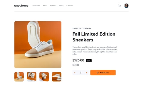
I noticed commented-out code in the following line:
index.html#L103-L106
Instead of:
<div class="product-images">
  <img src="images/image-product-1-thumbnail.jpg" alt="sneakers review small image">
  <!-- Other images -->
</div>
Use:
<ul class="product-images">
  <li><img src="images/image-product-1-thumbnail.jpg" alt="sneakers review small image"></li>
  <!-- Other images in <li> -->
</ul>
Semantic tags like <ul> and <li> communicate the structure of your content better to browsers, screen readers, and search engines. Think of it like organizing items in a menu—using a proper list helps everyone, including users with accessibility needs, understand what’s grouped together. 🤝
Similarly, refactor:
<div class="lightbox-content">
  <img src="images/icon-previous.svg" alt="previous icon" class="prev-image">
  <!-- Other images -->
</div>
To:
<ul class="lightbox-content">
  <li><img src="images/icon-previous.svg" alt="previous icon" class="prev-image"></li>
  <!-- Other images in <li> -->
</ul>
This ensures consistent and meaningful grouping of elements. 🎨
Currently, users can’t navigate back and forth using the arrows. This breaks the functionality and can frustrate users, much like trying to turn a page in a book and finding it glued shut! 📖🚫
prev-image and next-image elements have proper event listeners to update the displayed image.addProduct.addEventListener('click', function () {
counter++;
document.querySelector('.buy-product span').textContent = counter;
});
deleteProduct.addEventListener('click', function () {
if (counter > 0) counter--;
document.querySelector('.buy-product span').textContent = counter;
});
Attach a single click event listener to the parent element:
const buyProduct = document.querySelector('.buy-product');

buyProduct.addEventListener('click', function (event) {
  if (event.target.classList.contains('add')) {
    counter++;
  } else if (event.target.classList.contains('delete') && counter > 0) {
    counter--;
  }
  buyProduct.querySelector('span').textContent = counter;
});
Your project has a solid foundation, and with a few semantic adjustments and JavaScript refinements, it will shine even brighter. ✨ Keep up the great work, and don’t hesitate to reach out if you have any questions!
Let me know if you’d like detailed guidance on any specific point. Cheers! 🎉
It took a lot of trial and error but I got the design and functionality mostly accurate to what was asked but in some cases, I had to rely on some tricks to achieve the proper design.
What challenges did you encounter, and how did you overcome them?I encountered challenges mainly with the design and had to rely on tricks in some places.
Hi @CoolNight99,
Your project looks ok! it can provide an even better user experience. Here’s some constructive feedback and actionable suggestions to help refine your design:
The footer section feels cluttered and isn’t properly visible, which impacts the overall user experience. Here's why:
💡 Why It’s Happening:
In your code snippet:
body footer .attribution {
    /* position: fixed; */
    bottom: 0;
    right: 0.625rem;
}
The position: fixed and bottom properties are forcing the footer to stick awkwardly at the bottom of the viewport, regardless of the screen size.
💡 How to Fix It:
Remove these properties and let the footer flow naturally with the content.
body footer .attribution {
    font-size: 0.6875rem;
    text-align: center;
    font-family: "Alata";
}
🌟 Pro Tip: Use contrasting colors for text in the footer to ensure readability. For example, dark text on a light background or vice versa.
Imagine This:
If you’re at a restaurant and the waiter delivers your dessert while balancing it awkwardly on the edge of the table, it feels unsettling. Similarly, a footer sticking awkwardly at the bottom can make users feel the design is incomplete.
Your navigation bar isn’t adapting well to mobile screens, which affects usability.
💡 Why It’s Important:
Research shows over 60% of users access websites on mobile devices. If the navigation isn’t responsive, it’s like trying to find your way in a city with unreadable signs—it frustrates users!
💡 How to Improve:
<ul> inside a <nav> tag for semantic clarity.@media (max-width: 768px) { .nav-ul { display: none; } .sidebar { display: block; } }
This ensures that navigation adjusts seamlessly for smaller screens.
Your header is scrolling horizontally, which impacts the first impression.
💡 Why It Matters:
The header is the first thing users see—it’s like a front door to your website. If it doesn’t look good on mobile, users may leave immediately.
💡 How to Fix It:
Adjust your header styles for mobile screens:
body header {
    background-size: cover;
    padding: 1.25rem 1rem; /* Reduce padding for smaller screens */
    overflow: hidden; /* Avoid horizontal scroll */
    box-sizing: border-box;
}
@media (max-width: 768px) {
    body header {
        aspect-ratio: auto;
        padding: 1rem;
    }
}
Use-Case Story:
Imagine reading a book where the text spills off the page, making it hard to read. Fixing the header ensures users can "read the story" without distractions.
The entire design overflows horizontally, leading to a frustrating experience.
💡 Why It Happens:
This often occurs due to fixed widths or oversized elements.
💡 How to Debug:
overflow-x: hidden; in the <body> as a quick fix.%, em, rem, vw) instead of fixed widths.Analogy:
Think of packing a suitcase. If you overfill it, it won’t close properly. Similarly, a layout with overflowing elements makes the design look "broken."
Great effort so far, @CoolNight99! With these adjustments, your project will not only look polished but also deliver a better experience for users on all devices. Keep refining, and remember, the small details often make the biggest difference! 😊
Good luck, and happy coding! ✨
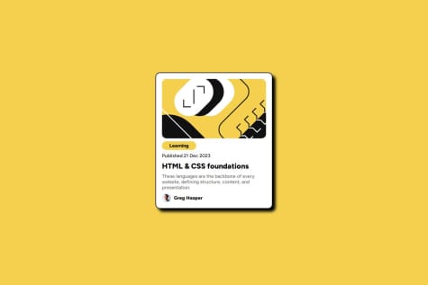
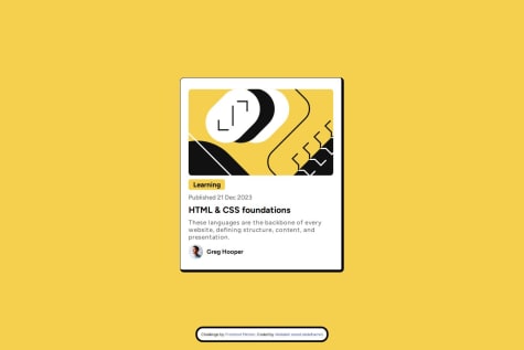
Hi @Abdallah-Darwesh, 👋
Your work shows promise, and with a few adjustments, it can be even more polished! Here are some specific suggestions to help refine your code and ensure best practices:
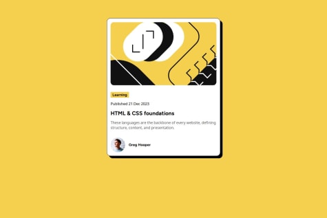
In your code:
<div class="content">
    <h3>Learning</h3>
    <p>Published 21 Dec 2023</p>
    <h2>HTML & CSS foundations</h2>
</div>
Using <h3> above <h2> breaks the heading hierarchy and can confuse screen readers or SEO crawlers. Think of it like writing a book: a chapter title (<h2>) comes before its subheading (<h3>).
Update the structure so headings flow logically:
<div class="content">
    <h2>Learning</h2>
    <p>Published 21 Dec 2023</p>
    <h3>HTML & CSS Foundations</h3>
</div>
Real-Life Analogy: Imagine you’re reading a blog post. If the introduction (h2) comes after the subpoints (h3), wouldn’t it feel disorganized? Proper hierarchy ensures clarity for both readers and tools. 📖
Your current approach uses multiple properties:
position: absolute;
top: 50%;
left: 50%;
transform: translate(-50%, -50%);
This method is verbose and harder to maintain. Modern CSS grid simplifies such tasks.
Use this streamlined approach:
body {
    display: grid;
    place-content: center;
    min-height: 100vh;
}
Real-Life Analogy: Imagine aligning a picture on your wall. Would you measure everything manually, or use a centered frame with built-in guides? Grid is your built-in guide! 🖼️
box-shadowYour code:
border-right: 7px solid black;
border-bottom: 7px solid black;
This method is visually inconsistent and increases the CSS file size.
Replace it with box-shadow:
border: 1px solid black;
box-shadow: 10px 10px 1px 1px black;
Real-Life Analogy: It’s like wrapping a gift—why use separate strips of tape when one wide strip does the job better? 🎁
Current code unnecessarily adds margins and hardcoded widths:
.container > img, .content {
    width: 90%;
    margin: auto;
}
Instead, use this:
.container > img, .content {
    width: 100%;
    border-radius: 10px;
}
Real-Life Analogy: Think of resizing an image in a document. Setting it to "fit page width" works better than manually dragging corners every time! 🖼️
max-content<h3>Current code:
h3 {
    width: 100px;
}
Use width: max-content for dynamic sizing:
h3 {
    background-color: hsl(47, 88%, 63%);
    width: max-content;
    padding: 3px 0;
    border-radius: 5px;
}
Real-Life Analogy: Imagine buying a shirt that adjusts to your size instead of guessing the perfect fit. max-content is like a tailored outfit for your text! 👕
Example:
.container > img, .content {
    width: 90%;
    margin: auto;
}

p {
    margin: 10px 0;
    color: hsl(0, 0%, 42%);
    font-size: 17px;
}
Use classes or variables for shared styles:
.shared-styles {
    margin: 10px 0;
    color: hsl(0, 0%, 42%);
    font-size: 17px;
}
.container > img, .content {
    width: 100%;
    border-radius: 10px;
}
Real-Life Analogy: It’s like reusing ingredients in recipes—why buy separate flour for every dish when one bag works for all? 🍞
It’s great that you’re coding and learning! However, remember to understand why you’re using a particular property instead of just copying. Tools like ChatGPT can brainstorm ideas, but the magic happens when you experiment and learn the "why" behind the code. ✨
box-shadow for shadows.width: 100%.max-content.Keep learning and growing! 🚀 Let me know if you have any questions! 😊
Hi @FutureCiso, 👋
Your project looks great! Here are a few suggestions to improve the structure, accessibility, and overall styling for a better user experience:
Use Semantic Tags for Links:
Instead of using <button> for navigation links, consider using a semantic structure like this:
<ul>
  <li><a href="your-link-here">GitHub</a></li>
  <li><a href="your-link-here">Frontend Mentor</a></li>
  <li><a href="your-link-here">LinkedIn</a></li>
  <li><a href="your-link-here">Twitter</a></li>
  <li><a href="your-link-here">Instagram</a></li>
</ul>
Reason:
<a> for links clearly indicates interactivity and intent, aligning with HTML5 best practices.Add cursor: pointer:
Ensure buttons or links have cursor: pointer in your CSS. This provides a clear visual cue to users that the element is clickable.
Avoid Fixed Height on the main:
Instead of using a fixed height (height: 600px), let the inner content determine the height naturally. A flexible layout prevents potential layout issues like overlapping or truncation.
Replace this:
main {
    width: 380px;
    height: 600px; /* Avoid this */
    background-color: var(--Grey800);
    border-radius: 15px;
    padding: 2.5rem;
    text-align: center;
}
With this:
main {
    max-width: 380px; /* Ensures responsive behavior */
    background-color: var(--Grey800);
    border-radius: 15px;
    padding: 2.5rem;
    text-align: center;
}
Reason: Using max-width makes the design more responsive, and height adjustments will adapt based on content, avoiding overflow issues.
I hope these suggestions help improve your project’s structure and usability! Feel free to reach out if you need more insights or assistance. 🚀😊
Best regards,
Aakash
Hi @basSluiter,
Great job on your project! 🎉 I can see the effort and creativity you’ve poured into it—it looks fantastic! I’d like to share a few suggestions to help improve the structure and maintainability of your code:
Use Semantic Tags for Lists
Instead of wrapping your social media links in a <div> tag, consider using an unordered list (<ul>) with list items (<li>) for better semantics and accessibility. For example:
<ul class="social-links">
  <li><a href="https://github.com/">Github</a></li>
  <li><a href="https://www.frontendmentor.io/">Frontend Mentor</a></li>
  <li><a href="https://nl.linkedin.com/">LinkedIn</a></li>
  <li><a href="https://x.com/">Twitter</a></li>
  <li><a href="https://instagram.com/">Instagram</a></li>
</ul>
Why? Semantic tags improve the document's structure and make it easier for screen readers and search engines to understand the content. 🌐
Styling Simplification
While your design is visually appealing, it might be slightly over-engineered with too many styles. Simplifying your CSS can improve maintainability and readability. Minimal styles can still deliver a sleek and professional look. Check out my solution for inspiration! 😊
Intentional Design Choices
If the current implementation was intentional, that’s awesome! If not, and you'd like some help refining your code, feel free to reach out. I’d be happy to assist. 💡
Keep up the great work, and I’m excited to see how you refine this project further! 🚀
Hi @Arekpok29,
Here are some suggestions for your code to improve it:
Remove commented code: There’s some commented-out code in your repo (lines 19-32 in index.html) that should be removed for cleaner and more maintainable code. You can check it here: GitHub link. ✅
Use place-content instead of place-items: place-content will help you position the card in the center. Both properties have different use cases, so using place-content in this case is more appropriate for centering. 🎯
Example:
body {
    font-family: "Figtree", serif;
    background-color: hsl(47, 88%, 63%);
    height: 100svh;
    display: grid;
    place-content: center;
}
Use max-width instead of width for responsiveness: When defining the card's size, max-width ensures that it adapts to different screen sizes, while width would keep it fixed. 📱
Example:
.card {
    background-color: white;
    border-radius: 1rem;
    max-width: 22rem;  /* Instead of width */
    box-shadow: 0.5rem 0.5rem 0 black;
    border: 1px solid black;
}
Make image width 100%: To ensure the image adapts properly to the card's size, simply set its width to 100%. 🎨
Example:
.card .top-image {
    display: flex;
    justify-self: center;
    max-width: 100%;
    margin: 1rem;
    border-radius: 1rem;
}
Consolidate margins and paddings: Instead of adding margin to the text inside the card, just add padding to the card itself. This keeps your layout clean and consistent. 💡
Example:
.card {
    padding: 1rem;  /* Add padding here */
}

.card .card-content {
    display: flex;
    flex-direction: column;
    align-items: flex-start;
    gap: 0.5rem;
}
These small adjustments will improve the readability, maintainability, and responsiveness of your code. Keep up the good work! 👍
Let me know if you have any questions. 😊
Hi @MichalJirak,
Great work on the project! Here are a few suggestions for improvement:
Move Inline Styles to a CSS File:
Instead of putting the styles inline, please move the highlighted code to a dedicated CSS file. This will help keep your code cleaner and more maintainable.
Highlighted Code
Use Semantic HTML Tags:
Instead of using <div> elements for your list of social media links, it's better to use semantic tags like <ul> and <li>. Also, replace the static text with anchor (<a>) tags to make the links accessible and SEO-friendly.
Example:
<ul class="flex flex-col items-center gap-4 px-2">
  <li><a href="your-github-link" class="w-full text-center text-sm bg-[var(--Grey700)] rounded-lg p-4">GitHub</a></li>
  <li><a href="your-frontend-mentor-link" class="w-full text-center text-sm bg-[var(--Grey700)] rounded-lg p-4">Frontend Mentor</a></li>
  <!-- Add other links here -->
</ul>
Add Hover Effect on Buttons: The hover state for your buttons is missing, which is part of the project requirement. Adding the following class will resolve this:
hover:bg-[#256252]
Hope this helps! Keep up the great work 👍
Best,
Aakash
I created this Blog Preview Card project using React.js. I plan to develop new projects using React and Next.js in the future.
I would appreciate any feedback or suggestions for improvement. Specifically, I want to learn more about best practices for optimizing performance and enhancing user experience. Additionally, any tips on code organization and maintainability would be highly valuable.
What challenges did you encounter, and how did you overcome them?During the development process, I encountered several challenges, such as configuring the project for deployment on GitHub Pages and ensuring the paths were correctly set. I overcame these challenges by carefully reading the documentation, seeking help from the community, and testing different configurations until I found the correct setup.
Hi @aliraza732-hub,
🔧 Consider using max-width instead of width for your .card styling. This will make your card more responsive on smaller screens (below 300px). With max-width: 300px, it will adapt to the screen size, and once it reaches 300px, it will stay fixed.
.card {
    background-color: #fff;
    border-radius: 20px;
    box-shadow: #000 .5rem .5rem;
    max-width: 300px;
    padding: 1rem;
}
👍 Overall, you're doing great! Just remember to push your changes to the branch so I can review them directly. I based my feedback on code inspection, but seeing the live changes will help a lot for further improvements.
Keep up the good work! 😊
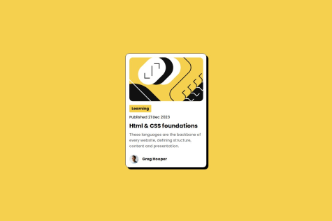
Hi @Mohamedibrahim0419 👋,
Here are a few suggestions for improving your project:
<div> instead of <section>: The <section> tag is meant for grouping related content that could stand alone, like sections of a webpage. For this small card layout, it's better to use <div> since it's a more generic container that suits the layout needs better. Here's an updated snippet for reference:<div class="container"> <div class="card"> <img src="assets/images/illustration-article.svg" alt="illustration-article.svg"> </div> <div class="text"> <h2>Learning</h2> <p>Published 21 Dec 2023</p> <h1>HTML & CSS foundations</h1> <p class="end">These languages are the backbone of every website, defining structure, content, and presentation.</p> </div> <div class="avatar"> <img src="assets/images/image-avatar.webp" alt="avatar"> <span>Greg Hooper</span> </div> </div>
<h2> tag followed by an <h1> tag. Instead, you should have the <h1> as the main heading and use subsequent headings (<h2>, <h3>, etc.) as needed. This ensures better semantic structure. Here's an improved version:<h1>HTML & CSS foundations</h1> <h2>Learning</h2>
Keep up the good work! 🎉 Let me know if you have any questions or need further assistance! 😊