

Design comparison

Community feedback
- @skyv26Posted about 2 months ago
Hi @basSluiter,
Great job on your project! 🎉 I can see the effort and creativity you’ve poured into it—it looks fantastic! I’d like to share a few suggestions to help improve the structure and maintainability of your code:
-
Use Semantic Tags for Lists
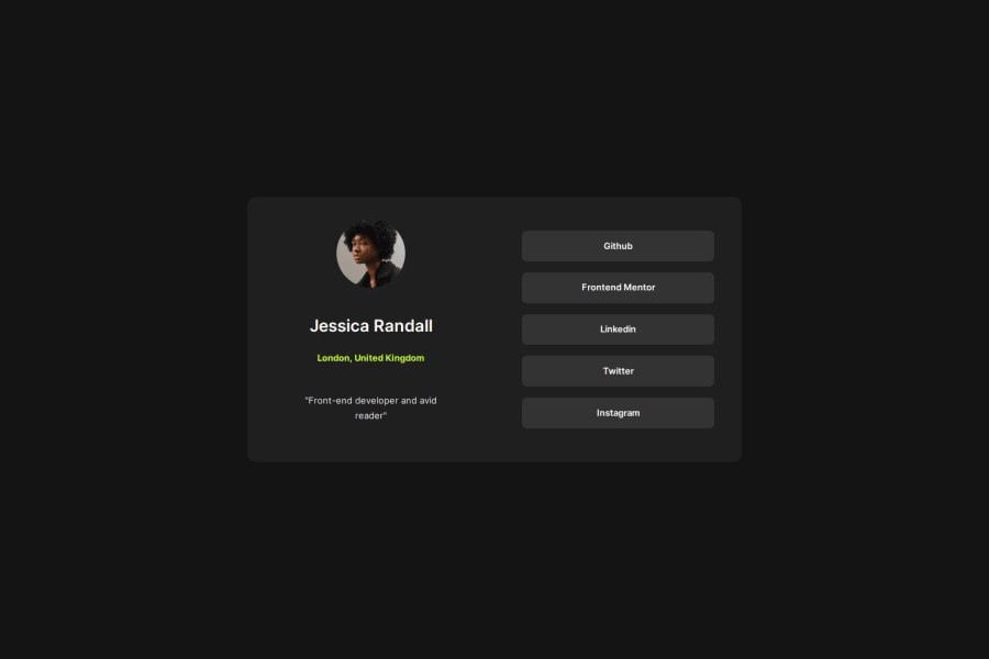
Instead of wrapping your social media links in a<div>tag, consider using an unordered list (<ul>) with list items (<li>) for better semantics and accessibility. For example:<ul class="social-links"> <li><a href="https://github.com/">Github</a></li> <li><a href="https://www.frontendmentor.io/">Frontend Mentor</a></li> <li><a href="https://nl.linkedin.com/">LinkedIn</a></li> <li><a href="https://x.com/">Twitter</a></li> <li><a href="https://instagram.com/">Instagram</a></li> </ul>Why? Semantic tags improve the document's structure and make it easier for screen readers and search engines to understand the content. 🌐
-
Styling Simplification
While your design is visually appealing, it might be slightly over-engineered with too many styles. Simplifying your CSS can improve maintainability and readability. Minimal styles can still deliver a sleek and professional look. Check out my solution for inspiration! 😊 -
Intentional Design Choices
If the current implementation was intentional, that’s awesome! If not, and you'd like some help refining your code, feel free to reach out. I’d be happy to assist. 💡
Keep up the great work, and I’m excited to see how you refine this project further! 🚀
0 -

Please log in to post a comment
Log in with GitHubJoin our Discord community
Join thousands of Frontend Mentor community members taking the challenges, sharing resources, helping each other, and chatting about all things front-end!
Join our Discord