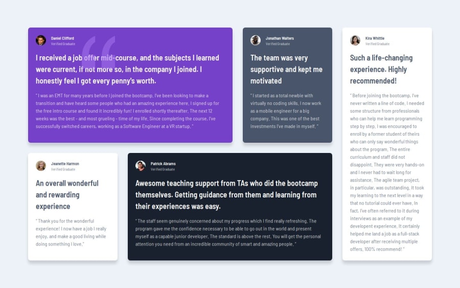
Responsive testimonials grid section main page using CSS Nesting and B


Design comparison

Solution retrospective
I couldn't make my project fully responsive, I need help on this issue. Apart from that, I am open to feedback on CSS Nesting and BEM methodology.
Community feedback
- @Komans-HubPosted about 2 months ago
Great job @mkalkandev, I would recommend the mobile first approach to working on projects like this. The mobile first approach makes your project fully responsive by default. Starting with mobile ensures the content flows naturally on smaller devices, where most users begin their experience. Good job, once again.
Marked as helpful0 - @skyv26Posted about 2 months ago
Hi @mkalkandev,
Here’s some feedback and suggestions for improving the project. I’ll also provide examples where needed to make it clearer:
1. Using Semantic Tags Appropriately
Currently, you're using the
<section>tag for individual cards in a grid layout. While<section>is great for grouping thematic content in a large layout, it's unnecessary here since the cards are part of a single grid structure. Instead, consider using<div>or<article>for each card.Example: Imagine hosting a small dinner for six people. Would you assign a separate room for each person? Probably not—you’d group them all around the same dining table. Similarly, in this project,
<section>over-complicates the structure.Refactor:
<article class="container__card container__card-4">
  <div class="container__card-author">
    <div class="container__card-author-image">
      <img class="container__card-author-image-img" src="./images/image-patrick.jpg" alt="">
    </div>
    <div class="container__card-author-content">
      <p class="container__card-author-content-name">Patrick Abrams</p>
      <p class="container__card-author-content-job">Verified Graduate</p>
    </div>
  </div>
  <h1 class="container__card-heading">Awesome teaching support...</h1>
  <p class="container__card-description">“ The staff seem genuinely concerned...”</p>
</article>
2. CSS Nesting Should Be Minimal
Deeply nested CSS selectors make code harder to maintain. For instance, in your current structure, a small style update could require navigating through layers of selectors. Limit nesting to two levels for clarity and scalability.
Think of it like giving directions: "Take the first left, then the second right" is easier to follow than "Go left, pass the park, find the third right past the coffee shop."
Refactor:
.container__card {
  padding: 1.5rem;
  border-radius: 0.5rem;
  box-shadow: 0px 10px 10px rgba(0, 0, 0, 0.15);
}

.container__card-author {
  display: flex;
  gap: 1rem;
}

.container__card-author-image-img {
  border-radius: 50%;
  width: 2rem;
}

.container__card-author-content-name {
  font-weight: bold;
  font-size: 0.8rem;
}
3. Optimize SVG Placement
Using
::beforeto add a background SVG can lead to unnecessary code complexity. Instead, directly use the SVG as a background image for the card. This approach reduces clutter and simplifies styling.Example: Imagine pinning a note on a board. Instead of attaching strings and using extra pins, you could directly stick the note where you want it.
Refactor:
.container__card {
  background: url(../images/bg-pattern-quotation.svg) no-repeat;
  background-position: 85% 10%;
}
4. Adopt a Mobile-First Approach
Designing for desktops first and then adapting to smaller screens can be cumbersome. Starting with mobile ensures the content flows naturally on smaller devices, where most users begin their experience.
Imagine designing a house starting with a single room and expanding outward. It's more manageable than starting with a mansion and then figuring out how to shrink it into a single room.
Refactor Example:
/* Base styles for mobile */
.container__card {
  width: 100%;
  padding: 1rem;
}

/* Adjust for larger screens */
@media (min-width: 768px) {
  .container__card {
    width: 45%;
  }
}

@media (min-width: 1024px) {
  .container__card {
    width: 30%;
  }
}
5. Avoid Fixed Widths for Cards
Using fixed widths restricts responsiveness. Instead, leverage grid properties to make the layout fluid. For instance, this style restricts adaptability:
.container__card-2 {
  width: 35ch;
}
Replace it with something like this:
.container {
  display: grid;
  grid-template-columns: repeat(auto-fit, minmax(300px, 1fr));
  gap: 2rem;
}
This way, the cards adapt naturally to different screen sizes, ensuring a seamless user experience.
Hope these suggestions are helpful! Let me know if you need further clarification or assistance 😊.
Best regards,
AakashMarked as helpful0@mkalkandevPosted about 2 months ago@skyv26 Thanks for your feedback, I will recreate this exercise with your suggestions.
1


Please log in to post a comment
Log in with GitHub
Join our Discord community
Join thousands of Frontend Mentor community members taking the challenges, sharing resources, helping each other, and chatting about all things front-end!
Join our Discord