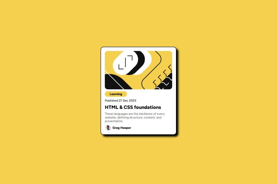


Design comparison

Community feedback
- @skyv26Posted 2 months ago
Hi @omarrrefaatt1, 👋
Your project has some great foundational work! However, I noticed a few areas where you can improve, and I'd love to share some suggestions to help you polish your code further. 🚀 Let's dive in:
1. Move inline styles to a CSS file
- Observation: Your GitHub code includes internal styles in your HTML file lines 13-158.
- Why it's important: Keeping styles in a separate CSS file makes the code cleaner, easier to maintain, and reusable across multiple pages. Think of it as organizing your tools in a toolbox instead of scattering them around your workspace—easier to find, right? 🛠️
- Suggestion: Move the styles to a CSS file and link it in the HTML. This also helps in collaborative development, making the HTML more readable.
Refactored Example: HTML:
<link rel="stylesheet" href="styles.css">CSS (in
styles.css):.card { max-width: 350px; padding: 20px; border-radius: 15px; background-color: white; display: grid; grid-template-rows: auto; gap: 10px; border: solid black 2px; box-shadow: 10px 10px 10px rgb(0, 0, 0); }
2. Avoid redundant properties
- Observation: Properties like
marginandheightin.cardare not essential. Similarly, other properties in.cardimg,.cardtitle,.date, etc., can be removed without altering the design. - Why it matters: Redundant code is like carrying unnecessary baggage on a trip—it weighs you down and serves no real purpose. Keeping your CSS lean improves readability and performance.
- Suggestion: Remove unused or redundant properties to streamline your styles.
Refactored Example:
.card { max-width: 350px; padding: 20px; border-radius: 15px; background-color: white; display: grid; grid-template-rows: auto; gap: 10px; border: solid black 2px; box-shadow: 10px 10px 10px rgb(0, 0, 0); } .cardimg { border-radius: 15px; width: 100%; object-fit: cover; }
3. Use semantic HTML tags
- Observation: It’s unclear if you’re leveraging semantic HTML tags properly, especially for navigation elements like buttons or anchor links.
- Why it matters: Semantic tags are like using clear labels on jars in your kitchen—they tell browsers and assistive technologies what each element does. For example:
<button>is for actions like submitting a form.<a>is for navigation to another page or section.
- Use-Case Example: If you're creating a card with a "Read More" button, use
<a>for linking to another page and<button>for triggering JavaScript actions like toggling content.
Refactored Example:
<!-- Use <a> for navigation -->
<a href="/more-info" class="card-button">Read More</a>

<!-- Use <button> for actions -->
<button onclick="toggleContent()">Show Details</button>
4. Understand grid usage
- Observation: You're using unnecessary
grid-rowandgrid-columnproperties in several classes like.cardimg,.cardtitle, etc. - Why it matters: Over-using these properties can complicate your layout. Think of it like over-planning every step of a walk when a simple path exists—it's extra work for no added value.
- Suggestion: Remove unused grid properties unless you're explicitly positioning items.
Refactored Example:
.cardtitle {
  width: max-content;
  padding: 5px 20px;
  border-radius: 5px;
  font-size: 16px;
  background-color: hsl(47, 88%, 63%);
  font-weight: 800;
}
Closing Thoughts 🌟
Simplifying and cleaning up your code not only enhances readability but also saves development time in the long run. As you build more projects, keeping these best practices in mind will ensure you're writing efficient and maintainable code.
Let me know if you need further clarification or assistance! 😊
1

Please log in to post a comment
Log in with GitHubJoin our Discord community
Join thousands of Frontend Mentor community members taking the challenges, sharing resources, helping each other, and chatting about all things front-end!
Join our Discord