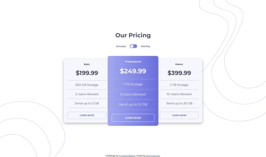

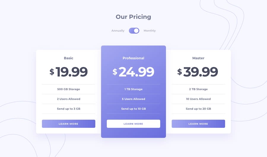
Design comparison
Solution retrospective
Any help with using plain CSS to style the middle column's height to extend beyond that of both columns beside it will be much appreciated.
Community feedback
- @skyv26Posted 2 months ago
Hi @romrauq,
Great work so far! Your project looks promising, but I’d love to share a few suggestions that can help refine and enhance it further. 😊
1️⃣ CSS Suggestion: Add Transform Scale Property
- Feedback: The middle card already stands out visually with its unique style. However, using the
transform: scale(1.1)property can make it pop even more by subtly emphasizing it. 🌟 - Suggestion: Add the scale transformation specifically for larger screens and disable it on mobile screens. On smaller devices, the scaling might cause layout issues or make the card look squeezed.
Why? Think of it as someone walking into a room and standing a bit closer than others—it naturally draws your attention without overwhelming the entire room!
Here’s the updated CSS snippet:
.pricing-column-middle {
    color: var(--Very-Light-Grayish-Blue);
    background: var(--Linear-Gradient);
    border-radius: 0;
    transform: scale(1.1);
}

@media (max-width: 768px) {
    .pricing-column-middle {
        transform: scale(1);
    }
}
2️⃣ JavaScript Suggestion: Simplify and DRY Your Code
- Feedback: Your toggle logic is solid, but it can be made more compact and DRY (Don’t Repeat Yourself) to improve readability and maintainability.
- Suggestion: By using a single loop and combining logic, you can make the code more concise without altering its functionality.
Why? Imagine you're organizing two groups of items in a room (monthly and yearly prices). Instead of going through each group separately, you can organize both at the same time. This saves time and effort!
Here’s the improved version:
let toggleButton = document.getElementById("toggle-button");
let isAnnually = false;
let prices = document.querySelectorAll(".pricing-monthly, .pricing-yearly");

toggleButton.addEventListener("click", () => {
    prices.forEach(price => {
        if (price.classList.contains("pricing-monthly")) {
            price.style.display = isAnnually ? "block" : "none";
        } else {
            price.style.display = isAnnually ? "none" : "block";
        }
    });
    toggleButton.style.justifyContent = isAnnually ? "flex-end" : "flex-start";
    isAnnually = !isAnnually;
});
Benefits:
- Reduced repetitive code 🧹
- Easier to understand and modify later
3️⃣ Accessibility: Use Semantic Tags for Anchor Links or Buttons
- Feedback: It’s crucial to use semantic HTML elements like
<button>for actions or<a>for navigation. If the buttons or links in your project don’t use these appropriately, accessibility and SEO may suffer. - Suggestion: Update your code to reflect the intended purpose of each element. For instance:
- Use
<button>for actions like toggling plans. - Use
<a href="#">for links that navigate to other parts of the page.
- Use
Why? Imagine a visually impaired user relying on a screen reader. A semantic
<button>tells them, “This is a button; you can click it,” while an<a>suggests, “This is a link to another destination.” This clear distinction improves their experience.
Let me know if you need further clarification or help implementing these suggestions! 🚀 Keep up the great work!
Marked as helpful0@romrauqPosted 2 months ago@skyv26 Thanks alot! Your suggestions are very helpful. I'll improve my code using your suggestions as my guide. 👍🏾
1 - Feedback: The middle card already stands out visually with its unique style. However, using the

Please log in to post a comment
Log in with GitHubJoin our Discord community
Join thousands of Frontend Mentor community members taking the challenges, sharing resources, helping each other, and chatting about all things front-end!
Join our Discord