FAQ_Accordion_Typescript_Accessibility

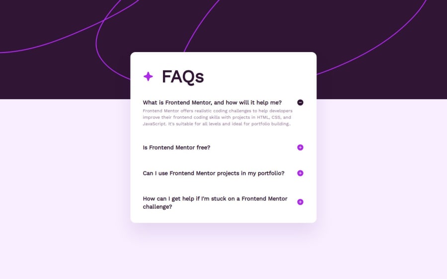
Design comparison

Solution retrospective
This project allowed me to deepen my knowledge of creating interactive components with a focus on accessibility. Here are some key takeaways:
- Implementing ARIA attributes for improved screen reader support
- Managing keyboard navigation for accordion components
- Creating smooth transitions for accordion panels
- Implementing responsive design for various screen sizes
One of the main challenges I encountered was implementing a smooth animation effect for the accordion. Initially, I struggled with achieving a natural open/close transition because the hidden class I used blocked the display, making the content appear or disappear instantly without any animation. To overcome this, I had to switch from simply hiding the content with hidden to using CSS transitions, adjusting the height and opacity of the accordion panel, which allowed for a smoother and more visually appealing effect.
Another challenge I faced was positioning the FAQ section correctly in relation to the background image. At first, using relative/absolute positioning caused the layout to break and shift elements in unexpected ways. Instead of relying on absolute positioning, I opted for a negative margin, which allowed me to properly align the FAQ section with the background while maintaining the overall structure and responsiveness of the layout
What specific areas of your project would you like help with?I would like help with effectively managing the positioning of a complex layout like the one I used in my project. Specifically, I struggled with aligning the FAQ section over the background image while keeping the overall layout responsive and balanced. I had to use a negative margin to achieve the desired effect, but I would appreciate guidance on whether this is the best approach or if there are more efficient ways to handle such positioning challenges without affecting the layout’s integrity.
Community feedback
Please log in to post a comment
Log in with GitHubJoin our Discord community
Join thousands of Frontend Mentor community members taking the challenges, sharing resources, helping each other, and chatting about all things front-end!
Join our Discord