Responsive social-link-profile using flexbox and custom properties.


Design comparison

Solution retrospective
I proud that I can finally undesrtand how custom properties work and why is soo important use when with start a project.
What challenges did you encounter, and how did you overcome them?The challenges was that I did not know how to place the buttons one above the other. I overcome them putting the buttons inside a div and then using the display block with a width of 100% to occupy all the space available in the card-footer.
What specific areas of your project would you like help with?All is clear for now.
Community feedback
- @R3ygoskiPosted 7 months ago
Hello again Kerwin, congratulations on completing another challenge!
Following up on the comment below (or above), regarding the
<article>, it's used for self-explanatory content, meaning it doesn't depend on the page as context. Using it for the card is correct, but you used two<article>elements, and one of them is in the wrong context. I'll explain below:<article class="container-articles">, the correct tag for this would be<main>, as it contains all the main content of your page, which in this case is the card with the information.
Regarding the
<button>elements, it would be more appropriate to use<a>tags because the idea is that clicking on them should redirect you to a new page. Therefore, instead of just using a<footer>, it would also be a<nav>(in this case,<nav>within<footer>).Edit: I said the right is to use
<nav>, but actually the correct thing is to use<ul>with<li>, because<nav>is dedicated to navigation within the page itself.A bonus tip is that you could also use an
<address>tag for<p class="location">, as it makes more sense since it's related to the location.Congratulations again, your project is very semantic. Keep practicing and improving, you're doing great. If you need help with anything, please ask below.
0 - @moadavouPosted 7 months ago
Great work on this project!
Here are a few suggestions for improvement:
HTML
- The
articleelement should represent a self-contained piece of content that could be independently distributed or reused. However, in your case, it seems like you're using it more as a generic container (you have two instances ofarticle). Consider usingmaininstead for thearticlewith the class namecontainer-articles.
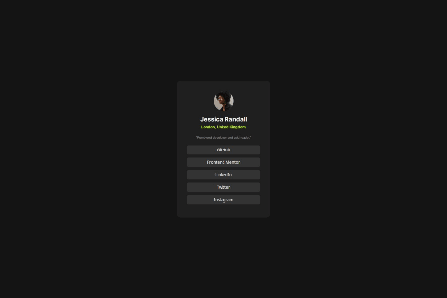
Alttext should provide a concise description of the image content. Consider describing the actual content or purpose of the image, like "Profile picture of Jessica Randall."
- The
buttonelement is appropriate for interactive controls, for linking to websites, it's better to usea.
CSS
- Don't use
pxforfont-size. This makes it so that the font won't change according to user settings.
Edit: Quite a few mistakes were left in this response. I edited them out so that future readers don't get confused. Thank you @R3ygoski for taking notice!
0@R3ygoskiPosted 7 months agoHello again Moa, I'd like to correct you on a few points you mentioned.
Starting with CSS, it's actually the opposite of what you said. Using rem allows the font to adapt to the user's settings, while px does not allow it, as px is an absolute value, unlike rem, which is relative.
Regarding HTML, in this case, it's not correct to use a
<div>, but rather<article>for the card. This is because the<card>element may not be reused, but it is self-explanatory by itself.1@moadavouPosted 7 months ago@R3ygoski Thank you for saving the day!
I probably should not write more feedback tonight. I accidentally wrote
reminstead ofpx. The first one was supposed to bedivormain(for the doublearticle) - but you explained it much better.Kerwin listen to Bernardo and not me 😅
1 - The


Please log in to post a comment
Log in with GitHubJoin our Discord community
Join thousands of Frontend Mentor community members taking the challenges, sharing resources, helping each other, and chatting about all things front-end!
Join our Discord