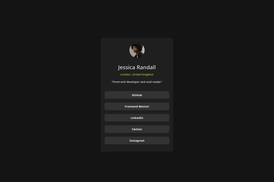
Design comparison
SolutionDesign
Community feedback
- @moadavouPosted 7 months ago
Great work on this challenge! Here are a few suggestions for improvement:
- Use semantic HTML to put more meaning into your elements and make a more accessible website. Wrap all of the content inside a
<main>and use<article>instead of<div>for the card.
- Add an alt-text on the images to improve accessibility.
- Don't use px for font-size. Use rem instead, since this unit scales with the user settings.
Marked as helpful1 - Use semantic HTML to put more meaning into your elements and make a more accessible website. Wrap all of the content inside a
Please log in to post a comment
Log in with GitHubJoin our Discord community
Join thousands of Frontend Mentor community members taking the challenges, sharing resources, helping each other, and chatting about all things front-end!
Join our Discord
