

Design comparison
SolutionDesign

Solution retrospective
What are you most proud of, and what would you do differently next time?
I'm proud of getting my website to look very close to the original design file
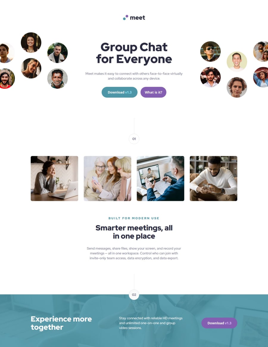
What challenges did you encounter, and how did you overcome them?A small challenge I encountered was figuring out how I wanted to style the hero images in desktop view. I have a wider monitor so the page looked a little off when the page was in full screen. I decided to not be too nit picky with it and keep it as it is.
What specific areas of your project would you like help with?Any feedback helps!
Community feedback
Please log in to post a comment
Log in with GitHubJoin our Discord community
Join thousands of Frontend Mentor community members taking the challenges, sharing resources, helping each other, and chatting about all things front-end!
Join our Discord