@wcyin9Submitted 12 months ago
What are you most proud of, and what would you do differently next time?
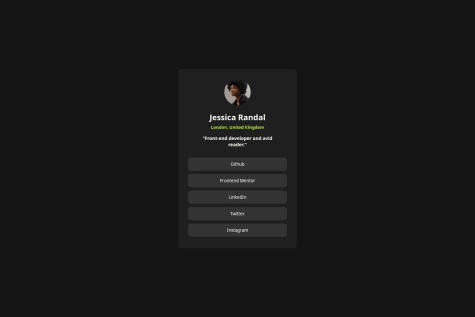
I liked implementing transitions to the buttons with hover effect, it added a bit more depth to the design.
What challenges did you encounter, and how did you overcome them?
In figma, the design looked identical in both mobile and browser view so I opted out of adding a media query. However, upon further look, I realized that the dimensions were indeed different, so I added a media query. I don't know the best px to use for specific devices, so I went with the one given in figma.
What specific areas of your project would you like help with?
When it comes to buttons, I'm not sure if I should use p with css styles to make it look like a button, or if I should use the button tag that already exists in HTML. I would like to know if there's specific situations where one is better than the other, or if it's just a personal preference for developers.
Another area is the sizing; currently I use fixed sizing (px) for the container since I'm trying to get the final product to look as similar to the design as possible. Should I instead use em/vw/vh/% to make it more responsive, despite given the specific dimensions in figma?


