Submitted about 1 year ago
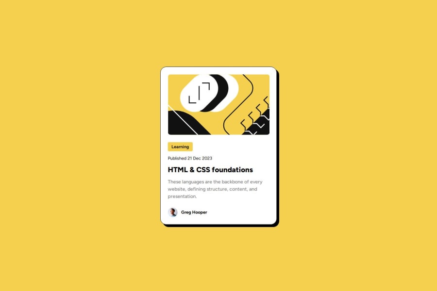
Blog card using CSS & HTML second attempt with active status
@yas-avocad
Design comparison
SolutionDesign
Solution retrospective
What are you most proud of, and what would you do differently next time?
Using flex more effectively. Was much faster to use flex and gap, rather than setting margin for each individual item.
What challenges did you encounter, and how did you overcome them?The background on the 'learning' item took up the whole line, despite setting the display property to inline-block. Align-self: flex fixed the problem
What specific areas of your project would you like help with?Font size/weight for the main body of text. I can't seem to get it exact.
Community feedback
Please log in to post a comment
Log in with GitHubJoin our Discord community
Join thousands of Frontend Mentor community members taking the challenges, sharing resources, helping each other, and chatting about all things front-end!
Join our Discord
