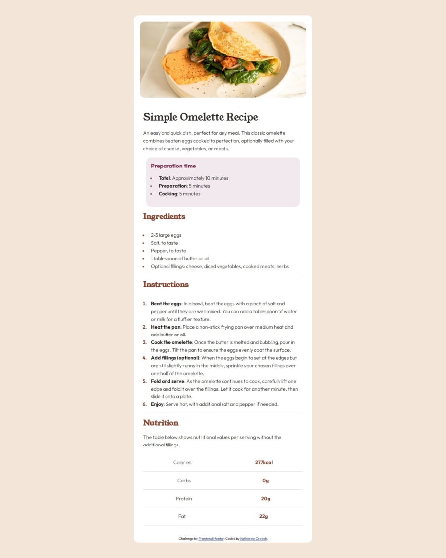
Design comparison
Solution retrospective
I'm most proud of how the responsive design turned out. Ensuring that the website looks great and functions well on various devices was a significant accomplishment. Next time, I would approach the organization of my HTML differently. I would strive to implement a more structured and modular approach to make the code easier to maintain and update in the future.
What challenges did you encounter, and how did you overcome them?Making sure that the containers and items were aligned properly. A lot of work with the inspect tools to make sure i got spacing and everything as close to the design as possible.
What specific areas of your project would you like help with?making sure that everything is up to best coding practices and anything i could do more efficiently.
Community feedback
- @Zy8712Posted 12 months ago
Hi there! Your site looks pretty good.
Here are somethings I feed you could change next time:
- instead of assigning your container a width of 40%, you should probably just assign it a clearly defined width so that the text doesn't shift so much when the portview size changes
- you should leave the alt description empty like
alt="", alt descriptions are mainly used to describe images that convery some type of information so decorative images should just have their descriptions be left empty
Hope you find this feedback useful 👍
Marked as helpful1
Please log in to post a comment
Log in with GitHubJoin our Discord community
Join thousands of Frontend Mentor community members taking the challenges, sharing resources, helping each other, and chatting about all things front-end!
Join our Discord
