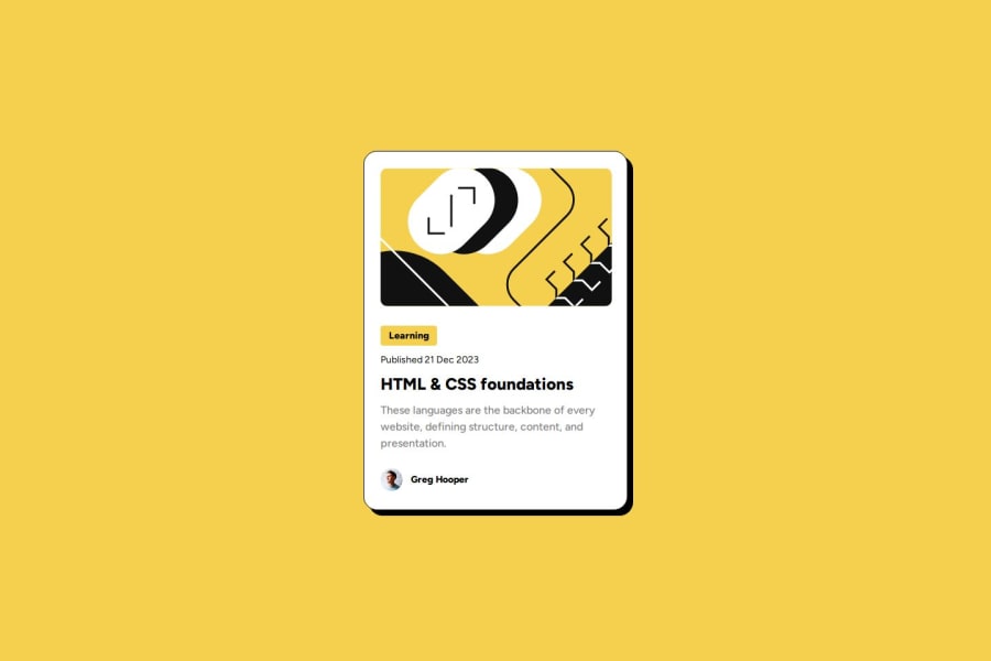
Design comparison
Solution retrospective
I'm proud of making the solution quite similar to the design, but I feel like there's still areas that are different.
What challenges did you encounter, and how did you overcome them?I was hesitant on using certain html tags for sectioning layouts. I wasn't sure if aside was necessary.
I also need help with the hover state! I want to trigger the increase in box shadow as well as the change in H1 font color to yellow, but I don't know how to trigger both of them at once. If I add :hover to card container, I can only increase the box shadow.
If I simply add H1:hover, the font change will only trigger when I hover on H1 specifically. How can I change the H1 font color when I hover over the entire card?
What specific areas of your project would you like help with?I think I have a tendency to write redundant code, so if anyone has tips on how I can change my code to be more efficient that would be really helpful. I would also like to know if I chose the right html tags. All other critiques are also welcome!
Community feedback
- @Zy8712Posted 12 months ago
Hi there! To change the color of the
<h1>text when you hover over the card you can do something along the lines of:main:hover h1{ color: #F4D04E; }Hope this helps 👍
Marked as helpful1
Please log in to post a comment
Log in with GitHubJoin our Discord community
Join thousands of Frontend Mentor community members taking the challenges, sharing resources, helping each other, and chatting about all things front-end!
Join our Discord
