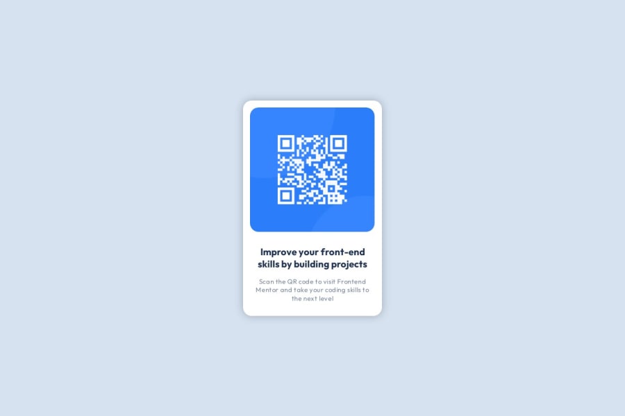
Design comparison
Solution retrospective
I am not quite proud of myself in this project, frankly speaking. It took a lot of time for doing simple things because of the inattentiveness and lack of practice.
What challenges did you encounter, and how did you overcome them?I definitely had challenges with sizes and the general understanding of the necessary positions of an element, like, what I need to do to place it in the right place on the page. I just tried different things, like removing width and height on certain elements, using flex and removing it again. In the end, I managed to make it look like as it does in Figma.
What specific areas of your project would you like help with?It'd be grateful for any feedback, any advice on html structure, how to organize things on the page, how properly use width and height, maybe some advice about using different units and values( px, vh, em, rem).
Community feedback
- @Zy8712Posted 12 months ago
Hi there! Congrats on finishing your first challenge, your site looks great!
Some things I feel like you could change/modify with your code:
- instead of using an
<h2>tag you should use an<h1>tag as headings are meant to be used in order from h1 to h6 without any skips. They all come with default font sizes that can be changed in css with thefont-sizeattribute - for the height of your
<body>I would recomment usingmin-height: 100vhas opposed toheight: 100%, as its standard practice and gives you the desired result in almost every scenario - for you
<img>you could leave the alt description empty in most cases unless the the image conveys some important information that needs to be read out by screen readers (not too sure how it would work in this case with a qr code though)
Aside from that your code structure is excellent and your site looks virtually identical to the original design. Nice work 👍
Marked as helpful0@svetikbaihePosted 12 months ago@Zy8712 Thanks for taking the time to share your pieces of advice! It's really nice of you:)
0 - instead of using an
Please log in to post a comment
Log in with GitHubJoin our Discord community
Join thousands of Frontend Mentor community members taking the challenges, sharing resources, helping each other, and chatting about all things front-end!
Join our Discord
