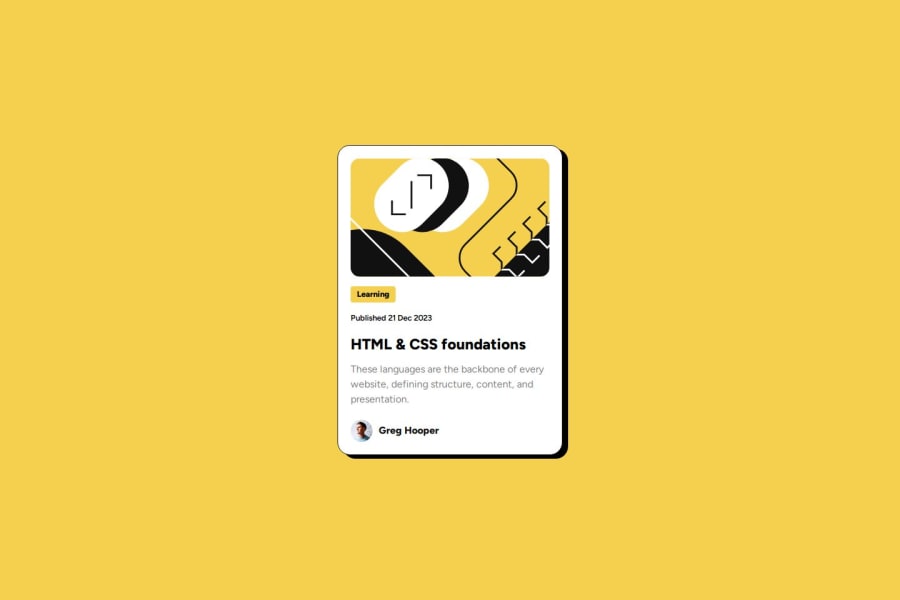
Design comparison
Solution retrospective
This was my third challange so far and I made it in a short time.
What challenges did you encounter, and how did you overcome them?I would say none, this one was very fluently I really enjoyed it and i felt very confident doing it.
What specific areas of your project would you like help with?Any little detail you see that can be improved, I am really willing to learn!
Community feedback
- @Zy8712Posted about 1 year ago
Hi there! Your site looks pretty good and your code is easy to read.
Some changes I would suggest:
- you should use a
<h1>tag instead of an<h2>tag as headings are supposed to be used in order from h1 to h6 without any skips. The headers come with default font sizes that can be changed using thefont-sizeattribute - one effect your site is missing is that the box-shadow of your card should increase in size when users hover over it
Aside from that your sites looks pretty solid. Nice work 👍
0@kevsmartiniPosted about 1 year agoHello Bryan, thank you very much for your feedback, good to know about the headings have to be used in order, every day is an school day, isn't it? I didn't realize about the other effect, I will modify the code, thanks for letting me know.
Thank you very much for your comment I really appreciate it, it encourages me and motivates me to keep learning!
0 - you should use a
Please log in to post a comment
Log in with GitHubJoin our Discord community
Join thousands of Frontend Mentor community members taking the challenges, sharing resources, helping each other, and chatting about all things front-end!
Join our Discord
