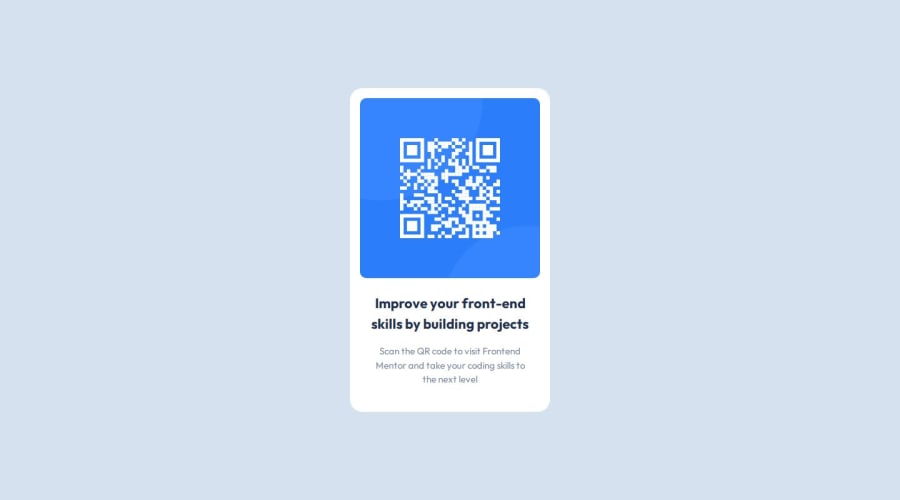


Design comparison
SolutionDesign

Solution retrospective
What are you most proud of, and what would you do differently next time?
The speed in which I built it, have a boilerplate
What challenges did you encounter, and how did you overcome them?N/A
What specific areas of your project would you like help with?Any feedback is nice
Community feedback
- @Zy8712Posted about 1 year ago
Hi there! Your site looks great.
The only changes I would suggest are:
- using an
<h1>tag instead of<p>for the title of the qr card - using
font-['Outfit']on the div containing your text, so you don't need to placefont-['Outfit']twice - since you are using tailwind and react you should try to install the tailwind cli for more customizability
Aside from that your site is solid. Nice work 👍
Marked as helpful0 - using an

Please log in to post a comment
Log in with GitHubJoin our Discord community
Join thousands of Frontend Mentor community members taking the challenges, sharing resources, helping each other, and chatting about all things front-end!
Join our Discord