

Design comparison

Solution retrospective
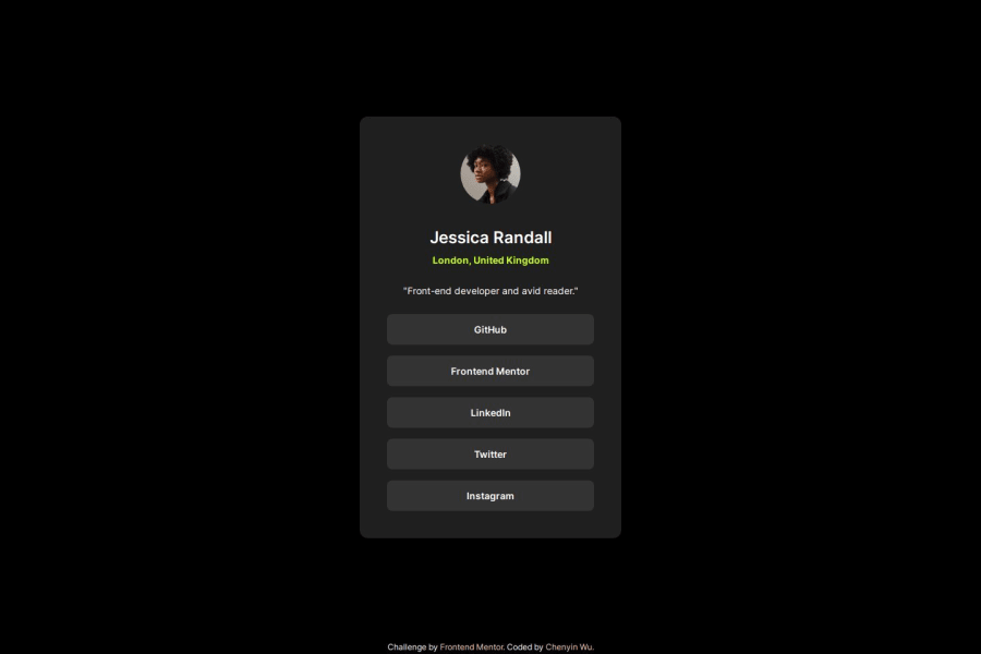
I liked implementing transitions to the buttons with hover effect, it added a bit more depth to the design.
What challenges did you encounter, and how did you overcome them?In figma, the design looked identical in both mobile and browser view so I opted out of adding a media query. However, upon further look, I realized that the dimensions were indeed different, so I added a media query. I don't know the best px to use for specific devices, so I went with the one given in figma.
What specific areas of your project would you like help with?When it comes to buttons, I'm not sure if I should use p with css styles to make it look like a button, or if I should use the button tag that already exists in HTML. I would like to know if there's specific situations where one is better than the other, or if it's just a personal preference for developers.
Another area is the sizing; currently I use fixed sizing (px) for the container since I'm trying to get the final product to look as similar to the design as possible. Should I instead use em/vw/vh/% to make it more responsive, despite given the specific dimensions in figma?
Community feedback
- @Zy8712Posted 12 months ago
Hi @yinnie, your site looks great!
To answer your question:
- this project is a social links profile so you should probably use the links tag
<a>for the boxes as it is built for that intended use. This would be better for semantics and we can use the built-in attributes for link tags likehrefandtarget
The only other feedback I'd give is that the alt description for the image can be left blank if you want (
alt="") because its usually only used to describe images that convey important information.Aside from that your site looks great!
Marked as helpful1 - this project is a social links profile so you should probably use the links tag

Please log in to post a comment
Log in with GitHubJoin our Discord community
Join thousands of Frontend Mentor community members taking the challenges, sharing resources, helping each other, and chatting about all things front-end!
Join our Discord