
@lanaschusterSubmitted almost 3 years ago

P
Valeria Montoya
@ValeriaMontoyaAll comments
- P@ValeriaMontoyaPosted about 1 month ago
Hi @lanaschuster 👋🏼
Your solution looks fantastic overall! However, I noticed a few areas where accessibility could be improved. For instance, adding styles for
focus-visibleon links would enhance the user experience for those navigating via keyboard.Additionally, in the
report-presentation-card.vuecomponent, the links for "Daily," "Weekly," and "Monthly" stats are present, but they don't seem to be functional at the moment. This could be the reason I'm unable to see the updated stats. It would be great if the logic to fetch and display the relevant data upon clicking these links could be implemented.Keep up the good work, happy coding!
0 - P@hartashuSubmitted 3 months agoWhat are you most proud of, and what would you do differently next time?
Still need to learn more and get more experience with JavaScript and form validation.
What challenges did you encounter, and how did you overcome them?I use constrain validation API for the form validation.
What specific areas of your project would you like help with?For validating form in JavaScript, which method is the best practice to use: The Constraint Validation API, without using API, or using FormData constructor? Which one is most recommended to use?
And also it is a little out of JavaScript topic: How to align list item vertically with the bullet/marker? Mine, the list item is a little lower than the marker (vertically)
P@ValeriaMontoyaPosted about 2 months agoHi Harta 👋🏼
Unfortunately, I don't have enough experience to answer your question about form validation with JavaScript, but I think you should explore different approaches to learn all you can about it.
To align the list items vertically with the bullet/marker, you can adjust the
line-heightandpaddingof the list items. Here's how you can do it:- Set a consistent line-height for the list items.
- Add padding to the list items to align them vertically with the bullet.
Here's an example of how you can modify the
.card__listand.card__itemstyles to achieve this:.card__list { list-style-image: url('../assets/images/icon-list.svg'); padding-left: 24px; gap: 10px; line-height: 1.5; /* Adjust the line-height */ } .card__item { color: var(--color-dark-slate-grey); padding-left: 1ch; padding-top: 2px; /* Adjust the padding-top */ padding-bottom: 2px; /* Adjust the padding-bottom */ }Feel free to adjust the values to achieve the desired alignment. I hope you find this useful! 🫱🏻🫲🏻
0 - P@hartashuSubmitted 3 months agoWhat are you most proud of, and what would you do differently next time?
Have to learn more about combining JavaScript with HTML and CSS, especially the best practice for naming the class name.
What challenges did you encounter, and how did you overcome them?Make the share button to always show up at the top when clicked by setting the z-index.
What specific areas of your project would you like help with?I think so far so good.
P@ValeriaMontoyaPosted about 2 months agoHi Harta 👋🏼
Your JavaScript file is concise and functional. Here are some awesome things you should keep implementing in next projects:
- Readable code with clear variable names.
- Your code is reusable for similar share button implementations.
Your solution looks great and works properly 👀
0 - P@wraith-wallSubmitted 3 months agoP@ValeriaMontoyaPosted about 2 months ago
Hi wraith-wall 👋🏼
Your code is generally well-structured and readable, however, here are some suggestions for improvement:
- Use more descriptive class names to improve readability and maintainability.
- Consider breaking down large sections into smaller components for better reusability.
Your solution looks great btw!
Marked as helpful0 - @AAB007209Submitted 3 months agoWhat are you most proud of, and what would you do differently next time?
I am proud about the Grid layout I learnt about while doing this challenge. Grid layouts are always kind of easy when thought about the design but when it comes to code they become messy during responsiveness.
What challenges did you encounter, and how did you overcome them?Grid Layout Responsiveness was little bit tough to come up at first. But later got some help from Kevin Powel the CSS master and was able to do it and understand properly.
P@ValeriaMontoyaPosted 3 months agoHi Akash A Benki 👋🏼
Your solution includes semantic HTML. However, there are a few improvements that could be made:
<section>could be used to group related content (e.g., all the testimonials could be wrapped in a<section>tag to emphasize the thematic grouping of content).<article>could be considered for each individual testimonial, as each one is a standalone piece of content.
Overall, your code provides a responsive, readable, and structured layout. I hope you find this helpful 🤓
Marked as helpful0 - @ElofatishSubmitted 3 months agoP@ValeriaMontoyaPosted 3 months ago
Hi @Elofatish 👋🏼
There are some positive aspects about your solution, but also areas for improvement:
- You correctly use
altattributes for your images, which is great for accessibility! However, for images like "Supervisor", "team-builder", etc., you might want to make thealttext more descriptive. For example, instead ofalt="Supervisor", use something likealt="Icon representing Supervisor tool for monitoring project roadblocks". This helps users with screen readers understand the context. - Avoid unnecessary comments like "file css" as it's self-explanatory from the link tag (line 10 of your index.html file).
- Finally, your implementation looks close to the design but some colors and font sizes can be changed to match the design. For example, you can replace color black for
--Very-Dark-Blue: hsl(234, 12%, 34%);
I hope you find my feedback useful! 🤓
0 - You correctly use
- @tuhamworldSubmitted 3 months agoWhat are you most proud of, and what would you do differently next time?
The last time I used Sass was in a javascript framework, I'm glad to use it in a vanilla HTML project.
What challenges did you encounter, and how did you overcome them?I initially had issues with compiling my styles in sass into CSS as I had to manually compile it on every change. Eventually, I was able to use the "sass watch" command to automatically compile my sass styles into CSS on every changes being made to my code
What specific areas of your project would you like help with?There's an extra margin-bottom on the mobile footer which I've tried debugging both with the main container and root/body code. Continued development would be getting rid of the extra margin-bottom
Here's a screenshot here : https://prnt.sc/nWiI6Cp3Vrpv
P@ValeriaMontoyaPosted 3 months agoHi Tunde 👋🏼
Your solution looks great, your code is well structured and easy to read.
I honestly couldn't see the extra margin-bottom on the mobile footer you mentioned but you could try to check the media queries as they can add extra margin to certain elements.I hope you find this helpful!
1 - @ItsYasserSubmitted 8 months agoWhat are you most proud of, and what would you do differently next time?
didn't include fonts because its repetitive
P@ValeriaMontoyaPosted 8 months agoHi Yasser 👋🏼 your code seems well structured in general. However here are some steps you could consider for your next project. To easily import fonts from Google Fonts into your website follow these simple steps:
- Go to the Google Fonts website at fonts.google.com.
- Browse or search for the font you want to use.
- Once you click on the font, click on "Get font" button.
- Once you have selected all the fonts you want to use, click the icon on the top right.
- Now click "Get embed code" and you will find a code snippet that you need to add to your HTML file. Copy this code snippet.
- Paste the code snippet into the
<head>section of your HTML file, between the<head>and</head>tags. - Save your HTML file and refresh your website. The fonts should now be imported.
By following these steps, you can easily import and use Google Fonts on your website to enhance the typography and design.
I hope this is helpful to you!
Marked as helpful0 - @aminbd90Submitted about 1 year agoWhat are you most proud of, and what would you do differently next time?P@ValeriaMontoyaPosted about 1 year ago
Hi, your solution looks amazing! 👍🏼 Just a small suggestion. Changing the
<section>tag to<main>in your HTML code might be a good idea since using<main>would be semantically more correct.0 - @alan-mesquitaSubmitted about 1 year agoWhat are you most proud of, and what would you do differently next time?
me orgulho do design, acredito ter conseguido desenvolve-lo mais fiel possível do projeto do figma e na próxima tentarei trazer novas formas pra ir aprimorando e refatorando meus códigos.
What challenges did you encounter, and how did you overcome them?A dificuldade que tive foi de como deixar meu card adaptável para diversas telas e com esforço, testes e pesquisa consegui deixa-lo adaptável.
What specific areas of your project would you like help with?Na refatoração, tentando deixa meu código menor e mais simples criei classes reutilizáveis e não se esse seria o ideal.
P@ValeriaMontoyaPosted about 1 year agoHi 👋🏼 about your question, I think using reusable classes is a good practice in terms of code maintenance and scalability. It allows for quick and consistent changes throughout the site if necessary. In my opinion you did a great job, keep going!
Marked as helpful1 - @PhushyamithraSubmitted about 1 year agoWhat are you most proud of, and what would you do differently next time?
Learnt how to build a HTML page with CSS styling from scratch without any tutorial HELL.
What challenges did you encounter, and how did you overcome them?Didn't know how to start CSS styling so actually created all the HTML styling then using the sketch made the changes one by one.
What specific areas of your project would you like help with?CSS Styling, JS, Responsive Design and also Development using React. JS framework.
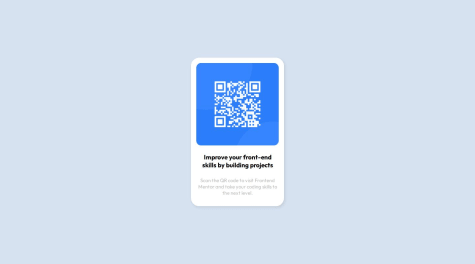
P@ValeriaMontoyaPosted about 1 year agoHi, here are some suggestions to improve the accessibility of your code:
- Screen readers rely on alt text to describe images to users. Add an alt attribute to the
<img>tag with a description of the QR code's purpose. For example:<img src="./images/image-qr-code.png" alt="QR code for Frontend Mentor" /> - While
<div>is generic, consider using more descriptive elements for specific content. In this case, replace the outer<div>with a<main>tag to indicate the main content area. - Headings (
<h1>to<h6>) should be used in a logical order to structure the content hierarchy. Since there's only one heading currently, you can simply remove the<b>tag for bold styling (use CSS instead) and replace it with a<h1>tag.
I hope my feedback is helpful! 🤓
0 - Screen readers rely on alt text to describe images to users. Add an alt attribute to the
- @dazzlerabhi30800Submitted about 3 years agoP@ValeriaMontoyaPosted about 3 years ago
Hi! Here are some suggestions after reviewing your code: you should always use semantic HTML to wrap the content and avoid using many divs. Another suggestion is that you should read the style guide provided in the challenge files, you'll find all the colors and fonts you need. Good luck!
0 - @hariprasad9899Submitted about 3 years agoP@ValeriaMontoyaPosted about 3 years ago
Hi! I wasn't able to see your code on GitHub, it seems like your repository link is wrong. Looking at the live site I'd like to say that the cards needed more padding to make them look better. I also notice that you used h3 tags, but I always recommend to use h1, h2, in that order and so on due to best practices. Hope my tips are useful.
0 - @Jintax1Submitted about 3 years agoP@ValeriaMontoyaPosted about 3 years ago
Hi Jintax. You got close to the design, you did great. I just want to give you a tip: you should always use the <main> tag to wrap all the content so you avoid accessibility issues. Happy New Year btw 🎉
Marked as helpful1 - @SDKishorSubmitted over 3 years agoP@ValeriaMontoyaPosted over 3 years ago
You did a great job, it looks amazing. My only tip is that you can separate the CSS on different files, for example create a mobile.css and desktop.css files and add something like this in the HTML head: <link rel="stylesheet" href="mobile.css" />
<link rel="stylesheet" href="desktop.css" media="screen and (min-width: 1440px)"/>1 - @shan1ySubmitted over 3 years agoP@ValeriaMontoyaPosted over 3 years ago
Hi! I recommend you to use a main tag to wrap all the page content. This way you avoid accessibility issues.
Good luck 😊
0 - @JimCarey08Submitted over 3 years agoP@ValeriaMontoyaPosted over 3 years ago
Hi Lucas. My first tip to you is that you should use classes instead of id's for your CSS selectors, this is due to id's are more used to work with JavaScript. Another thing I recommend to you is to import the fonts from Google Fonts and add them in your HTML file instead of adding them in your CSS file. That way your page will have a better performance. Also try not to mix CSS styles on the HTML file because it's not a good practice (this has to do with specificity). I hope my tips help you, good luck! ☺️
Marked as helpful1 - P@ValeriaMontoyaSubmitted over 3 years agoP@ValeriaMontoyaPosted over 3 years ago
Hi Aakash. I really appreciate your feedback, you're completely right and I'll be more careful with responsive design from now on. Thanks a lot!😊
1