Design comparison
Solution retrospective
Kindly provide your feedbacks
Community feedback
- P@ValeriaMontoyaPosted over 3 years ago
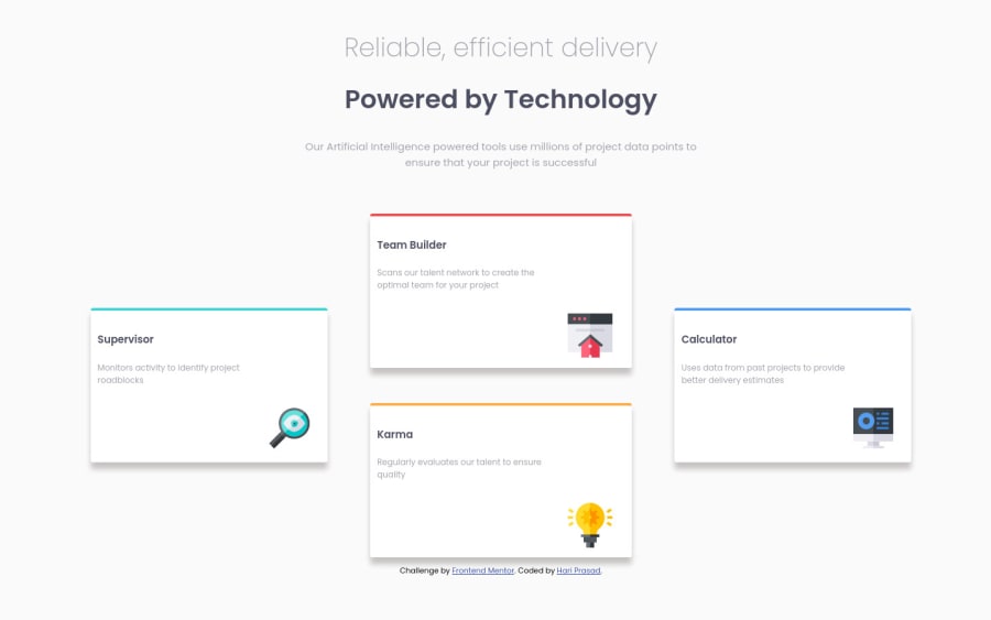
Hi! I wasn't able to see your code on GitHub, it seems like your repository link is wrong. Looking at the live site I'd like to say that the cards needed more padding to make them look better. I also notice that you used h3 tags, but I always recommend to use h1, h2, in that order and so on due to best practices. Hope my tips are useful.
0@hariprasad9899Posted over 3 years ago@ValeriaMontoya Hi Valeria !! Yes, there is some issue in the link I guess !! Here you go:
https://github.com/hariprasad9899/Web-Real-Time-Practice/tree/master/four-card-feature-section-master
And, also thanks for your tips! Definitely helpful. Please also, provide tips for my future uploads too!!
Regards, Hari prasad
1
Please log in to post a comment
Log in with GitHubJoin our Discord community
Join thousands of Frontend Mentor community members taking the challenges, sharing resources, helping each other, and chatting about all things front-end!
Join our Discord
