

Design comparison
SolutionDesign

Community feedback
- P@ValeriaMontoyaPosted 3 months ago
Hi @Elofatish 👋🏼
There are some positive aspects about your solution, but also areas for improvement:
- You correctly use
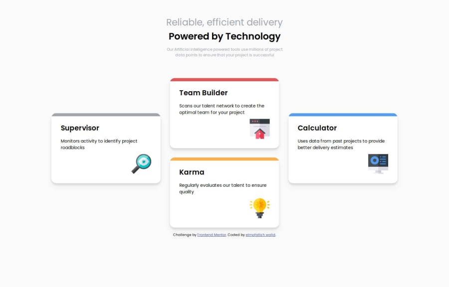
altattributes for your images, which is great for accessibility! However, for images like "Supervisor", "team-builder", etc., you might want to make thealttext more descriptive. For example, instead ofalt="Supervisor", use something likealt="Icon representing Supervisor tool for monitoring project roadblocks". This helps users with screen readers understand the context. - Avoid unnecessary comments like "file css" as it's self-explanatory from the link tag (line 10 of your index.html file).
- Finally, your implementation looks close to the design but some colors and font sizes can be changed to match the design. For example, you can replace color black for
--Very-Dark-Blue: hsl(234, 12%, 34%);
I hope you find my feedback useful! 🤓
0 - You correctly use

Please log in to post a comment
Log in with GitHubJoin our Discord community
Join thousands of Frontend Mentor community members taking the challenges, sharing resources, helping each other, and chatting about all things front-end!
Join our Discord