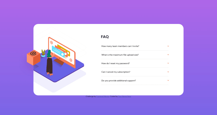
Design comparison
Solution retrospective
All feedback is welcomed!
Community feedback
- @MojtabaMosaviPosted over 3 years ago
1- There is too much empty space om the mobile view which makes look a bit off, I suggest you set the max-width to something like 34rem and ceneter it horisontelly.
2- A good way to make things you style is to pay extra attention to how different UI component behave in their interactive state, for instace the accordion question open state could be trasition a bit more smoothly, at the moment it's just sudden movement.
Keep coding :=)
Marked as helpful1 - @anoshaahmedPosted over 3 years ago
To avoid accessibility issues in the future, wrap everything in your body in
<main>OR giverole=""to the direct children of your<body>... Read more hereGood job! :)
0 - P@ValeriaMontoyaPosted over 3 years ago
Hi! I recommend you to use a main tag to wrap all the page content. This way you avoid accessibility issues.
Good luck 😊
0
Please log in to post a comment
Log in with GitHubJoin our Discord community
Join thousands of Frontend Mentor community members taking the challenges, sharing resources, helping each other, and chatting about all things front-end!
Join our Discord
