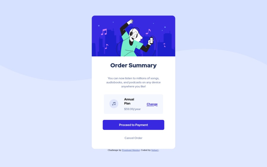
Design comparison
Solution retrospective
I don't know how to do shadows and it's not as pixel perfect as I would like. I will return to make it a little better in the future. Any feedback would be appreciated :)
Community feedback
- @kesevan626Posted over 3 years ago
. container{ box-shadow: 2px 3px 15px grey; } //This will give it the shadow of 2px right and 3px bottom. //Top and left will have a negative value
Marked as helpful1@Jintax1Posted about 3 years ago@kesevan626 thank you for you feedback, I'll come back to it as soon as I finish my second one :)
0 - P@ValeriaMontoyaPosted over 3 years ago
Hi Jintax. You got close to the design, you did great. I just want to give you a tip: you should always use the <main> tag to wrap all the content so you avoid accessibility issues. Happy New Year btw 🎉
Marked as helpful1@Jintax1Posted over 3 years ago@ValeriaMontoya Thank you I'll note that, Happy New Year to you too :)
1
Please log in to post a comment
Log in with GitHubJoin our Discord community
Join thousands of Frontend Mentor community members taking the challenges, sharing resources, helping each other, and chatting about all things front-end!
Join our Discord
