Thomas
@TomSifAll solutions
Bookmark_Landing-page with Bootstrap and minimal JS
#bootstrapSubmitted 3 months agoI'm not particularly proud of this integration, I would change a lot of things if I had to start from scratch, but the idea was to discover the framework and I think I have a general idea of how to use it now.
Room_Homepage-master with mixins
Submitted 3 months agoHonestly, I had to pause the project for a while due to the hectic Christmas season at work. When I came back to it, it felt like sleeping in someone else's bed—it took me a full day to regain control and remember what I was doing. How do you stay on track with your projects? Do you take notes?
Front-end_Mentor_Loop-Studio
Submitted 4 months agoI would like to know how to make a site completely responsive, and what are the norms and standards, for example up to what screen sizes, do you do your tests, what are the best practices, because I am moving forward a little by feeling and there are probably rules to follow that then allow the elements to grow or shrink harmoniously. Afterwards I take all the advice, thank you to those who will come take a look and leave a comment :)
Front-end_Mentor_NFT_Preview-CARD ( Tailwindcss )
#tailwind-cssSubmitted 5 months agoAny advice is welcome, thanks to those who come and take a look :)
Frontend_Mentor_E-commerce_product_page
Submitted 5 months agoAll advice is good to take and thanks to those who will dig into my code, I think we could still push the integration on certain elements, notably how the modals close I still don't know how to animate the closures, but I saw a tutorial, but I haven't had the courage to start yet.
Front-end_Mentor_News_Homepage_main
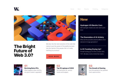
Submitted 5 months agoAll advice is welcome, particularly on accessibility and focuses, I did based on my current knowledge. Thank you very much to those who take the time to read my code and leave a comment, it's always very encouraging and it's what allows me to progress.
Front-end_Mentor_Contact_form_main
Submitted 5 months agoAs this was an accessibility exercise, I hope the project meets the requested criteria, and I will be curious to know what other developers think of my work. Thank you to those who take the time to take a look and comment, your opinions and criticisms are greatly appreciated.
Front-end_Mentor_FAQ_Accordion
Submitted 6 months agoAll the advice is good to take, I will be curious to see how to make a beautiful accordion transition, very fluid for the deployment of the answer when we click on the question, I adjusted the opacity otherwise the answer appeared on the lower container when launching the animation, but there was perhaps something better than playing on the max-height. Thanks in advance to those who pass by and leave a little comment :)
Front-end_Mentor_Interactive_rating_component
Submitted 6 months agoAs this is a part on accessibility, I hope that I have fulfilled my mission well and I would be curious to have the opinion of a more experienced person to know which part to improve this one. All comments are very welcome and thank you in advance to those who take the time to take a look at my work.
Tip Calculator App
Submitted 6 months agoHonestly I take all the advice, being self-taught, I need feedback to know if I'm going in the right direction and if my work is understandable by others. So comment and thank you to those who take the time to take a look at the code :)
Frontend-Mentor-Time-tracking-dashboard
Submitted 6 months agoI used list logic for activity containers, but I'm not sure it was a good idea. I will be curious to see this project in react. After all the advice is good to take, I learn a lot by doing but an outside eye sometimes helps greatly, so don't hesitate to correct me, it's really with pleasure that I would read you.
Newsletter_sign-up_form_with_success_message( Javascript )
Submitted 6 months agoAll advice is welcome, especially on how I structured the project, I am curious to see if there was simpler or how others have proceeded, I would perhaps look at other projects to learn an idea. The JavaScript approach is still a big gap, even if I understand the language, sometimes I have a lot of trouble articulating the functions together.
Article_Preview_Component_Master ( Javascript )
Submitted 6 months agoAll advice is welcome whether in html, css or javascript, I would be curious to know the opinion of people with more advanced levels than mine on the way I organized my code, there are surely methodologies which I don't know yet, thank you in advance to those who will take the time to read my code, it's really a big help when you're self-taught
Testimonials grid section Using Grid and Flexbox
Submitted 6 months agoAny advice is welcome especially on the html structure where I must say I am not always sure to use the right tags effectively. I would also be curious to know how other developers would judge my code, in terms of readability and if there was a method to make changing the number of columns smoother and less abrupt.
Four-card-feature-section-master using Flexbox and Grid
Submitted 6 months agoAny advice is more than welcome, especially on the structure and readability of my code, having no experience in a professional environment, I do not know the customs and traditions of the environment in terms of standards. On small projects like this, my goal is to adopt good habits and try to keep my code maintainable and understandable by others.
Front-end_mentor_preview_card_component
Submitted 6 months agoAs said before, on small simple projects like this my goal is to apply as much as possible, the advice and uses of the industry, being totally self-taught, I hope to succeed by doing these exercises to acquire necessary reflexes, and essential to work in a company. So all advice, criticism and resources are welcome. Thank you for taking the time to read my code and leave me a little comment :)
Front-end_Mentor_recipe-page-main
Submitted 7 months ago"I'd like to know the best way to implement margins so that they scale with the screen resolution. I had to use media queries at different resolutions, but the result feels a bit choppy. There must be a better way to do it."
Front-end_Mentor_Social-Links
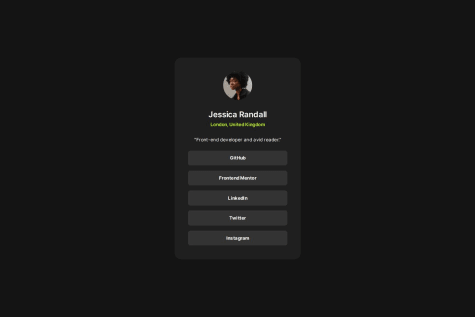
Submitted 7 months agoI guess I should have used more max width, but I got some weird behavior on the tile, so I implemented it on the parent container.
Frontend Mentor - Blog preview card solution
Submitted 7 months agoI will probably need to dive deeper into industry standards for web responsiveness and learn the best practices for responsive design.
# Frontend Mentor - QR code component solution
Submitted 7 months agoProbably using media query to pixel perfect the project.


