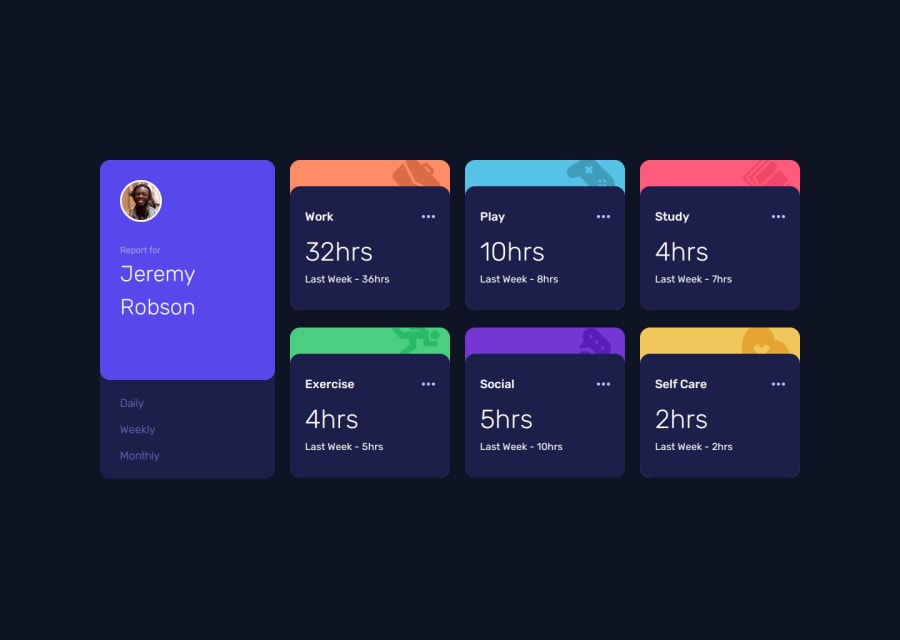
Design comparison
Solution retrospective
Probably the most complex project I have done so far, I continued to apply the same method as on previous projects starting with the mobile design. I'm starting to think that maybe using tailwind for the next project will save me from constantly switching between my css file and my html to know what class name I could have used!
What challenges did you encounter, and how did you overcome them?I had a big bug, on github pages with 404 errors on my file paths, I had to use urls to solve the problem but I don't understand where it could come from. The javascript part, honestly without the help of chatgpt I would never have succeeded, even if I understand, sometimes the logic of the variables still escapes me, but I tell myself that by dint of doing projects it will end up doing meaning and becoming automatisms.
What specific areas of your project would you like help with?I used list logic for activity containers, but I'm not sure it was a good idea. I will be curious to see this project in react. After all the advice is good to take, I learn a lot by doing but an outside eye sometimes helps greatly, so don't hesitate to correct me, it's really with pleasure that I would read you.
Community feedback
- @Emynex4realPosted 6 months ago
I hope chatgpt didn't give you the code, but instead it just assisted you in where you where wrong The CSS is top notch i love it but the media queries just need a little of tweaking
1
Please log in to post a comment
Log in with GitHubJoin our Discord community
Join thousands of Frontend Mentor community members taking the challenges, sharing resources, helping each other, and chatting about all things front-end!
Join our Discord
