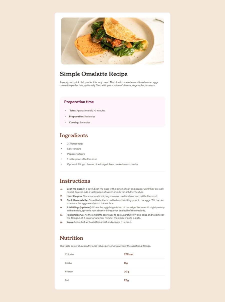


Design comparison

Solution retrospective
"For the first time, I started with a mobile-first approach and adjusted the breakpoints with media queries. It's probably my most advanced project so far, even though it's still simple. I spent way too much time fine-tuning some design details, such as the bullet points in the list, which needed to be centered in the paragraphs. There's probably a quicker method, but I eventually managed to adjust everything as expected. The project is fully responsive—probably a bit rough around the edges, but I'm still pretty proud of it!"
What challenges did you encounter, and how did you overcome them?"The darn bullet point that needed to be centered in the middle of the paragraph gave me a hard time. I had to use ::before with content: "\2022" and position: relative, then adjust the position of the last bullet with padding. And for some reason, it took me hours... At least now lists hold no more secrets for me—well, until proven otherwise!"
What specific areas of your project would you like help with?"I'd like to know the best way to implement margins so that they scale with the screen resolution. I had to use media queries at different resolutions, but the result feels a bit choppy. There must be a better way to do it."
Please log in to post a comment
Log in with GitHubCommunity feedback
No feedback yet. Be the first to give feedback on Thomas's solution.
Join our Discord community
Join thousands of Frontend Mentor community members taking the challenges, sharing resources, helping each other, and chatting about all things front-end!
Join our Discord