Design comparison
Solution retrospective
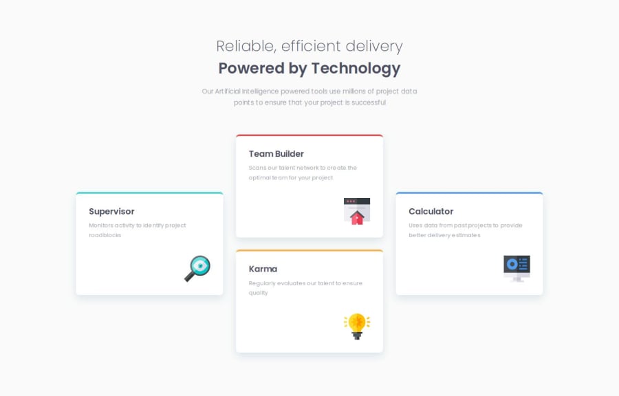
I tried to continue using the BEM method and annotate my code as much as possible to make it more readable. Before starting to code, I thought about a solution on the evolution of the design and decided to use only flexbox for the mobile version, the version I started with, then for the desktop version I used a 1fr 1fr 1fr grid which made my work much easier, there were only minor adjustments left to stick as faithfully as possible to the final design.
What challenges did you encounter, and how did you overcome them?I didn't encounter any major difficulty, I hesitated in the choice of tags on the html but I believe that the use of section and article was coherent, I could have chosen divs but I think that it makes sense if we consider the site as a Landing Page that leads to sections, in any case that's how I interpreted it.
What specific areas of your project would you like help with?Any advice is more than welcome, especially on the structure and readability of my code, having no experience in a professional environment, I do not know the customs and traditions of the environment in terms of standards. On small projects like this, my goal is to adopt good habits and try to keep my code maintainable and understandable by others.
Community feedback
Please log in to post a comment
Log in with GitHubJoin our Discord community
Join thousands of Frontend Mentor community members taking the challenges, sharing resources, helping each other, and chatting about all things front-end!
Join our Discord
