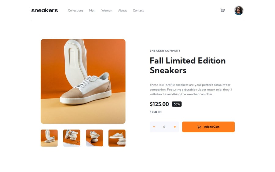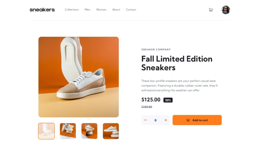
Design comparison
Solution retrospective
I'm really happy to finally feel like I know how to build something from scratch, like figuring out how to do it and taking it step by step was an infinitely more rewarding experience than following a tutorial.
What challenges did you encounter, and how did you overcome them?The hardest part was understanding how the modals worked, but once I understood that, the rest followed. I think it took me more than 20 hours to complete this integration and sometimes I was lost in front of the number of adjustments to put in place, but making plans of the things that remained to be done, then taking the time to test and note the bugs, allowed me to complete what I was capable of doing for the moment, I think.
What specific areas of your project would you like help with?All advice is good to take and thanks to those who will dig into my code, I think we could still push the integration on certain elements, notably how the modals close I still don't know how to animate the closures, but I saw a tutorial, but I haven't had the courage to start yet.
Community feedback
- @EtSuraDevPosted 5 months ago
hey man the design and solution are the same, how did you do that??
0@TomSifPosted 5 months ago@EtSuraDev i take some screenshots with firefox at the same screen resolution, and i compare it with the original design in photoshop. In otherway that's a lot of tweaking haha :)
1
Please log in to post a comment
Log in with GitHubJoin our Discord community
Join thousands of Frontend Mentor community members taking the challenges, sharing resources, helping each other, and chatting about all things front-end!
Join our Discord
