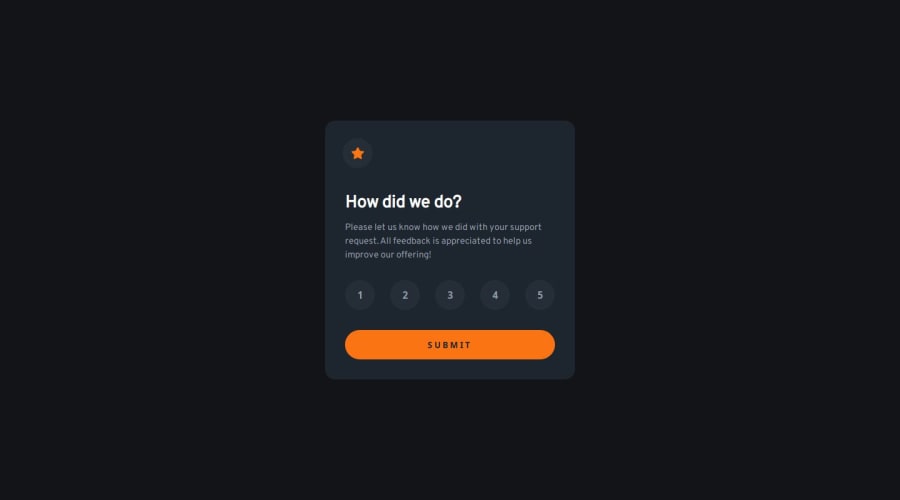
Design comparison
Solution retrospective
I tried as much as possible to make the content accessible, curious to know if there were any omissions or better optimization. The javascript part was much simpler than on the previous project, it's starting to make sens, I even added a little transition animation, it was interesting to understand how to trigger it with a delay.
What challenges did you encounter, and how did you overcome them?I didn't really encounter any particular difficulty on this project, other than trying to understand how to offset my transition animation.
What specific areas of your project would you like help with?As this is a part on accessibility, I hope that I have fulfilled my mission well and I would be curious to have the opinion of a more experienced person to know which part to improve this one. All comments are very welcome and thank you in advance to those who take the time to take a look at my work.
Community feedback
- @muiruri3000Posted 6 months ago
Well done! How did you manage to almost fit in perfectly the width and the height?
1@TomSifPosted 6 months ago@muiruri3000
Thanks :) Actually I open the image provided in the design in Photoshop, and I compare screenshots taken with Firefox at the same resolutions and I adjust the details until it gets as close as possible.
1
Please log in to post a comment
Log in with GitHubJoin our Discord community
Join thousands of Frontend Mentor community members taking the challenges, sharing resources, helping each other, and chatting about all things front-end!
Join our Discord
