Design comparison
Solution retrospective
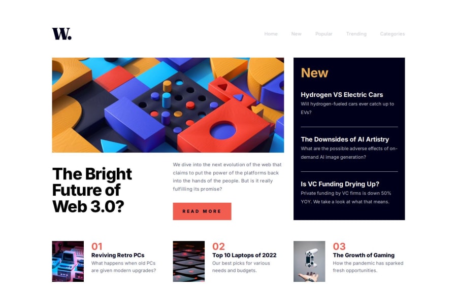
Very proud to say that I can now create this kind of homepage without too much trouble.
What challenges did you encounter, and how did you overcome them?I struggled with the grids, until I understood that each parent container had to be in display:content to transmit the grid to its children, otherwise it does some pretty strange things, but I looked hard for a while. hours to understand where these shifts came from.
What specific areas of your project would you like help with?All advice is welcome, particularly on accessibility and focuses, I did based on my current knowledge. Thank you very much to those who take the time to read my code and leave a comment, it's always very encouraging and it's what allows me to progress.
Please log in to post a comment
Log in with GitHubCommunity feedback
- @Emynex4real
The home page looks really amazing but there is a little mistake in the js
when you move the mobile and trigger the menu icon to popout the nav bar then you switch back to desktop the properties doesn't disappear i think so should check I has an issue like that and this is how i resolved it.
@media (min-width: 750px){ .menu-icon{ display: none !important; } .close-icon{ display: none !important; } .vertical-list{ display: none !important; }
Marked as helpful
Join our Discord community
Join thousands of Frontend Mentor community members taking the challenges, sharing resources, helping each other, and chatting about all things front-end!
Join our Discord
