

Design comparison

Solution retrospective
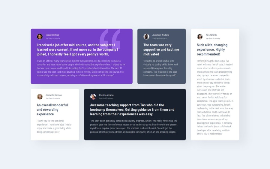
I tried to apply the advice I was given previously, use a modern-reset.css, start with the mobile approach, do not use px as a unit in my project. I liked this reminder about "grids" and I must say that I rediscovered some things, I also adjusted the cards to also adapt to tablets which was not requested. I tried to stick as much as possible to the design but I did not manage to reproduce the height of the cards.
What challenges did you encounter, and how did you overcome them?I think my class names could have been chosen more wisely, I might have adopted a different semantic structure, if I had thought a little more in advance about the organization of the cards, especially the white ones. I spent way too much time tinkering with the adjustments to make it match both designs, I think I got as close as I could.
What specific areas of your project would you like help with?Any advice is welcome especially on the html structure where I must say I am not always sure to use the right tags effectively. I would also be curious to know how other developers would judge my code, in terms of readability and if there was a method to make changing the number of columns smoother and less abrupt.
Community feedback
Please log in to post a comment
Log in with GitHub
Join our Discord community
Join thousands of Frontend Mentor community members taking the challenges, sharing resources, helping each other, and chatting about all things front-end!
Join our Discord