Jeff Guleserian
@jguleserianAll solutions
Product Preview Card Component - Second Solution
PSubmitted 9 months agoI someone has a minute to take a look at what I did with the
andto help me understand my error, I would be very grateful. Additionally, if you see any other issues that would be to my benefit (more efficient coding, better technique for adjustments, etc.), please let me know.Thank you so much for taking the time to look at my work. Any feedback is greatly appreciated.
Happy coding!
Jeff
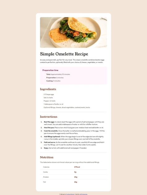
Recipe Page Solution using Flex and HTML Table
PSubmitted 9 months agoAs mentioned above, I would be so grateful if someone could take a look at my code and let me know how I can improve, in any area, but specifically with respect to the bullet points and GitHub.
Thank you so much for taking a look at my submission. I appreciate any encouragement or insight.
Happy coding!
Social Links Profile Solution
PSubmitted 9 months ago(See previous section)
Thank you for taking a look at my solution. If you have any helpful suggestions, I would be grateful.
Happy coding!
Jeff
Blog Preview Card - My Solution
PSubmitted 9 months agoIn terms of areas of help, I think I was able to do everything fairly smoothly and economically. however, if you have the time to take a look at my code, I would more than appreciate any feedback on how to improve or new angles I should consider.
Thank you for taking time to take a look at my project.
Happy coding, Everyone!
Jeff
QR Component Card - Second Solution
PSubmitted 9 months agoWhat I would like help with is understanding GitHub more and becoming more proficient in utilizing what it has to offer. I find that I struggle with having a design work fine in my browser, but when it is published from GidHub Pages, the effects don't work or the image does not show up. I have reduced my frustration by avoiding the leading "/" in references to images or stylesheets but it still does not seem to work in every circumstance. If anyone has some better insight on this, I would really appreciate your help. In fact, if you have any suggestion at all, I would love to hear it.
Happy coding!
Jeff
BMI Calculator
PSubmitted 10 months ago- I would love a good tutorial on how to handle custom radio buttons. I've tried a few, but they only gave examples of how they did it and didn't give much instruction.
- If someone would take a look at my script.js file and let me know if they could have solved the calculation issue more succinctly.
- Also, my use of the
::beforeand::afterpesudo elements was a bit awkward. I had to add aelement after theand add a pseudo element in order to add a stylized placeholder for the input fields. This led to many issues in keeping those placeholders in the right place during resizing.
Anyway, I would love some advice along these issues if someone had the time to help me out.
Thank you, Everyone! Happy coding!
Jeff
Workit Landing Page
PSubmitted about 1 year agoOn GitHub, I was unable to get my Javascript file to link. I had added a few effects with JavaScript, just for fun and practice. These work fine locally, but on GitHub pages, the file does not seem to link properly. Could someone take a look and let me know what I did wrong? I would be most appreciative.
Thank you everyone! Happy coding! Jeff
Results Summary Component: JS/jQuery + Interactive Animation/Content
#jqueryPSubmitted about 2 years agoSkilled eLearning Landing Page - responsive using HTML and CSS
#accessibilityPSubmitted over 2 years ago