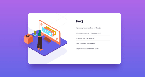
FAQ Accordion Card - Bonus Challenge: CSS only

Solution retrospective
Fellow Coders:
I really enjoyed taking on this "bonus" challenge because it helped me build confidence in solving problems that I had not faced before.
- Moving the marker to the right-hand side of a list and then apply a 2-d transformation to it alone using only CSS.
- Layering the 3 images with only the top one having a visible overflow, but do it with the least amount of code possible (hence, a resistance to creating an entirely new container for the image - well, resistance was futile, in this case)
Another goal (see the README) was to create more responsiveness in the project, minimizing that sudden contortion that happens in the transition to the next breakpoint. So I worked on making that transition a bit smoother but did not take the time (or do the calculations) to have the <pictures>/<img> files adapt in size. Also, the text get pretty cramped before it hits the 375px mark.
If you get a chance to take a look at the project, I would love feedback on:
- Responsiveness, especially as it transitions. I would love to hear how you do it, or how I could transition the font size better without having to create additional breakpoints.
- Organization, readability, and succinctness of the code
- Any other issue that you see might be helpful, positive or critical.
Thank you, Community, for your help and mentorship. It means so much to me.
Jeff
Please log in to post a comment
Log in with GitHubCommunity feedback
No feedback yet. Be the first to give feedback on Jeff Guleserian's solution.
Join our Discord community
Join thousands of Frontend Mentor community members taking the challenges, sharing resources, helping each other, and chatting about all things front-end!
Join our Discord