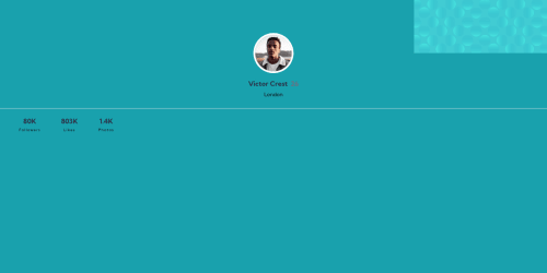
Profile Card Component: Practice makes problems

Solution retrospective
Good afternoon, Fellow Coders!
I took on this quick challenge to work on some of my CSS organization skills and trying out a new (to me) system called GPS (Global, Page, Section). Well, what I thought would be quick, actually took me longer than I planned because I ran in to a couple of problems. Maybe one of my peers out there has the solution? You know I love getting feedback from you all. Here were the issues:
- I could not think of a logical way to manipulate the two graphics used for the background. I tried rotations and translations, etc. But I was always at a loss because I don't know where the designers started with the designs (centered, left, right, default location?) In the end I just settled on putting their position as absolute and using my eyes to place them manually with "top" and "left."
- The second issue was when I tried to publish the site on GitHub. While everything looked great in development, once I got it on GitHub, all the formatting went crazy and those pesky background graphics showed up as block-element graphics (at 900+ pixels each). Needless to say, it didn't look like a social media profile card - more like a profile tome. :)
Anyway, if you have any suggestions, please send them my way. I really do appreciate you all. Thank you for taking the time to glance at my work.
Best wishes!
Jeff
Please log in to post a comment
Log in with GitHubCommunity feedback
No feedback yet. Be the first to give feedback on Jeff Guleserian's solution.
Join our Discord community
Join thousands of Frontend Mentor community members taking the challenges, sharing resources, helping each other, and chatting about all things front-end!
Join our Discord